tl;dr

Suppose you want to know which package(s) a given R function belongs to, say filter. Here come find_funsto help you:

find_funs("filter")
## # A tibble: 4 x 3
##   package_name builtin_pckage loaded
##          <chr>          <lgl>  <lgl>
## 1         base           TRUE   TRUE
## 2        dplyr          FALSE   TRUE
## 3       plotly          FALSE  FALSE
## 4        stats           TRUE   TRUE

This function will search all installed packages for this function name. It will return all the package names that match the function name (ie., packages which include a function by the respective name). In addition, the function raises a flag as to whether the packages is a standard (built-in) packge and whether the package is currently loaded/attached.

For convenience this function can be sourced like this:

source("https://sebastiansauer.github.io/Rcode/find_funs.R")

Usecase

Sometimes it is helpful to know in which R package a function ‘resides’. For example, ggplot comes from the package ggplot2, and select is a function that can be located in the package dplyr (among other packages). Especially if a function has a common name name clases are bound to be experienced. For a example, I was bitten by filter a couple of times - not reckognizing that the function filter that was applied did not come from dplyr as intended but from some other package.

Additionally, sometimes we have in mind ‘oh I should make use of this function filter here’, but cannot remember which package should be loaded for that function.

A number of ways exist to address this question. Our convenience function here takes the name of the function for which we search its residential package as its input (that’s the only parameter). The function will then return the one more packgages in which the function was found. In addition, it returns for each package found whether that package comes with standard R (is ‘built-in’). That information can be useful to know whether someone needs to install a package in order to use some function. The function also returns whether the function is currently loaded.

Code

find_funs <- function(f) {
  # Returns dataframe with two columns:
    # `package_name`: packages(s) which the function is part of (chr)
    # `builtin_package`:  whether the package comes with standard R (a 'builtin'  package)

  # Arguments:
    # f: name of function for which the package(s) are to be identified.


  if ("tidyverse" %in% rownames(installed.packages()) == FALSE) {
    cat("tidyverse is needed for this fuction. Please install. Stopping")
    stop()}

  suppressMessages(library(tidyverse))


  # search for help in list of installed packages
  help_installed <- help.search(paste0("^",f,"$"), agrep = FALSE)

  # extract package name from help file
  pckg_hits <- help_installed$matches[,"Package"]

  if (length(pckg_hits) == 0) pckg_hits <- "No_results_found"


  # get list of built-in packages

  pckgs <- installed.packages()  %>% as_tibble
  pckgs %>%
    dplyr::filter(Priority %in% c("base","recommended")) %>%
    dplyr::select(Package) %>%
    distinct -> builtin_pckgs_df

  # check for each element of 'pckg hit' whether its built-in and loaded (via match). Then print results.

  results <- data_frame(
    package_name = pckg_hits,
    builtin_pckage = match(pckg_hits, builtin_pckgs_df$Package, nomatch = 0) > 0,
    loaded = match(paste("package:",pckg_hits, sep = ""), search(), nomatch = 0) > 0
  )

  return(results)

}

Example

find_funs("filter")
## # A tibble: 4 x 3
##   package_name builtin_pckage loaded
##          <chr>          <lgl>  <lgl>
## 1         base           TRUE   TRUE
## 2        dplyr          FALSE   TRUE
## 3       plotly          FALSE  FALSE
## 4        stats           TRUE   TRUE

Convenience access

For convenience this function can be sourced like this:

source("https://sebastiansauer.github.io/Rcode/find_funs.R")

Notes

tidyverse needs to installed to run this code. tidyverse is loaded quietly. The function will return an empty dataframe if no target package is found.

Acknowledgements

This function was inspired by code from Ben Bolker’s post on SO.

Some time ago, I posted about how to plot frequencies using ggplot2. One point that remained untouched was how to sort the order of the bars. Let’s look at that issue here.

First, let’s load some data.

data(tips, package = "reshape2")

And the usual culprits.

library(tidyverse)
library(scales)  # for percentage scales

First, let’s plot a standard plot, with bars unsorted.

tips %>% 
  count(day) %>% 
  mutate(perc = n / nrow(tips)) -> tips2

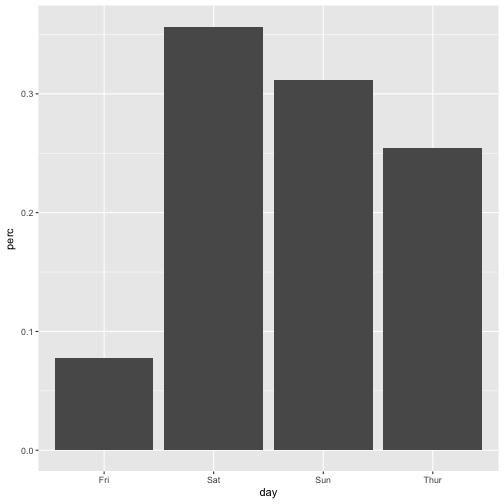
ggplot(tips2, aes(x = day, y = perc)) + geom_bar(stat = "identity")

plot of chunk unnamed-chunk-3

Hang on, what could ‘unsorted’ possibly mean? There must be some rule, by which ggplot2 determines order.

And the rule is:

  • if factor, the order of factor levels is used
  • if character, an alphabetical order ist used

Sorting bars by factor ordering

Albeit it appears common not to like factors, now that’s a situation when they are useful. Factors provide an easy for sorting, see:

tips2$day <- factor(tips2$day,levels = c("Fri", "Sat", "Sun", "Thur"))

Now let’s plot again:

ggplot(tips2, aes(x = day, y = perc)) + geom_bar(stat = "identity")

plot of chunk unnamed-chunk-5

Sorting bars by some numeric variable

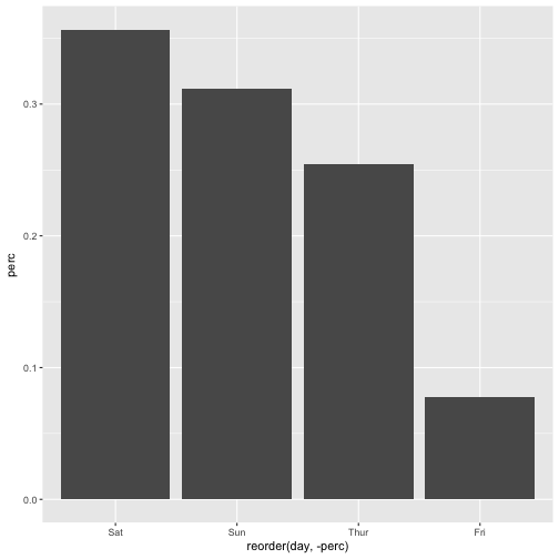
Often, we do not want just some ordering, we want to order by frequency, the most frequent bar coming first. This can be achieved in this way.

ggplot(tips2, aes(x = reorder(day, -perc), y = perc)) + geom_bar(stat = "identity")

plot of chunk unnamed-chunk-6

Note the minus sign -, leaving it out will change the ordering (from low to high).

Happy plotting!

Edit: This post was updated, including two errors fixed - thanks to (private) comments from Norman Markgraf.

z-values, aka values coming from an z-transformation are a frequent creature in statistics land. Among their properties are the following:

  1. mean is zero
  2. variance is one (and hence sd is one)

But why is that? How come that this two properties are true? The goal of this post is to shed light on these two properties of z-values.

Mean value of z-value is zero

There are a number of ways to explain this fact.

One is that it is one feature of mean values that the sum of the differences of the mean is zero. z-values tell nothing but the difference to the mean (in relation to the SD of the distribution). Hence, once you realize that the mean z-value is nothing but some mean value, you will see that the mean of a distribution/sample in z-values equals zero.

Intuition

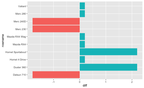
Look at the following codea and diagram as an intuition:

library(tidyverse)

mtcars %>% 
  select(cyl) %>% 
  slice(1:10) %>% 
  mutate(cyl_mean = mean(cyl),
         diff = cyl - cyl_mean) %>% 
  summarise(sum(diff))
##      sum(diff)
## 1 1.776357e-15

So our sum of the diff values is (practically) zero.

mtcars %>% 
  rownames_to_column %>% 
  select(cyl, rowname) %>% 
  slice(1:10) %>% 
  mutate(cyl_mean = mean(cyl),
         diff = cyl - cyl_mean,
         sign_diff = sign(diff)) %>% 
  ggplot() +
  aes(x = rowname, y = diff) +
  geom_col(aes(fill = factor(sign_diff))) +
  coord_flip() +
  guides(fill = FALSE)

plot of chunk unnamed-chunk-2

The diagram above is meant to give an impression that the negative and positive differences to the mean “cancel out”, ie., sum up to zero. Put pluntly: First, concatenate the red bars. Then, concatenate the magenta bars. You will find the total red bar and the total magenta bar are of the same length.

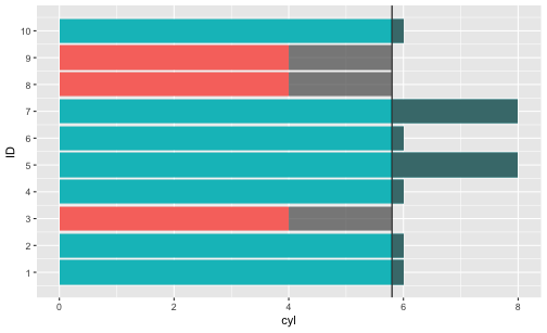
One further visualization:

cyl_mean <- mean(mtcars[1:10, "cyl"])

mtcars %>% 
  rownames_to_column %>% 
  select(cyl, rowname) %>% 
  slice(1:10) %>% 
  mutate(cyl_mean = mean(cyl),
         diff = cyl - cyl_mean,
         sign_diff = sign(diff),
         ID = 1:10) %>% 
  ggplot() +
  aes(x = ID, y = cyl) +
  geom_col(aes(fill = factor(sign_diff))) +
  coord_flip() +
  guides(fill = FALSE) +
  geom_hline(yintercept = cyl_mean) +
  geom_rect(aes(xmin = ID-.45, xmax = ID+.45,
                ymin = cyl_mean,
                ymax = cyl_mean + diff
               ),
            alpha = .7) +
  scale_x_continuous(breaks = 1:10)

plot of chunk unnamed-chunk-3

Saying that the differences of the values to the mean sum up amounts to saying that the “negative bars” (starting at the vertical mean line at about 5.8) are of equal length if concatenated as the “positive bars” (again starting at the vertical line), concatenated.

More formally

More formally, let \(X\) be some numeric variable, and \(\bar{x}\) the respective arithmetic mean, then \(\sum{(X_i - \bar{x}}) = 0\).

But why does this equation hold? And how does this apply to z-values?

Let’s look at some algebra:

\(\bar{z}_x =\) \(\frac{1}{n}\sum{z_{xi}} =\) \(\frac{1}{n}\sum{\frac{x_i- \bar{x}}{sd_x}} =\) \(\frac{1}{n} sd^-1 \underbrace{\sum{(x_i - \bar{x})}}_{\text{0}} = 0\)

But the sum of the differences to the mean (\(\sum{(x_i - \bar{x})}\)) is zero. Hence, the whole term is zero. That’s why (that’s one reason hot to explain why) the mean of z-values is zero.

But… why is the sum of differences from the mean equal to zero?

\(\sum{(x_i - \bar{x})} = \sum{x_i} - \sum{\bar{x}}=\) \(\sum{x_i} - n\bar{x} = \sum{x_i} - n \frac{\sum{x_i}}{n} = \sum{x_i} - \sum{x_i} = 0\)

SD of z-values is one

Ok, maybe the mean value of z-values is zero. But why is the SD or the variance equal to one?

If the variance is one, we will agree that the sd is one, too, because the root of 1 is 1.

Intuition

Well, suppose you take all the differences \(d\) from the mean and divide them by \(sd\). Let’s call the new differences \(d^{\prime}\). Not very surprisingly, the \(sd\) of \(d^{\prime}\) will also change accordingly - multiplied by \(sd^{-1}\), ie., \(sd^{\prime}\) will be divided by the factor \(sd\). And that yields 1.

More formally

Let \(V(X)\) be the variance (V) of some variable X, the remaining details are as above.

\[V{z_x} = \frac{1}{n} \sum{(z_{x_i} - \bar{z}_x)^2}=\]

But, \(\bar{z}_x = 0\), as discussed above. Thus, the equation is shortened to:

\[\frac{1}{n} \sum{(z_{x_i} - 0)^2}=\]

Now we replace \(z_{x_i}\) by its definition.

\[\frac{1}{n} \sum{\left( \frac{x_i - \bar{x}}{sd} \right)^2}=\]

Rearranging gives:

\[\frac{1}{sd^2} \sum \frac{(x_i - \bar{x})^2}{n} =\]

which can be simplified to

\[\frac{1}{V} V(X)=1\]

Thus, we see that the variance of z-values equals 1.


Similarly, picking up the idea from the intuition above, note that

\[V(aX) = a^2V(X)\]

In other words, if we multiply our values (the \(x_i\)s) by some factor \(a\), the resulting variance will increase by \(a^2\). In case that the mean value is zero (as for z-values), then we may say that “if we multiply our differences \(d\) by some factor \(a\), the variance will increase by \(a^2\)”. Taking the root of the variance, we are left with the sd changed by factor \(a\).

Plotting a function is often helpful to better understand what’s going on. Plotting curves in R base is simple by virtue of function curve. But how to draw curves using ggplot2?

That’s a little bit more complicated by can still be accomplished by 1-2 lines.

library(ggplot2)

Normal curve

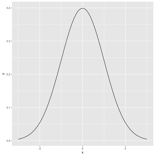
p <- ggplot(data = data.frame(x = c(-3, 3)), aes(x))
  
p + stat_function(fun = dnorm, n = 101) 

plot of chunk unnamed-chunk-2

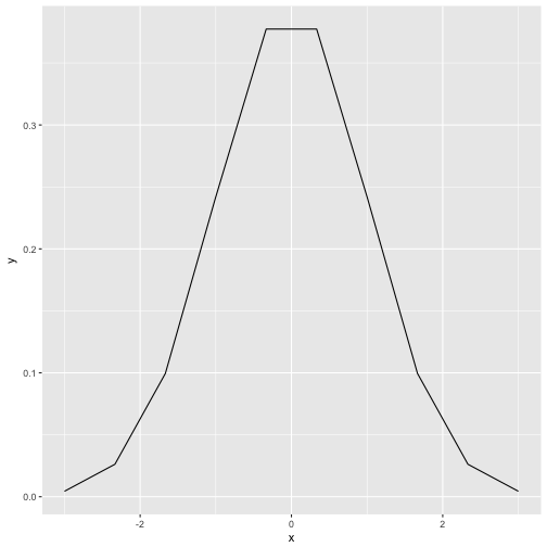
stat_function is some kind of parallel function to curve. The parameter n tells ggplot how finely granulated the curve should be. Compare to n=10:

p + stat_function(fun = dnorm, n = 10) 

plot of chunk unnamed-chunk-3

Logistic curve

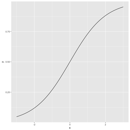
The logitistic curve plays an eniment role in many statistical methods, e.g., regression for binary events, and Rasch model in psychometric. It is sometimes called “s-type” curve (or “ogive”) due to its form vaguely resembling an “S”:

scurve <- function(x){
  y <- exp(x) / (1 + exp(x))
  return(y)
}

p + stat_function(fun = scurve, n = 100) 

plot of chunk unnamed-chunk-4

As our function does not have a prebottled version in base R, we have defined a function beforehand. That function is then passed over to ggplot2.

Alternatively, we could have done that in one step:

p + stat_function(fun = function(x) exp(x)/(1+exp(x)), n = 100) 

plot of chunk unnamed-chunk-5

Which is shorter but somewhat less readable.

Ln-Function

Now the principle is clear and we can readily apply it to whatever function we wish. Let’s take the natural logarithm (log in R) as a final example.

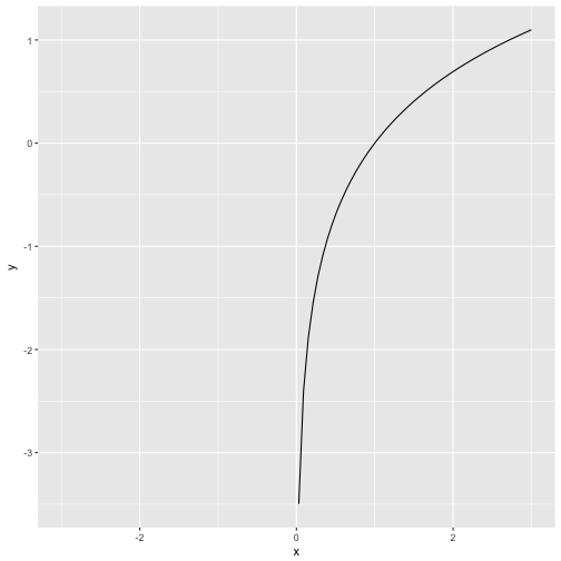
p + stat_function(fun = log, n = 100)
## Warning in .Primitive("log")(x_trans): NaNs produced
## Warning: Removed 50 rows containing missing values (geom_path).

plot of chunk unnamed-chunk-6

Note that the ln-function is not defined for negative values (zero gives -Inf).

An old story is that one of the farmer with a fence of some given length, say 20m. Now this farmer wants to put up his fence so that he claims the largest piece of land possible. What width (w) and height (h) should we pick?

Instead of a formal proof, let’s start with a visualization.

First, we need some packages.

library(tidyverse)
library(gganimate)
library(RColorBrewer)
library(scales)
library(knitr)

Now, let’s make up serveral ways to split up a rectengular piece of land. Note that we only need to define two sides (width and height), as the circumference of a rectangle is \(c = 2w + sh\).

df <- data_frame(
  w = c(0:10, 9:0),
  h = c(10:0, 1:10),
  area = w * h)

df$row <- 1:nrow(df)

Next, let’s define a palette from Brewer’s palette no 5.

cols <- brewer_pal("seq")(5)
mypal <- gradient_n_pal(cols)(seq(0, 1, length.out = 21))

names(mypal) <- as.character(df$area)

Next, plot an animated diagram:

p <- ggplot(df) +
  aes(x = w, y = h, fill = mypal, frame = row) +
  geom_rect(aes(xmax = w, ymax = h), xmin = 0, ymin = 0) +
  labs(title = paste0("area = ", df$area)) +
  # theme(legend.position = "none") +
  guides(fill = FALSE) +
  theme(plot.title = element_text(hjust = 0.5))

gganimate(p)
detach("package:gganimate", unload=TRUE)

Save output as gif:

#gganimate(p, "output.gif")

We can see (those wich quick eyes) that area is maximized when our piece of land is of quadratic shape. Glimpsing at the numbers confirms that impression:

df %>% 
  select(row, w, h, area) %>% 
  kable
row w h area
1 0 10 0
2 1 9 9
3 2 8 16
4 3 7 21
5 4 6 24
6 5 5 25
7 6 4 24
8 7 3 21
9 8 2 16
10 9 1 9
11 10 0 0
12 9 1 9
13 8 2 16
14 7 3 21
15 6 4 24
16 5 5 25
17 4 6 24
18 3 7 21
19 2 8 16
20 1 9 9
21 0 10 0

Area as a function of w

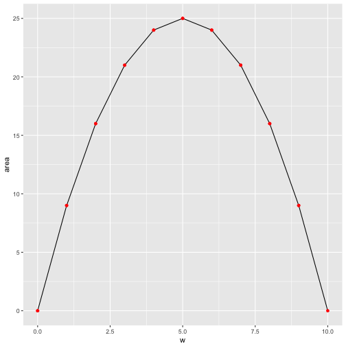
Maybe a more classical plot of area as a function of w (or h) is in order.

ggplot(df) +
  aes(y = area) +
  geom_line(aes(x = w)) +
  geom_point(aes(x = w), color = "red") 

plot of chunk unnamed-chunk-7

Similarly, area as a function of h:

ggplot(df) +
  aes(y = area) +
  geom_line(aes(x = h)) +
  geom_point(aes(x = h), color = "red") 

plot of chunk unnamed-chunk-8

That’s of coure no formal proof, but we get a “feel” that quadratic forms make best use of the fence (ie maximize the area for a given circumference) for all rectangular forms.

Proof

More formally, note that \(2w + 2h = 20\), or \(w+h=10\).

The area \(a\) is given by

\(a = wh = w(10-w) = 10w - w^2\).

The derivative of this function is zero at the maximum, so

\(\frac{da}{dw} = 10 - 2w\).

This equation is satisfied when \(a = 5\), hence also \(b = 5\). So the maximum rectengular area enclosed by a 20 meter fence is provided by a side length of 5 meters. a