reading time: 15-20 min.

Slidify is a cool tool to render HTML5 slide decks, see here, here or here for examples.

Features include:

  • reproducibility. You write your slide deck as you would write any other text, similar to Latex/Beamer. But you write using Markdown, which is easier and less clumsy. As you write plain text, you are free to use git.
  • modern look. Just a website, nothing more. But with cool, modern features.
  • techiwecki. Well, probably techie-minded persons will love that more than non-techies… Check this tutorial out as a starter.

Basically, slidify procudes a website:

While it is quite straight forward to write up your slidify presentations, some customization is a bit more of a hassle.

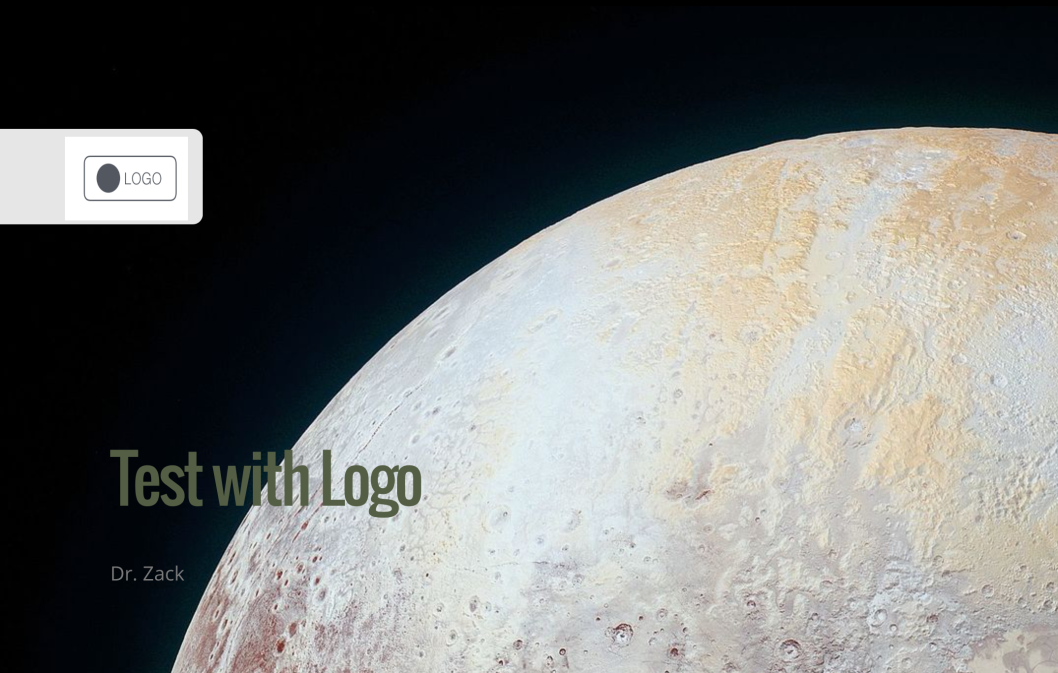
Let’s assume you would like to include a logo to your presentation. How to do that?

Logo page

There is an easy solution: In your slidify main file (probably something like index.Rmd) you will find the YAML header right at the start of the file:

---
title : "Test with Logo"
author : "Dr. Zack"
widgets : [mathjax, quiz, bootstrap, interactive] # {mathjax, quiz, bootstrap}
ext_widgets : {rCharts: [libraries/nvd3, libraries/leaflet, libraries/dygraphs]}
mode : selfcontained # {standalone, draft}
logo : logo.png
biglogo : logo.png
---

To get your logo page, do the following two steps:

  1. In your project folder, go to assets/img. Drop your logo file there (png and jpg will both work)
  2. Then adjust your YAML header by adding two lines:
logo : logo.png
biglogo : logo.png

Done!

Two changes will now take place. First, you will have a logo page, where nothing but your logo will show up (biglogo.png):

Second, a following page, the title page, will also show you logo (logo.png), but smaller and with a little animation (in the default):

Note that there are a number of other variables that you can define in the YAML header.

Background image on title page

Now, a little more fancy. What about a cool background image on your first page? OK, let’s check it out. This will be the output:

So what did I do?

I defined a CSS class as follows:

.title-slide {
 background-image: url(https://goo.gl/gAeQqj);
}

The picture is from WikiMedia Commons, published in the public domain.

Then, I saved this code as a css file (name does not matter; in my case title_slide_bg.css) in this folder:

[project_folder]/assets/css.

That’s it. Wait, don’t forget to slidify("my_deck").

You will say, that’s ok, but I want a footer or a header line, because that’s where I like to put my logo (accustomed to…).

The solution I used (there are surely a number of different) consisted of rewriting/customizing the template of the standard slide slide.html, adding the footer/header with logo.

So, the basic slide template looks like this:

<slide class="" id="" style="background:};">

<hgroup>
}
</hgroup>

<article data-timings="">
}
</article>
<!-- Presenter Notes -->

<aside class="note" id="">
<section>
}
</section>
</aside>

</slide>

I added some lines to add an object (logo) at a certain position; so my slide.html file looked like this:

<slide class="" id="">
<hgroup>
}
</hgroup>
<article>
}
<footer class = 'logo'>
<div style="position: absolute; left: 1000px; top: 50px; z-index:100">
<img src = "assets/img/logo.png" height="80" width="80">
</div>
</footer>
</article>
</slide>

Now, we have to save this file under [project folder]/assets/layouts.

The name does not matter; any html-file in this folder will be parsed by slidify. Here come the header with logo:

You can adapt size and position of the logo with the img html function.

That’s it! Happy slidifying!

You will find the code on this github repo, along with the slidify-presentation.

reading time: 10 min.

A quite common task in data analysis is to change a dataset from wide to long format.

For example, this is a dataset in wide format:

Is is called wide, as, well, it is wide – several columns side by side.

For example, assume, we have measured a number of predictors (here: predictor_1, predictor_2, predictor_3), and an outcome measure (here: outcome). In this case, each variable is dichotomous (either yes or no).

For plotting, eg. using ggplot2, we have to convert this format to long format. Long datasets look like this:

So, non really surprising, the dataset is now longer than in wide format. Hence the name…

It was converted in a certain way. Look at the two figures (and the color scheme). The 4 columns are now 3: All of the predictors are now paired in two colums: key and value. In the key column we find the names of the former columns as entries; in the value column we find the entries of those columns as entries (check the colors).

We easily see that the variable outcome was not paired. Before and after the convertion, it happily resides in its own, whole column. We often want a non-paired column, as we need it for eg., facetting.

Let’s visualize this transformation. First, we look at the transformation of the values:

Second, let’s look at the transformation of the keys (column headers), and the outcome variable, which will not be paires (remains in its own, complete, tidy column):

So let’s see the tidyr and dplyr code:

library(dplyr)
library(tidyr)
library(ggplot2)

data(Wage, package = "ISLR")

Wage %>%
  mutate(wage_f = ntile(wage, 2)) %>%  # bin it
  mutate(wage_f = factor(wage_f, labels = c("low_wage","high_wage"))) %>%
  select(health, race, wage_f) %>%
  gather(key = predictor, value = pred_value, -wage_f) %>%
  ggplot(aes(x = pred_value, fill = predictor)) + geom_bar() + facet_wrap(~wage_f) +
  coord_flip()
## Warning: attributes are not identical across measure variables; they will
## be dropped

The plot itself is not particular useful as it is, but at times you will want such a type of plot. And many R functions built on the long format.

reading time: 15-20 min.

Recently, I analyzed some data of a study where the efficacy of online psychotherapy was investigated. The investigator had assessed whether or not a participant suffered from some comorbidities (such as depression, anxiety, eating disorder…).

I wanted to know whether each of these (10 or so) comorbidities was associated with the outcome (treatment success, yes vs. no).

Of course, an easy solution would be to “half-manually” check the association, eg. using table() in R. But I wanted a more reproducible, more automated solution (ok, I confess, I justed wanted it to be cooler, probably…).

As a starter, consider the old question of the Titanic disaster: Did class correlate with survival? Let’s see:

data(titanic, package = "COUNT")  # package need be installed
attach(titanic)  # save some typing
table(class, survived)# tabulate the two variables
##            survived
## class        no yes
##   1st class 122 203
##   2nd class 167 118
##   3rd class 528 178
##   crew        0   0
prop.table(table(class, survived))  # get the percentages/proportions
##            survived
## class               no        yes
##   1st class 0.09270517 0.15425532
##   2nd class 0.12689970 0.08966565
##   3rd class 0.40121581 0.13525836
##   crew      0.00000000 0.00000000

The tabulation results look like this:

Alas! Money can buy you life, it appears…

Note that we are talking about nominal variables with two levels, ie. dichotomous variables. In other words, we are looking at frequencies.

So my idea was:

  • take a column of a predictor (say, depression)
  • take the column of the outcome variable (treatment success)
  • Cross-tabulate the association.
  • Repeat those steps for each of the comorbidities
  • Make sure it looks (sufficiently) cool…

Have I already told that I like the R-package dplyr? Check it out. Let’s see how to do the job with dplyr. Let’s use the Wages dataset from package ISLR.

This dataset from ISLR shows the wage of some male professionals in the Atlantic US area; along with the wage there are also some “risk factors” for the wage such as health status, education, race. Let’s see if there is an association.

First, load the package and the data:

# don't forget to install the packages upfront.
library(dplyr)
## 
## Attaching package: 'dplyr'
## The following objects are masked from 'package:stats':
## 
##     filter, lag
## The following objects are masked from 'package:base':
## 
##     intersect, setdiff, setequal, union
library(ggplot2)
data(Wage, package = "ISLR")

Now, here comes dplyr:

Wage %>%
  mutate(wage_f = ntile(wage, 2)) %>%  # bin it
  group_by(wage_f, health, race) %>%
  summarise(count = n()) %>%  # summarise by each group
  ggplot(aes(x = factor(wage_f), y = count, fill = race)) +
  geom_bar(stat = "identity") +
  facet_wrap(~health)

Let’s discuss the code a bit (not every bit), looking briefly the lines:

  1. build a column where wage is binned in two groups (low vs. high wage)
  2. group by wage group, health status and race (image 222 sub-spreadsheets)
  3. count the row number in each group (ie., 8 mini-spreadsheets)
  4. plot it, with some parameters

z-transformation is an ubiquitous operation in data analysis. It is often quite practical.

Example: Assume Dr Zack scored 42 points on a test (say, IQ). Average score is 40 in the relevant population, and SD is 1, let’s say. So Zack’s score is 2 points above average. 2 points equals to SDs in this example. We can thus safely infer that Zack is about 2 SDs above average (leaving measurement precision and other issues at side).

If the variable (IQ) is normally distributed, than we are allowed to look up the percentiles of this z-value in a table. Or ask the computer (in R):

pnorm(2)
## [1] 0.9772499

Here, R tells us that approx. 98% of all individuals have an IQ that is smaller than that of Dr. Zack. Lucky guy! Compare the figure.

Here an overview on some frequently used quantiles of the normal distribution:

Now, next step. We have a bunch of guys, and test each of them. Say, 10 guys. Now we can calculate mean and SD of this distribution. To see the differences more clearly, we can z-transform the values.

IQ <- rnorm(10, mean = 40, sd = 1)
IQ
##  [1] 40.91472 38.53260 40.30042 40.87957 40.99679 39.86815 40.14272
##  [8] 39.26335 40.19174 39.85837
IQ_z <- scale(IQ)
IQ_z
##              [,1]
##  [1,]  1.05897590
##  [2,] -2.01783361
##  [3,]  0.26552871
##  [4,]  1.01356631
##  [5,]  1.16497561
##  [6,] -0.29280567
##  [7,]  0.06183789
##  [8,] -1.07397171
##  [9,]  0.12515803
## [10,] -0.30543146
## attr(,"scaled:center")
## [1] 40.09484
## attr(,"scaled:scale")
## [1] 0.7742196

Ok. Let’s compute mean and sd of the z-scaled values:

mean(IQ_z)
## [1] -4.605338e-15
sd(IQ_z)
## [1] 1

So it worked apparently.

But why is it that mean and sd will end up nicely with 0 (mean) and 1 (sd)?

To see this, consider the following. A z-transformation is in step 1 nothing more than subtracting the mean of some value. If I subtract the mean (42 here) from each value, and compute the mean then, I will not be surprised that the mean is now 42 points lower than it was. But 42-42=0. So the new mean (after z-transformation) will be 0.

Ok, but what about sd? Why must it equal 1? A similar reasoning applies. If I divide each value by the SD of the distribution (here 1), the new SD will be exactly by this factor lower. So whatever it used to be before z-transformtion, it will be 1 afterwards, as x / x = 1.