At times it is convenient to draw a frequency bar plot; at times we prefer not the bare frequencies but the proportions or the percentages per category. There are lots of ways doing so; let’s look at some ggplot2 ways.
First, let’s load some data.
data(tips, package = "reshape2")
And the typical libraries.
library(dplyr)
library(ggplot2)
library(tidyr)
library(scales)  # for percentage scales
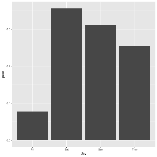
Way 1
tips %>%
  count(day) %>%
  mutate(perc = n / nrow(tips)) -> tips2

ggplot(tips2, aes(x = day, y = perc)) + geom_bar(stat = "identity")
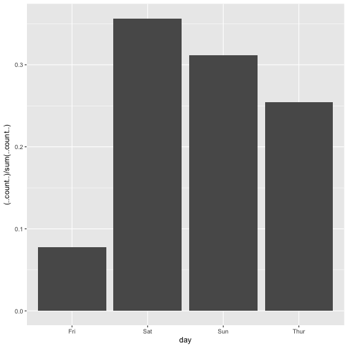
Way 2
ggplot(tips, aes(x = day)) +
  geom_bar(aes(y = (..count..)/sum(..count..)))
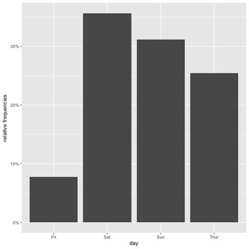
Way 3
myplot <- ggplot(tips, aes(day)) +
          geom_bar(aes(y = (..count..)/sum(..count..))) +
          scale_y_continuous(labels=scales::percent) +
  ylab("relative frequencies")

myplot
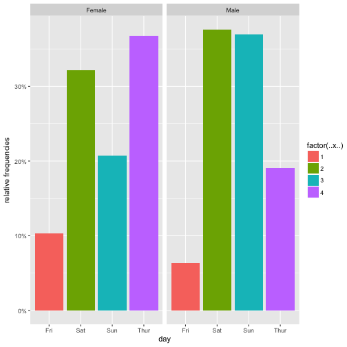
Way 4
myplot <- ggplot(tips, aes(day, group = sex)) +
          geom_bar(aes(y = ..prop.., fill = factor(..x..)), stat="count") +
          scale_y_continuous(labels=scales::percent) +
          ylab("relative frequencies") +
          facet_grid(~sex)

myplot
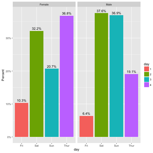
Way 5
ggplot(tips, aes(x= day,  group=sex)) +
    geom_bar(aes(y = ..prop.., fill = factor(..x..)), stat="count") +
    geom_text(aes( label = scales::percent(..prop..),
                   y= ..prop.. ), stat= "count", vjust = -.5) +
    labs(y = "Percent", fill="day") +
    facet_grid(~sex) +
    scale_y_continuous(labels = scales::percent)