Nicht jeder liebt Datenanalyse und Statistik… in gleichem Maße. Das ist zumindest meine Erfahrung aus dem Unterricht 
 . Crashkurse zu R sind vergleichbar zu Crahskursen zu Französisch - kann man machen, aber es sollte die Maxime gelten “If everything else fails”.
Dieser Crashkurs ist für Studierende oder Anfänger der Datenanalyse gedacht, die in kurzer Zeit einen verzweifelten Versuch … äh … einen grundständigen Überblick über die Datenanalyse erwerben wollen.
Ok, also los geht’s im Schweingalopp durch die Datenanalyse 
 .
.
Software
Bevor wir uns die Schritte näher anschauen, ein paar Worte zur Software.
Programme
Wir brauchen zwei Programme.
Wenn R installiert ist, dann findet RStudio R auch direkt. Wenn alles läuft, sieht es etwa so aus:
Erweiterungen
Außerdem brauchen wir diese Pakete für R:
 Um einen Befehl zu verwenden, der nicht im Standard-R, sondern in einer Erweiterung von R (“Paket”) wohnt, müssen sie dieses Paket erst starten (laden). Dazu können Sie den Befehl
 library verwenden. Oder Sie klicken den Namen des Pakets hier an:
Um ein Paket zu laden, muss es installiert sein. Klicken Sie auf den Button “Install” unter dem Reiter “Packages” in RStudio:

Starten Sie jetzt die beiden Erweiterungen (per Klick oder mit folgenden Befehlen).
library(mosaic)
library(tidyverse)
Über sieben Brücken musst Du gehen

Lizenz: André D Conrad, CC BY SA 3.0 De, https://de.wikipedia.org/wiki/Peter_Maffay#/media/File:Peter_Maffay.jpg
Man kann (wenn man will) die Datenanalyse in sieben fünf Brücken oder Schritte einteilen, angelehnt dem Song von Peter Maffay “Über sieben Brücken musst du gehen”.
Brücke 1: Daten einlesen
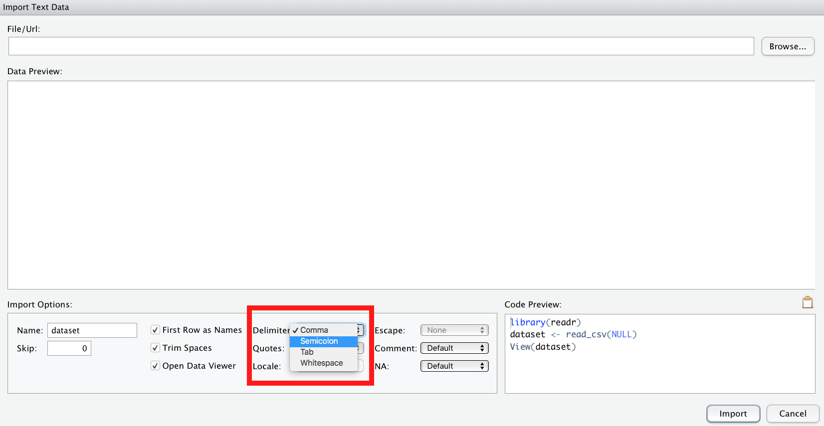
Der einfachste Weg, Daten einzulesen, ist über den Button “Import Dataset” in RStudio.
So lassen sich verschiedene Formate - wie XLS(X) oder CSV - importieren.
Beim Importieren von CSV-Dateien ist zu beachten, dass R davon von us-amerikanisch formatierten CSV-Dateien ausgeht. Was heißt das? Das bedeutet, das Spaltentrennzeichen (delimiter) ist ein Kommma ,. Deutsch formatierte CSV-Dateien, wie sie ein deutsch-eingestellltes Excel ausgibt, nutzen aber ein Semikolon ; (Strichpunkt) als Spaltentrennzeichen.
Ggf. müssen Sie also in der Import-Maske von RStudio als delimiter ein semicolon auswählen.
Alternativ können Sie natürlich eine XLS- oder XLSX-Datei importieren.
 Am einfachsten ist es, XLSX-Dateien zu importieren.
Damit Sie in R vernünftig mit Ihren Daten arbeiten können, sollten die Daten “tidy” sein, d.h. in Normalform. Was ist Normalform? Betrachten Sie folgende Abbildung:
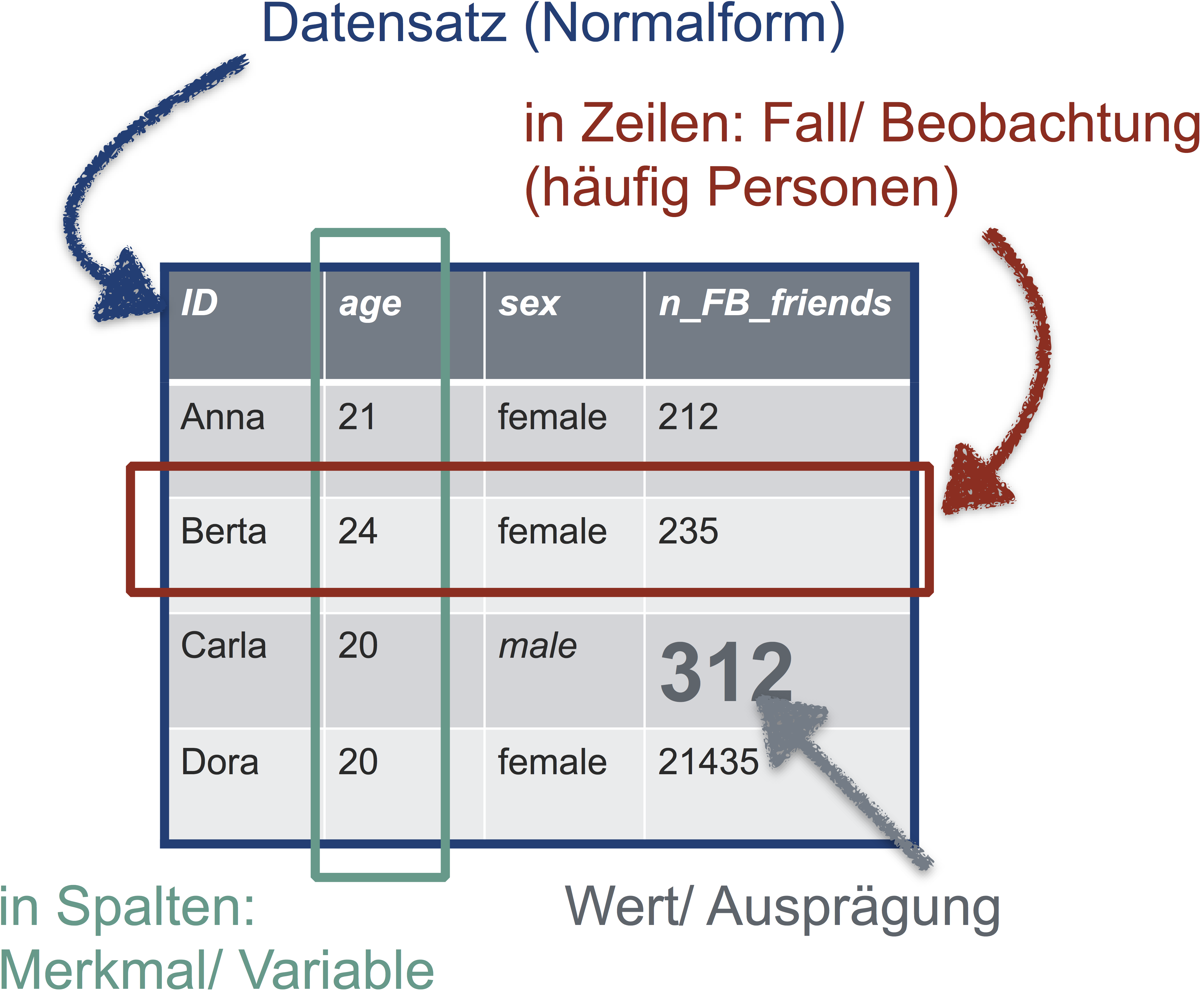
Die goldene Regel der Normalform einer Tabelle lautet also:
In jeder Zeile steht eine Beobachtung (z.B. Person). In jeder Spalte eine Variable (z.B. Geschlecht). In der ersten Zeile stehen die Spaltennamen, danach folgen die Werte. Sonst steht nichts in der Tabelle.
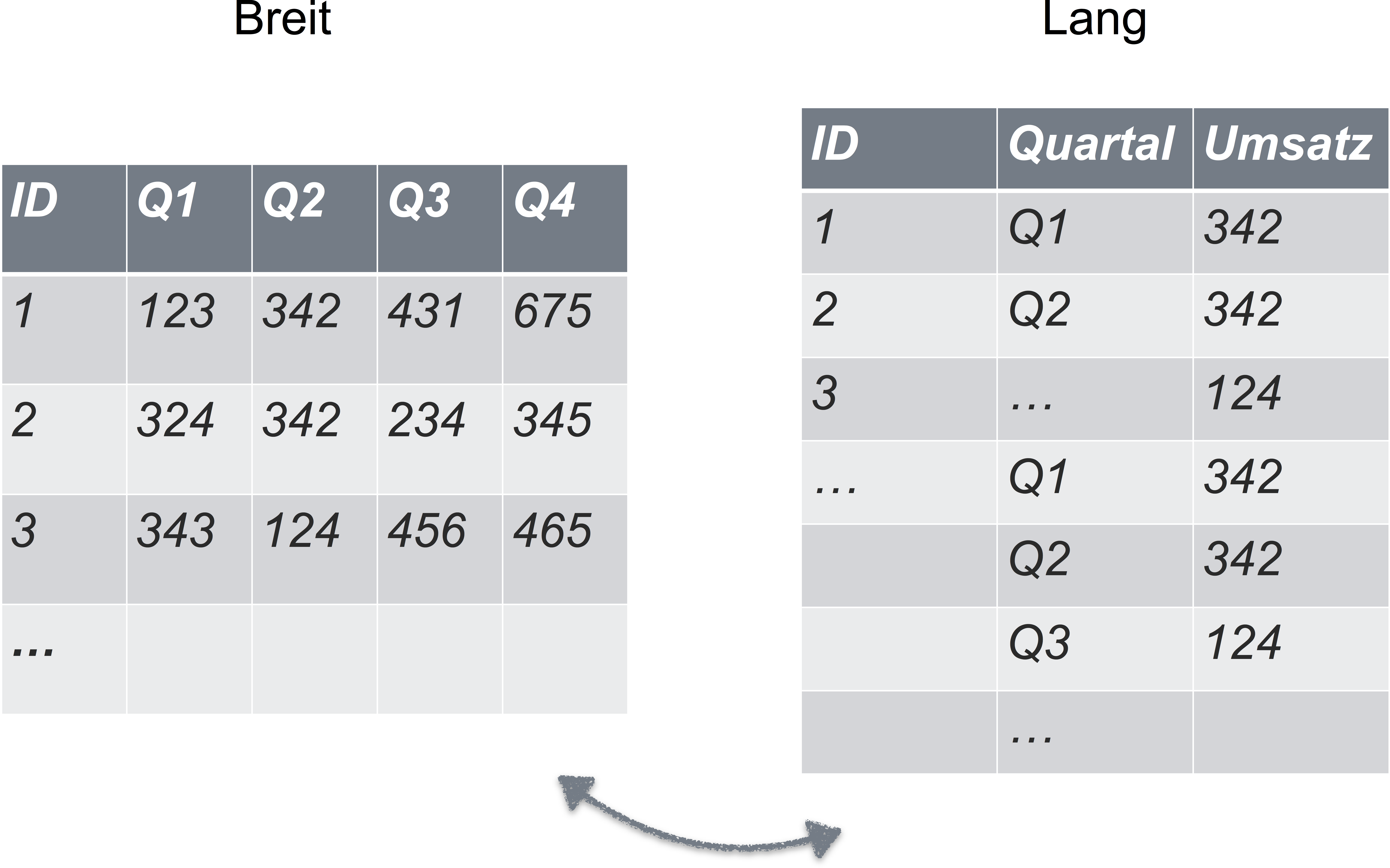
Falls Ihre Daten nicht in Normalform sind, sollten Sie diese zunächst in Normalform bringen.
Der einfachste Weg (von der Lernkurve her betrachtet, nicht vom Zeitaufwand), Daten in Normalform zu bringen, ist sie in Excel passend umzubauen.
Sie denken, dass Ihre Daten immer/auf jeden Fall in Normalform sind? Dann scheuen Sie sich mal dieses Bild an:
Textkodierung in UTF-8
Falls Sie RStudio oder ein beliebiger Texteditor irgendwann fragt, wie die Textdatei kodiert sein soll, wählen Sie immer “UTF-8”. Googeln Sie bei Interesse, was da bedeutet.
Schritt 2: Aufbereiten
Der Schritt des Aufbereitens ist häufig der zeitintensivste Schritt. In diesem Schritt erledigen Sie alles, bevor Sie zu den “coolen” oder fortgeschrittenen Analysen kommen. Z.B.
- prüfen auf Fehler beim Daten einlesen (und korrigieren)
- Spaltennamen korrigieren
- Daten umkodieren
- Fehlende Werte verarzten
- Komische Werte prüfen
- Daten zusammenfassen
- Zeilenmittelwerte bilden
- Logische Variablen bilden
Auf Fehler prüfen
Ein häufiger Fehler ist, dass die Daten nicht richtig eingelesen werden. Zum Beispiel werden die Spaltentrennzeichen nicht richtig erkannt. Das kann dann so aussehen.
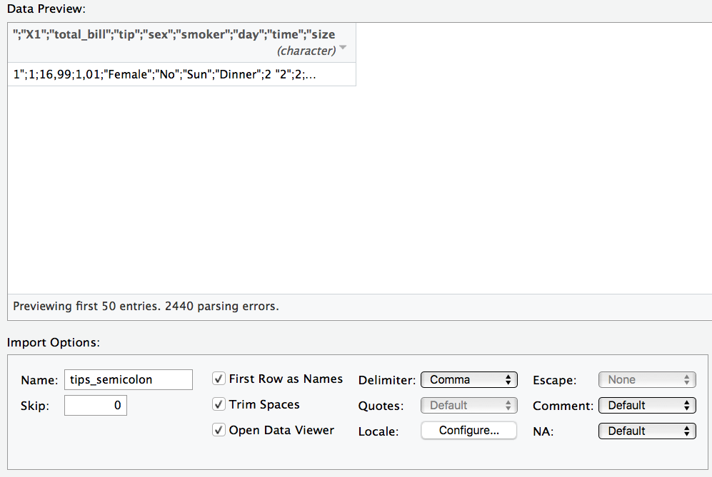
Unter “delimiter” in der Maske können Sie das Trennzeichen anpassen.
“Deutsche” CSV-Dateien verwenden als Dezimaltrennzeichen ein Komma; englisch-formatierte CSV-Dateien hingegen einen Punk. R geht per Default von englisch-formatierten CSV-Dateien aus. Importieren Sie eine deutsch-formatierte CSV-Datei, müssen Sie das Dezimaltrennzeichen von Hand ändern; es wird nicht automatisch erkannt.
Unter “locale” können Sie das Dezimaltrennzeichen anpassen.
Spaltennamen korrigieren
Spaltennamen müssen auch “tidy” sein. Das heißt in diesem Fall:
- keine Leerzeichen
- keine Sonderzeichen (#,ß,ä,…)
- nicht zu lang, aber trotzdem informativ
Spaltennamen sollten nur Buchstaben (ohne Umlaute) und Ziffern enthalten.
Für Textdaten in den Spalten sind diese Regeln auch sinnvoll.
Umkodieren
Gerade bei der Analyse von Fragebogendaten ist es immer wieder nötig, Daten umzukodieren. Klassisches Besispiel: Ein Item ist negativ kodiert. Zum Beispiel das Item “Ich bin ein Couch-Potato” in einem Fragebogen für Extraversion.
Nehmen wir an, das Item “i04” hat die Werte 1 (“stimme überhaupt nicht zu”) bis 4 (“stimme voll und ganz zu”). Kreuzt jemand das Couch-Potato-Item mit 4 an, so sollte er nicht die maximale Extraversion-Punktzahl (4), sondern die minimale Extraversion-Punktzahl (1) erhalten. Also
1 --> 4
2 --> 3
3 --> 2
4 --> 1
Am einfachsten ist dies zu bewerkstelligen mit folgendem R-Befehl:
meine_tabelle$i04_r <- 5 - meine_Tabelle$i04
Rechnet man 5-i04 so kommt der richtige, “neue” Wert heraus.
Zur Erinnerung:
-
$ ist das Trennzeichen zwischen Tabellennamen und Spaltenname.
-
<- ist der Zuweisungsbefehl. Wir definieren eine neue Spalte mit dem Namen i04_r. Das r soll stehen für “rekodiert”, damit wir wissen, dass in dieser Spalte die umkodierten Werte stehen.
Fehlende Werte
Der einfachste Umgang mit fehlenden Werten ist: nichts machen. Denken Sie nur daran, dass viele R-Befehle von Natur aus nervös sind - beim Anblick von fehlenden Werten werden sie panisch und machen nix mehr. Zum Beispiel der Befehl mean. Haben sie fehlende Werte in ihren Daten, so verwenden Sie den Parameter na.rm = TRUE. na steht für “not available”, also fehlende Werte. rm steht für “remove”. Also mean(meine_tabelle$i04_r, na.rm = TRUE).
Der R-Befehl summary zeigt Ihnen an, ob es fehlende Werte gibt:
summary(meine_daten).
Komische Werte
Hat ein Spaßvogel beim Alter 999 oder -1 angegeben, kann das Ihre Daten ganz schön verhageln. Prüfen Sie die Daten auf komische Werte. Der einfachste Weg ist, sich die Daten in Excel anzuschauen. Cleverer ist noch, sich Zusammenfassungen auszugeben, wie der kleinste oder der größte Wert, oder der Mittelwert etc., und dann zu schauen, ob einem etwas spanisch vorkommt. Diagramme sind ebenfalls hilfreich.
Logische Variablen bilden
Sagen wir, uns interessiert welches Auto mehr als 200 PS hat; wir wollen Autos mit mehr als 200 PS vergleichen (“Spass”) mit schwach motorisierten Autos (“Kruecke”). Wie können wir das (einfach) in R erreichen? Logische Variablen sind ein einfacher Weg.
mtcars$Spass <- mtcars$hp > 200
Dieser Befehl hat eine Spalte (Variable) in der Tabelle mtcars erzeugt, in der TRUE steht, wenn das Auto der jeweiligen Spalte die Bedingung (hp > 200) erfüllt. Schauen Sie nach.
## Warning in fav_stats(x, ..., na.rm = na.rm): Auto-converting logical to
## numeric.
##  min Q1 median Q3 max    mean        sd  n missing
##    0  0      0  0   1 0.21875 0.4200134 32       0
Daten zusammenfassen: Deskriptivstatistik
Deskriptive Statistik ist letztlich nichts anderes, als Daten geschickt zusammenzufassen.
Praktisch sind es meistens Spalten, die zu einen Zahl zusammengefasst werden.
Schauen wir uns das mal mit echten Daten an. Der Datensatz “mtcars” ist schon in R eingebaut, so dass wir in nicht extra laden müssen. Ganz praktisch.
##       mpg             cyl             disp             hp
##  Min.   :10.40   Min.   :4.000   Min.   : 71.1   Min.   : 52.0
##  1st Qu.:15.43   1st Qu.:4.000   1st Qu.:120.8   1st Qu.: 96.5
##  Median :19.20   Median :6.000   Median :196.3   Median :123.0
##  Mean   :20.09   Mean   :6.188   Mean   :230.7   Mean   :146.7
##  3rd Qu.:22.80   3rd Qu.:8.000   3rd Qu.:326.0   3rd Qu.:180.0
##  Max.   :33.90   Max.   :8.000   Max.   :472.0   Max.   :335.0
##       drat             wt             qsec             vs
##  Min.   :2.760   Min.   :1.513   Min.   :14.50   Min.   :0.0000
##  1st Qu.:3.080   1st Qu.:2.581   1st Qu.:16.89   1st Qu.:0.0000
##  Median :3.695   Median :3.325   Median :17.71   Median :0.0000
##  Mean   :3.597   Mean   :3.217   Mean   :17.85   Mean   :0.4375
##  3rd Qu.:3.920   3rd Qu.:3.610   3rd Qu.:18.90   3rd Qu.:1.0000
##  Max.   :4.930   Max.   :5.424   Max.   :22.90   Max.   :1.0000
##        am              gear            carb         Spass         cyl_f
##  Min.   :0.0000   Min.   :3.000   Min.   :1.000   Mode :logical   4:11
##  1st Qu.:0.0000   1st Qu.:3.000   1st Qu.:2.000   FALSE:25        6: 7
##  Median :0.0000   Median :4.000   Median :2.000   TRUE :7         8:14
##  Mean   :0.4062   Mean   :3.688   Mean   :2.812   NA's :0
##  3rd Qu.:1.0000   3rd Qu.:4.000   3rd Qu.:4.000
##  Max.   :1.0000   Max.   :5.000   Max.   :8.000
Hilfe zu diesem Datensatz bekommen Sie so:
mit help(Befehl) bekommt man Hilfe zu einem Befehl oder einem sonstigen Objekt (z.B. Datensatz).
Numerische Variablen
Der einfachste Weg, um Deskriptivstatistik für eine numerische Variable auf einen Abwasch zu erledigen ist dieser Befehl:
##   min     Q1 median   Q3  max     mean       sd  n missing
##  10.4 15.425   19.2 22.8 33.9 20.09062 6.026948 32       0
Der Befehl favstats lässt auch Subgruppenanalysen zu, z.B. um Männer und Frauen zu vergleichen:
favstats(mpg ~ cyl, data = mtcars)
##   cyl  min    Q1 median    Q3  max     mean       sd  n missing
## 1   4 21.4 22.80   26.0 30.40 33.9 26.66364 4.509828 11       0
## 2   6 17.8 18.65   19.7 21.00 21.4 19.74286 1.453567  7       0
## 3   8 10.4 14.40   15.2 16.25 19.2 15.10000 2.560048 14       0
Dabei ist mpg die Variable, die sie vergleichen wollen (Spritverbrauch); cyl die Gruppierungsvariable (Anzahl der Zylinder). Gruppierungsvariable bedeutet hier, dass den Spritverbrauch zwischen 4,6 und 8-Zylindern vergleichen wollen.
Nominale Variablen
Eine Häufigkeitstabelle für eine nicht-metrische Variable lässt über den Befehl table erstellen.
Aber zuerst wandeln wir eine unserer metrischen Variablen in eine nominale um:
my_cars <- mtcars

my_cars$cyl_f <- factor(mtcars$cyl)
my_cars$Spass <- my_cars$hp > 200
factor wandelt eine metrische (numerische) Variable in einen nominale Variable um; nominale Variablen nennt man in R auch “Faktor”. Um den “originalen” Datensatz nicht zu überschreiben, packen wir alles in eine Kopie mit dem Namen my_cars.
Aha, 14 Autos in unserer Tabelle haben also 8 Zylinder.
Brechen wir jetzt die Auszählunng noch mal auf in “Spass” vs. “Krücke”.
table(my_cars$cyl_f, my_cars$Spass)
##
##     FALSE TRUE
##   4    11    0
##   6     7    0
##   8     7    7
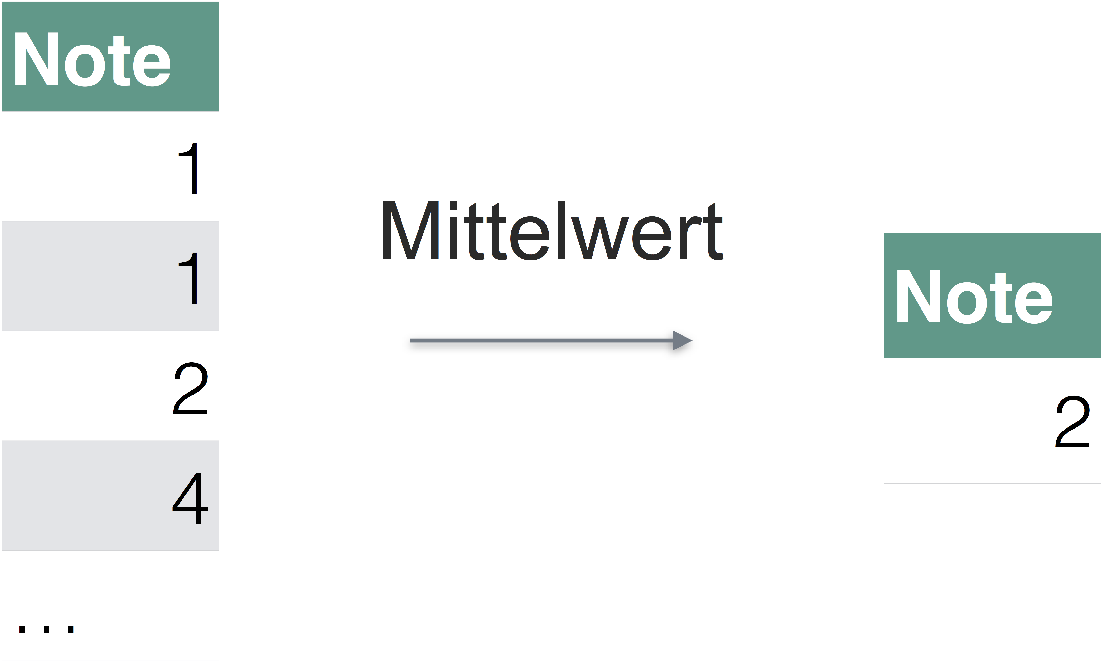
Zeilenmittelwerte bilden
Bei Umfragen kommt es häufig vor, dass man Zeilenmittelwerte bildet. Wieso? Man möchte z.B. in einer Mitarbeiterbefragung den “Engagementwert” jedes Beschäftigten wissen (klingt einfach gut). Dazu addiert man die Werte jedes passenden Items auf. Diese Summe teilen Sie durch die Anzahl der Spalten
Zeilenmittelwerte bilden Sie am einfachsten in Excel.
In R können Sie Zeilen einfach mit dem + Zeichen addieren:
meine_tabelle$zeilenmittelwert <- (meine_tabelle$item1 + meine Tabelle$item2) / 2
Schritt 3: Visualisieren
Ein Bild sagt bekanntlich mehr als 1000 Worte. Betrachten Sie dazu “Anscombes Quartett”:
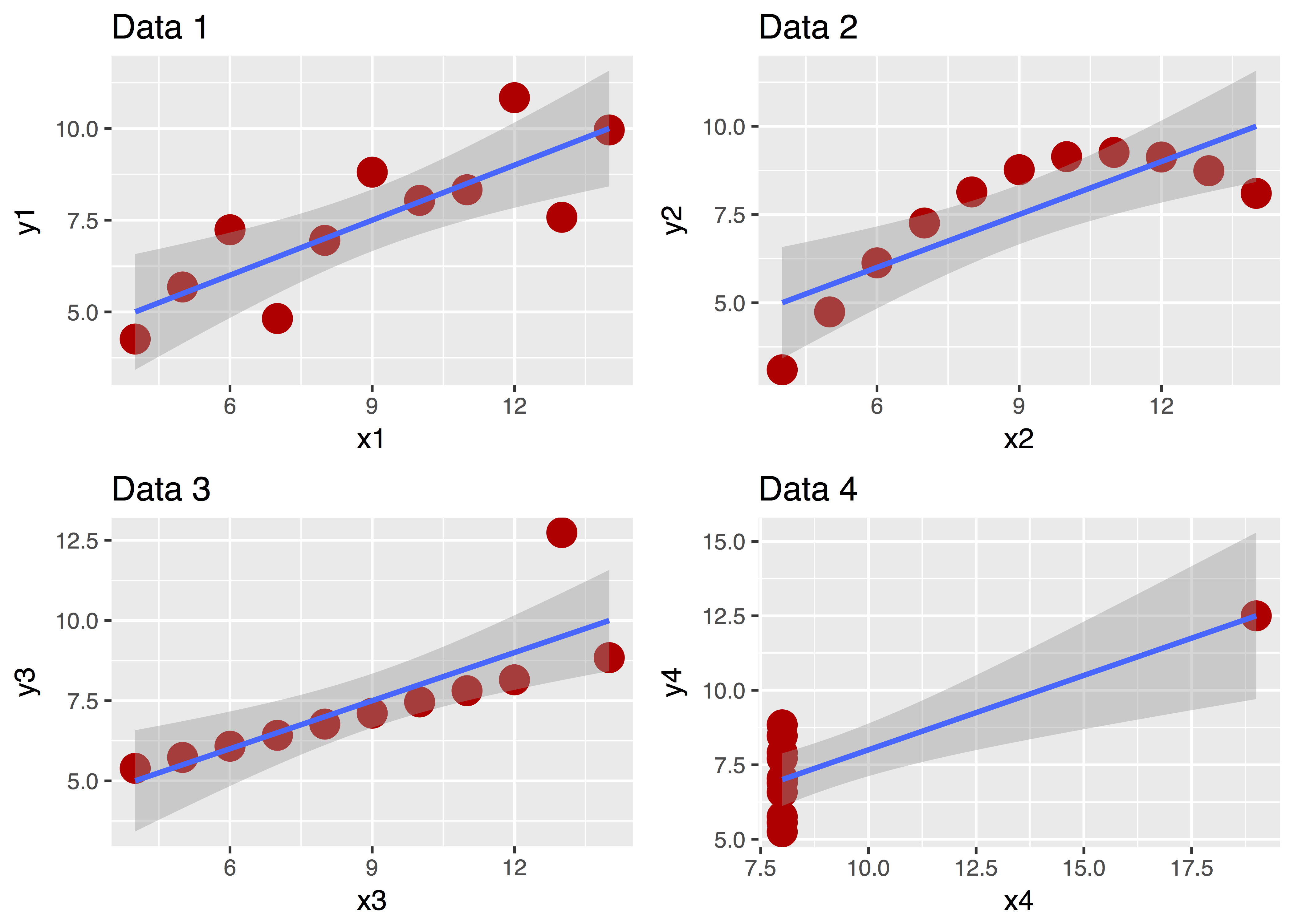
Diese vier Datensätze sehen ganz unterschiedlich aus, nicht wahr? Aber ihre zentralen deskriptiven Statistiken sind praktisch gleich! Ohne Diagramm wäre uns diese Unterschiedlichkeit nicht (so leicht) aufgefallen!
Zur Visualisierung empfehle ich das R-Paket ggplot2. Es wird mit geladen, wenn Sie tidyverse laden.
Es gib einen recht einfachen Befehl in diesem Paket, qplot. Bei qplot geben Sie folgende Parameter an:
- X-Achse (
x): Welche Variable (Spalte in ihrer Tabelle) soll auf der X-Achse stehen?
- Y-Achse (
y): Welche Variable (Spalte in ihrer Tabelle) soll auf der Y-Achse stehen?
- Daten (
data): Wie heißt ihre Datentabelle?
- Geom (
geom): Welche Art von Bildchen wollen Sie malen (z.B. Punkte, Boxplots, Linien, Histogramm…)`
Darüber hinaus verkrafter der Befehl noch viele andere Schnörkel, die wir uns hier sparen. Interessierte können googeln… Es ist ein sehr mächtiger Befehl, der sehr ansprechende Diagramme erzeugen kann.
Probieren wir’s!
qplot(x = hp,
      y = mpg,
      geom = "point",
      data = mtcars)

Easy, oder?
Ein anderes Geom:
qplot(x = factor(cyl),
      y = mpg,
      data = mtcars,
      geom = "boxplot")

Beachten Sie, dass qplot nur dann mehrere Boxplots zeichnet, wenn auf der X-Achse eine nominal skalierte Variable steht.
Eine metrische Variable wandeln Sie in eine nominal skalierte Variable um mit dem Befehl factor(meine_metrische_variable).
Oder mal nur eine Variable:
qplot(x = hp,
      data = mtcars,
      geom = "histogram")

Geben wir keine Y-Variable an, nimmt qplot eigenständig die Häufigkeit pro X-Wert!
Tauschen Sie mal “histogram” mit “density”!
Schritt 4: Modellieren
Modellieren hört sich kompliziert an. Für uns hier heißt es vor allem ein inferenzstatistisches Verfahren anzuwenden.
Das Schweizer Taschenmesser und den Modellierungsverfahren ist die Regressionsanalyse. Man kann sie für viele Zwecke einsetzen.
Wann welchen Test?
Es gibt in vielen Lehrbüchern Übersichten zur Frage, wann man welchen Test rechnen soll. Googeln hilft hier auch weiter. Eine Übersicht findet man hier: http://www.methodenberatung.uzh.ch/de/datenanalyse.html.
Wie heißt der jeweilige R-Befehl?
Wenn man diese Befehle nicht häufig verwendet, ist es schwierig, sie auswändig zu wissen. Googeln Sie. Eine gute Übersicht findet sich hier: http://r-statistics.co/Statistical-Tests-in-R.html.
Regression
Weil die Regression so praktisch ist, hier ein Beispiel.
lm(mpg ~ cyl, data = mtcars)
##
## Call:
## lm(formula = mpg ~ cyl, data = mtcars)
##
## Coefficients:
## (Intercept)          cyl
##      37.885       -2.876
lm heißt “lineares Modell” - weil man bei der (normalen) Regression eine Gerade in die Punktewolke der Daten legt, um den Trend zu abzuschätzen. Als nächstes gibt man die “Ziel-Variable” (Output) an, hier mpg. Dann kommt ein Kringel ~ gefolgt von einer (mehr) Input-Variablen (Prädiktoren, UVs). Schließnoch muss noch die Datentabelle erwähnt werden.
Das Ergbebnis sagt uns, dass pro Zylinder die Variable mpg um knapp 3 Punkte sinkt. Also: Hat die Karre einen Zylinder mehr, so kann man pro Galone Sprit 3 Meilen weniger fahren. Immer im Schnitt, versteht sich. (Und wenn die Voraussetzungen erfüllt sind, aber darum kümmern wir uns jetzt nicht.)
Allgemein:
lm(output ~ input, data = meine_daten)
Easy, oder?
Man kann auch mehrere Prädiktoren anführen:
lm(mpg ~ cyl + hp, data = mtcars)
##
## Call:
## lm(formula = mpg ~ cyl + hp, data = mtcars)
##
## Coefficients:
## (Intercept)          cyl           hp
##    36.90833     -2.26469     -0.01912
Dazu werden die durch + getrennt. Die Ergebnisse zeigen uns, dass die PS-Zahl (´hp´) kaum Einfluss auf den Spritverbrauch haut. Genauer: Kaum zusätzlichen Einfluss auf den Spritverbrauch hat. Also Einfluss, der über den Einfluss hinausgeht, der schon durch die Anzahl der Zylinder erklärt werden würde. Es ist also praktisch wurscht, wie viel PS das Auto hat, wenn man den Verbrauch schätzen will - Hauptsache, man weiß die Anzahl der Zylinder.
Vorhersagen
Man kann die Regression nutzen, um Vorhersagen zu treffen. Sagen wir, unser neuer Lamborghini hat 400 PS und 12 Zylinder. Wie groß ist wohl der Spritverbrauch laut unserem Regressionsmodell?
Als Vorbereitung speichern wir unser Regressionsmodell in einer eigenen Variablen:
mein_lm <- lm(mpg ~ cyl + hp, data = mtcars)
Dazu nimmt man am besten den Befehl predict, weil wir wollen eine Vorhersage treffen:
predict(mein_lm, data.frame(cyl = 12, hp = 400))
Aha. Pro Gallone kämmen wir 2 Meilen. Schluckspecht.
Visualisierung des Modells
Schauen wir uns das Modell mal an, damit es nicht so theoretisch ist. Wie gesagt, ein Regressionsmodell ist nichts anderes als eine Trendgerade in einer Punktewolke.
Gerade sind durch Achsenabschnitt (engl. “intercept”) f(x=0) und Steigung (englisch: “slope”) definiert. Der Steigungswert ist die Zahl, die der lm-Befehl für den Prädiktor ausspuckt
qplot(x = cyl,
      y = mpg,
      data = mtcars,
      geom = "point") +
  geom_abline(slope = -2.9, intercept = 38)

Schritt 5: Kommunizieren
Kommunizieren soll sagen, dass Sie Ihre Ergebnisse anderen mitteilen - als Student heißt das häufig in Form einer Seminararbeit an den Dozenten.
Einige Hinweise:
- Geben Sie nicht alle Ergebnisse heraus. Ihre Fehler müssen niemanden interessieren.
- Die wesentlichen Ergebnisse kommen in den Hauptteil der Arbeit. Interessante Details in den Anhang.
- Der Mensch ist ein Augentier. Ihr Gutachter auch. Achten Sie auf optisch ansprechende Darstellung; schöne Diagramme helfen.
- Dozenten achten gerne auf formale Korrektheit. Das Gute ist, dass dies relativ einfach sicherzustellen ist, da auf starren Regeln basierend.
Tabellen und Diagramme
Daten kommunizieren heißt praktisch zumeist, Tabellen oder Diagramme zu erstellen. Meist gibt es dazu Richtlinien von Seiten irgendeiner (selbsterannten) Autorität wie Dozenten oder Fachgesellschaften. Zum Beispiel hat die APA ein umfangreiches Manual zum Thema Manuskripterstellung publiziert; die deutsche Fachgesellschaft der Psychologie entsprechend. Googeln Sie mal, wie in ihren Richtlinien Tabellen und Diagramme zu erstellen sind (oder fragen Sie Ihren Gutachter).
Für Fortgeschrittene: RMarkdown
Wäre das nicht cool: Jegliches Formatieren wird automatisch übernommen und sogar so, das ses schick aussieht? Außerdem wird Ihr R-Code und dessen Ergebnisse (Tabellen und Diagramme oder reine Zahlen) automatisch in Ihr Dokument übernommen. Keine Copy-Paste-Fehler mehr. Keine händisches Aktualisieren, weil Sie Daten oder die vorhergehende Analyse geändert haben. Hört sich gut an? Probieren Sie mal RMarkdown aus :one_up:.
Fazit
Glück auf 
Hier finden Sie einen Überblick an einige “Lieblings-R-Befehle”.