knitr::opts_chunk$set(fig.align = "center",
                      out.width = "70%",
                      fig.asp = .61)
Every now and then, random numbers come in handy to demonstrate some statistical behavior. Of course, well-known appraoches are rnorm and friends. These functions are what is called pseudo random number generators, because they are not random at all, strictly speaking, but determined by some algorithm. An algorithm is a sort of creature that is 100% predictable once you know the input (and the details of the algorithm). Pseudo random numbers are useful ‘cause you know what you will get; reproducibility ensured.
However, at times it is useful to get make use of true random numbers, coming from atmospheric noise, for example. That’s were the R package random by Dirk Eddelbuettel comes into play.
Technical details are beyond the scope of this post; here we just grap some random numbers to simulate or demonstrate some research setting.
For that end, suppose we conducted an experiment with three groups. Our hypothesis was that stories plus images of persons in despair will induce more pro social behavior (ie. amount of donation) compared to presenting stats about suffering people.
Say we came up with three experimental groups:
- Statistics only (“100,000 are at the brink of famine”)
- Story plus image of child (“Rodia from Sudan has not eaten since a week”. Picture added.)
- Combination of 1. and 2.
The basis of this experiment is from this paper:
Slovic, P. (2007). If I look at the mass I will never act: Psychic numbing and genocide. Judgment and Decision Making, 2(2), 79–95. https://doi.org/10.1007/978-90-481-8647-1
For a presentation, I wanted to demonstrate simulated data.
That’s what I did:
First, load some packages.
library(tidyverse)
library(random)
Next, simulate true random data.
Note that the data is uniformally distributed, more or less.
raw <- random::randomNumbers(n = 150, min = 1, max = 10, col = 3) %>%
  as_tibble
Then, we tidy up the dataframe:
df <- raw %>%
  mutate(V2 = V2 + 5,
         V3 = V3 + 10) %>%
  gather %>%
  mutate(group = recode(key,
                        V1 = "stat",
                        V2 = "stat+img",
                        V3 = "img"))
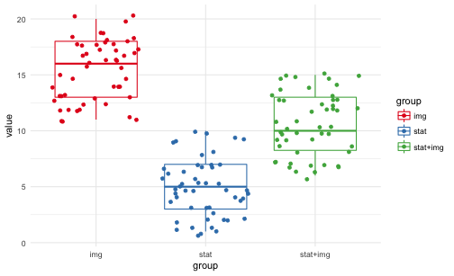
… and plot it:
ggplot(df) +
  aes(x = group, y = value, color = group) +
  geom_boxplot() +
  geom_jitter() +
  theme_minimal() +
  scale_color_brewer(palette = "Set1")

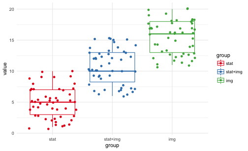
In order sort the groups to our desire, we can make use of factors.
df$group <- factor(df$group, levels = c("stat", "stat+img", "img"))
And plot again, now with groups sorted:
ggplot(df) +
  aes(x = group, y = value, color = group) +
  geom_boxplot() +
  geom_jitter() +
  theme_minimal() +
  scale_color_brewer(palette = "Set1")
