t-Test on multiple columns

Suppose you have a data set where you want to perform a t-Test on multiple columns with some grouping variable. As an example, say you a data frame where each column depicts the score on some test (1st, 2nd, 3rd assignment…). In each row is a different student. So you glance at the grading list (OMG!) of a teacher!

How to do do that in R? Probably, the most “natural” solution would be some lapply() call.

But I like dplyr (see intro here); so, is there some nice way to perform that with dplyr? The short answer is: no. dplyr basically wants to deliver back a data frame, and the t-test does not output a single value, so you cannot use the t-test (right away) for dplyr’s summarise. One way out is using list-columns… Let’s see.

Load some dplyr, tidyr and some data:

library(dplyr)
library(tidyr)
data(tips, package = "reshape2")
glimpse(tips)
## Observations: 244
## Variables: 7
## $ total_bill <dbl> 16.99, 10.34, 21.01, 23.68, 24.59, 25.29, 8.77, 26....
## $ tip        <dbl> 1.01, 1.66, 3.50, 3.31, 3.61, 4.71, 2.00, 3.12, 1.9...
## $ sex        <fctr> Female, Male, Male, Male, Female, Male, Male, Male...
## $ smoker     <fctr> No, No, No, No, No, No, No, No, No, No, No, No, No...
## $ day        <fctr> Sun, Sun, Sun, Sun, Sun, Sun, Sun, Sun, Sun, Sun, ...
## $ time       <fctr> Dinner, Dinner, Dinner, Dinner, Dinner, Dinner, Di...
## $ size       <int> 2, 3, 3, 2, 4, 4, 2, 4, 2, 2, 2, 4, 2, 4, 2, 2, 3, ...

Well, it looks crude, but that’s a way:

tips %>% 
  select(tip, total_bill, sex) %>% 
  gather(key = variable, value = value, -sex) %>% 
  group_by(sex, variable) %>% 
  summarise(value = list(value)) %>% 
  spread(sex, value) %>% 
  group_by(variable) %>% 
  mutate(p_value = t.test(unlist(Female), unlist(Male))$p.value,
         t_value = t.test(unlist(Female), unlist(Male))$statistic)
## Source: local data frame [2 x 5]
## Groups: variable [2]
## 
##     variable     Female        Male    p_value   t_value
##        <chr>     <list>      <list>      <dbl>     <dbl>
## 1        tip <dbl [87]> <dbl [157]> 0.13780684 -1.489536
## 2 total_bill <dbl [87]> <dbl [157]> 0.01857339 -2.373398

Let’s go through this code step by step. First, this bit

tips %>% 
  select(tip, total_bill, sex) %>% head
##    tip total_bill    sex
## 1 1.01      16.99 Female
## 2 1.66      10.34   Male
## 3 3.50      21.01   Male
## 4 3.31      23.68   Male
## 5 3.61      24.59 Female
## 6 4.71      25.29   Male

is used to select the columns we want to perform the t-Test on (here: tip and total_bill) plus the grouping variable (sex).

Then by the next bit

tips %>% 
  select(tip, total_bill, sex) %>% 
  gather(key = variable, value = value, -sex) %>% head
##      sex variable value
## 1 Female      tip  1.01
## 2   Male      tip  1.66
## 3   Male      tip  3.50
## 4   Male      tip  3.31
## 5 Female      tip  3.61
## 6   Male      tip  4.71

we “melt” the data frame down, so that all numeric variables are put in one column (underneath each other).

tips %>% 
  select(tip, total_bill, sex) %>% 
  gather(key = variable, value = value, -sex) %>% 
  group_by(sex, variable) %>% 
  summarise(value = list(value)) 
## Source: local data frame [4 x 3]
## Groups: sex [?]
## 
##      sex   variable       value
##   <fctr>      <chr>      <list>
## 1 Female        tip  <dbl [87]>
## 2 Female total_bill  <dbl [87]>
## 3   Male        tip <dbl [157]>
## 4   Male total_bill <dbl [157]>

Now it get’s interesting. We put all the values per group (e.g., male-tip or female-total_bill…) in one cell. Yes, that’s right. In each cell of column value there is now a list (a bunch) of values. That’s what is called a “list-column”. We will now use this list column for the t-test.

tips %>% 
  select(tip, total_bill, sex) %>% 
  gather(key = variable, value = value, -sex) %>% 
  group_by(sex, variable) %>% 
  summarise(value = list(value)) %>% 
  spread(sex, value) %>% 
  group_by(variable) 
## Source: local data frame [2 x 3]
## Groups: variable [2]
## 
##     variable     Female        Male
## *      <chr>     <list>      <list>
## 1        tip <dbl [87]> <dbl [157]>
## 2 total_bill <dbl [87]> <dbl [157]>

But before we do the t-Test, we “spread” the data frame. That is, we convert from “long” to “wide” format. Next, we group for variable. That means in practice, that the following t-test will be applied to each member of this group (ie., each variable, here tip and total_bill).

And now the t-Test:

tips %>% 
  select(tip, total_bill, sex) %>% 
  gather(key = variable, value = value, -sex) %>% 
  group_by(sex, variable) %>% 
  summarise(value = list(value)) %>% 
  spread(sex, value) %>% 
  group_by(variable) %>% 
  mutate(p_value = t.test(unlist(Female), unlist(Male))$p.value,
         t_value = t.test(unlist(Female), unlist(Male))$statistic)
## Source: local data frame [2 x 5]
## Groups: variable [2]
## 
##     variable     Female        Male    p_value   t_value
##        <chr>     <list>      <list>      <dbl>     <dbl>
## 1        tip <dbl [87]> <dbl [157]> 0.13780684 -1.489536
## 2 total_bill <dbl [87]> <dbl [157]> 0.01857339 -2.373398

That’s it.

You can have it very simple

That was quite cumbersome for something which could have been achieved very simple with

t.test(tip ~ sex, data = tips)$p.value
## [1] 0.1378068
t.test(total_bill ~ sex, data = tips)$p.value
## [1] 0.01857339

So our way (OK, my way) does not seem advisable. However, it may has been instructive for the “thinking” of dplyr.

By the way, another simpler approach with dplyr could have been:

tips %>%
    summarise_each(funs(t.test(.[sex == "Female"], .[sex == "Male"])$p.value), vars = total_bill:tip)
##        vars1     vars2
## 1 0.01857339 0.1378068

Acknowledgment

This post was inspired by this post on Stack Overflow, and also by this one.

What is measurement? Why should I care?

Measurement is a basis of an empirical science. Image a geometer (a person measuring distances on the earth) with a metering rul made of rubber! Poor guy! Without proper measurement, even the smartest theory cannot be expected to be found, precisely because it cannot be measured.

So, what exactly is measurement? Measurement can be seen as tying numbers to empirical objects. But not in some arbritrary style. Measurement is achieved, if and only if the relations found in the empirical objects do also hold in the numbers. What does that mean? Suppose you have three rods: A, B and C. You hold them next to each other and find that A is longer than B and B longer than C. So you are entitled to give whatever numbers to the rods as long as the number of rod A is greater than the number of rod B, which in turn must be greater than the number assigned to rod C; in short: l(A) > l(B) > l(C), where l is the length of the rod. It goes without saying that if l(A) > l(B), and l(B) > l(C), then it must hold that l(A) > l(C) (transitivity). Given these relations hold for all objects, we have achieved something like an ordinal scale.

To establish a quantitative variable, we need to find additive relations. For example, suppose the length of A equals the length of B and C, concatenated next to each other; more formally l(A) = l(B) #+# l(C), where #+# means “concatenated next to each other”. So, if the rods add up, the numbers should, too. You are free to assign any numbers to the lengths of the rods, as long as the numbers add up (and satisfy order). Now we have established a quantitative measurement.

This is very straight forward, an easy process. This idea or method for checking whether a variable can be deemed quantitative has been dubbed extensive measurement. Note that even length is the typical example, there are things in physics which cannot be measured this way (e.g., temperature).

For psychology and related fields, the situation is even worse. How can I say, hey, intelligence of person A concatenated to intelligence of B equals intelligence of person C? Hardly possible. We need to find some other way.

Note that it is no automatism that a variable is quantitative, not even ordinal structures can be taken for granted. Take beauty as an example. Can beauty be measured at ordinal level? Is it even quantitative? What happens if I prefer Anna over Berta, and Berta over Carla, but then insist that Carla is prettier than Anna!? (Thereby violating transitivity)

A maybe more familiar example for psychologists are Likert scales (“I fully agree … I do not agree at all”). Normally, they are bona fide taken as quantitative. For simplicity, let’s focus on dichotomous items (two answer options). If I answer in the affirmative to item A, but not B, and you do it the other way round (say no to B, but yes to A) – should our latent score be considered equal? If I “solve” two items, you “solve” one, is my latent score than higher than yours (“solving” means here agreeing to)? Not necessarily. It need be tested before we can confidently assert so. Such questions deal with the ordinal structure of the variable.

The quantitative level is even more intricate. For interval level we need to be able to say that the differences sum up, as we have seen above for length measurement. Is the difference (in extraversion, say) between individuals A and B plus the difference between C and D equal the difference between E and F? This is not easy to investigate. However, in the 1960, two researchers come up with a theory to deal with this problem: the theory of conjoint measurement.

Let’s get purrr. Recently, I ran across this issue: A data frame with many columns; I wanted to select all numeric columns and submit them to a t-test with some grouping variables.

As this is a quite common task, and the purrr-approach (package purrr by @HadleyWickham) is quite elegant, I present the approach in this post.

Let’s load the data, the Affairs data set, and some packages:

data(Affairs, package = "AER")
library(purrr)  # functional programming
library(dplyr)  # dataframe wrangling
library(ggplot2)  # plotting
library(tidyr)  # reshaping df

Don’t forget that the four packages need to be installed in the first place.

So, now let’s select all numeric variables from the data set. dplyr and purrr provide functions for that purpose, very convenient:

Affairs %>% 
select_if(is.numeric) %>% head
##    affairs age yearsmarried religiousness education occupation rating
## 4        0  37        10.00             3        18          7      4
## 5        0  27         4.00             4        14          6      4
## 11       0  32        15.00             1        12          1      4
## 16       0  57        15.00             5        18          6      5
## 23       0  22         0.75             2        17          6      3
## 29       0  32         1.50             2        17          5      5

In the next step, we “map” each of these columns to a function, here the t-test.

Affairs %>% 
  select_if(is.numeric) %>%
  map(~t.test(. ~ Affairs$gender)$p.value)
## $affairs
## [1] 0.7739606
## 
## $age
## [1] 2.848452e-06
## 
## $yearsmarried
## [1] 0.458246
## 
## $religiousness
## [1] 0.8513998
## 
## $education
## [1] 9.772643e-24
## 
## $occupation
## [1] 8.887471e-35
## 
## $rating
## [1] 0.8533625

the map function may look obscure if you have not seen it before. As said, the map function maps each column to the function you mention. The ~t.test() bit means that you define an anonymous function, just as you would for normal apply calls, for example. So equivalently, one could write:

Affairs %>% 
  select_if(is.numeric) %>%
  #map(~t.test(. ~ Affairs$gender)$p.value) %>% 
  map(function(x) t.test(x ~ Affairs$gender)$p.value)
## $affairs
## [1] 0.7739606
## 
## $age
## [1] 2.848452e-06
## 
## $yearsmarried
## [1] 0.458246
## 
## $religiousness
## [1] 0.8513998
## 
## $education
## [1] 9.772643e-24
## 
## $occupation
## [1] 8.887471e-35
## 
## $rating
## [1] 0.8533625

The ~ is just a convenient short hand for the normal way of writing anonymous functions. And the dot . is then again a shorthand for the column that is handed through the function (just as xin the normal apply call).

Well, that’s basically it! The $p.value bit just extracts the p-value statistic out of the t-test object.

The more familiar, lapply approach would be something like:

lapply(Affairs[c("affairs", "age", "yearsmarried")], function(x) t.test(x ~ Affairs$gender))
## $affairs
## 
## 	Welch Two Sample t-test
## 
## data:  x by Affairs$gender
## t = -0.28733, df = 594.01, p-value = 0.774
## alternative hypothesis: true difference in means is not equal to 0
## 95 percent confidence interval:
##  -0.6068861  0.4519744
## sample estimates:
## mean in group female   mean in group male 
##             1.419048             1.496503 
## 
## 
## $age
## 
## 	Welch Two Sample t-test
## 
## data:  x by Affairs$gender
## t = -4.7285, df = 575.26, p-value = 2.848e-06
## alternative hypothesis: true difference in means is not equal to 0
## 95 percent confidence interval:
##  -5.014417 -2.071219
## sample estimates:
## mean in group female   mean in group male 
##             30.80159             34.34441 
## 
## 
## $yearsmarried
## 
## 	Welch Two Sample t-test
## 
## data:  x by Affairs$gender
## t = -0.74222, df = 595.53, p-value = 0.4582
## alternative hypothesis: true difference in means is not equal to 0
## 95 percent confidence interval:
##  -1.2306829  0.5556058
## sample estimates:
## mean in group female   mean in group male 
##             8.017070             8.354608

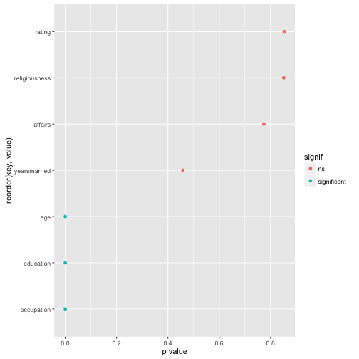
Now, finally, let’s plot the result for easier comprehension. Some minor wrangling of the data is necessary:

Affairs %>% 
  select_if(is.numeric) %>%
  #na.omit() %>% 
  map(~t.test(. ~ Affairs$gender)$p.value) %>% 
  as.data.frame %>% 
  gather %>% 
  mutate(signif = ifelse(value < .05, "significant", "ns")) %>% 
  ggplot(aes(x = reorder(key, value), y = value)) + 
  geom_point(aes(color = signif)) + 
  coord_flip() +
  ylab("p value")

output

reading time: 10 min.

Pearson’s correlation (short: correlation) is one of statistics’ all time classics. With an age of about a century, it is some kind of grand dad of analytic tools – but an oldie who is still very busy!

Formula, interpretation and application of correlation is well known.

In some non-technical lay terms, correlation captures the (linear) degree of co-variation of two linear variables. For example: if tall people have large feet (and small people small feet), on average, we say that height and foot size are correlated.

But what is maybe less well known is some intuitive understanding of correlation. That’s the plan of this post.

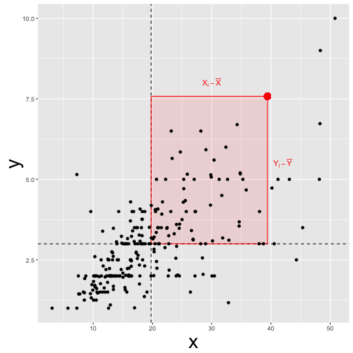
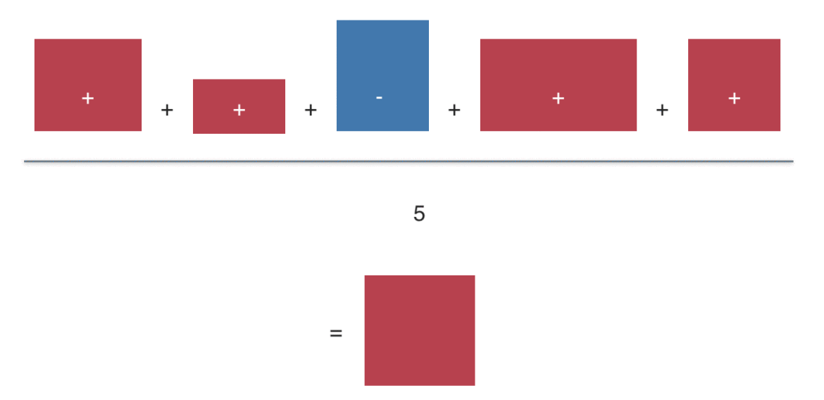
Roughly, correlation can be seen as the average deviation rectangle:

library(ggplot2)
data(tips, package = "reshape2")

(ggplot(tips) + 
 geom_hline(yintercept = mean(tips$tip), linetype = "dashed") + 
 geom_vline(xintercept = mean(tips$total_bill), linetype = "dashed") +
 annotate("rect",xmin = mean(tips$total_bill), ymin = mean(tips$tip),
 xmax = tips$total_bill[24], ymax = tips$tip[24], alpha = .1,
 color = "red", fill = "red") +
 annotate("text", x = 30, y = 8, 
 label = "X[i] - bar(X)", parse = T, colour = "Red") +
 annotate("text", x = 42, y = 5.5, 
 label = "Y[i] - bar(Y)", parse = T, colour = "Red") +
 geom_point(aes(x = total_bill, y = tip)) +
 geom_point(x = tips$total_bill[24], y = tips$tip[24], color = "red", 
 alpha = .1, size = 4) +
 theme(axis.title=element_text(size=28),
 plot.title = element_text(size = rel(4))))

“Deviation” means here distance from the mean. For example, if my height is 1.95 meters, and the mean height is 1.80 meters my “deviation” or “delta” \(\Delta X=X_i - \bar{X}\) would be 0.15 meters.

A bit more formally, this mean average deviation is \(\varnothing (\Delta X \cdot \Delta Y\)) , where \(\varnothing X\) means “mean of X” or “average X”.

This measure of “joint deviation” or let’s say coordinated deviation is called covariance as it measures the degree to which large deltas in X go together with large deltas in Y.

Looking at a more official formula we find:

\(Cov(X,Y) = \frac{1}{n} \sum{(X_i - \bar{X}) \cdot (Y_i - \bar{Y})} = \varnothing(\Delta X \Delta Y)\).

Now, let’s do the same calculation not with the normal, raw data (such as my height of 1.95 meters) but use z-standardized values instead.

Computing the “average deviation rectangle” with z-values (instead of raw values) yields the correlation or Person’s correlation coefficient:

\(Cor(X,Y) = \varnothing((z_{X_i} - z_{\bar{X}}) \cdot (z_{Y_i} - z_{\bar{Y}}))= \varnothing(z_{X_i} - 0) \cdot (z_{Y_i} - 0) = \varnothing(z_X z_Y)\).

In words, the correlation (Cor) of X and Y is the mean z deviation rectangle.

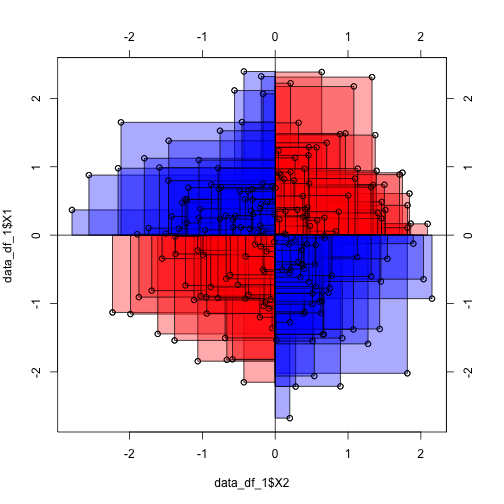
Wait a minute! Does that mean that if correlation is zero, than the mean deviation rectangle equals zero? Yes, thats true! How can that be? Let’s visualize:

library(TeachingDemos)
library('MASS')
## 
## Attaching package: 'MASS'
## The following object is masked from 'package:dplyr':
## 
##     select
samples = 200

data_1 = mvrnorm(n=samples, mu=c(0, 0), Sigma=matrix(c(1, 0, 0, 1), nrow=2), empirical=TRUE)

data_df_1 <- data.frame(data_1)

cor.rect.plot(y = data_df_1$X1, x = data_df_1$X2)

We see that the average red rectangle appears roughly the average blue rectangle. Now, the red rectangle have a positive sign (+), whereas the blue ones have a negative sign.

This is because in the upper right corner, both X and Y delta is positive (my height and my foot size is above average), yielding a positive product value (eg., +10 * +3 = +30). Similarly, in the lower left (red) corner, both deltas are negative (values below average), yielding a positive product (eg., -10 * -3 = -30).

In the “blue corners” (upper left, lower right), one delta has a negative sign and one delta has a positive sign, yielding a negative sign for their product (e.g, -10 * + 3 = -30).

Hence, some rectangles have a positive value, some a negative. In sum, the average rectangle is zero. Zero mean rectangle means zero correlation.

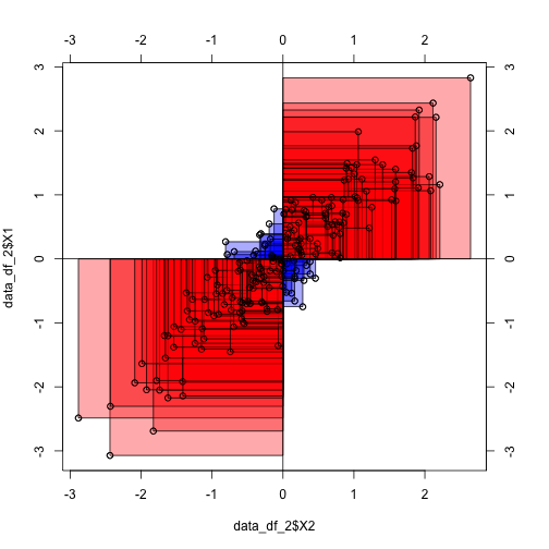
To the contrary, in the following diagram we see that the average rectangle is positive and quite large (as their are only few blue ones):

library(TeachingDemos)
library('MASS')


data_2 = mvrnorm(n=samples, mu=c(0, 0), Sigma=matrix(c(1, .9, .9, 1), nrow=2), empirical=TRUE)

data_df_2 <- data.frame(data_2)


cor.rect.plot(y = data_df_2$X1, x = data_df_2$X2)

The “averaging rectangles process” can be visualized like this:

Sum up the value (area) of the deviation rectangles. Then divide by the number of rectangles to get the average rectangle (or average value). This value is the covariance (if you started with raw values). Or the correlation, if you started with z-values.

For more in depth voyage, have a look at the paper where 13 ways to look at the correlation coefficient are discussed.

What is “data cleansing” about?

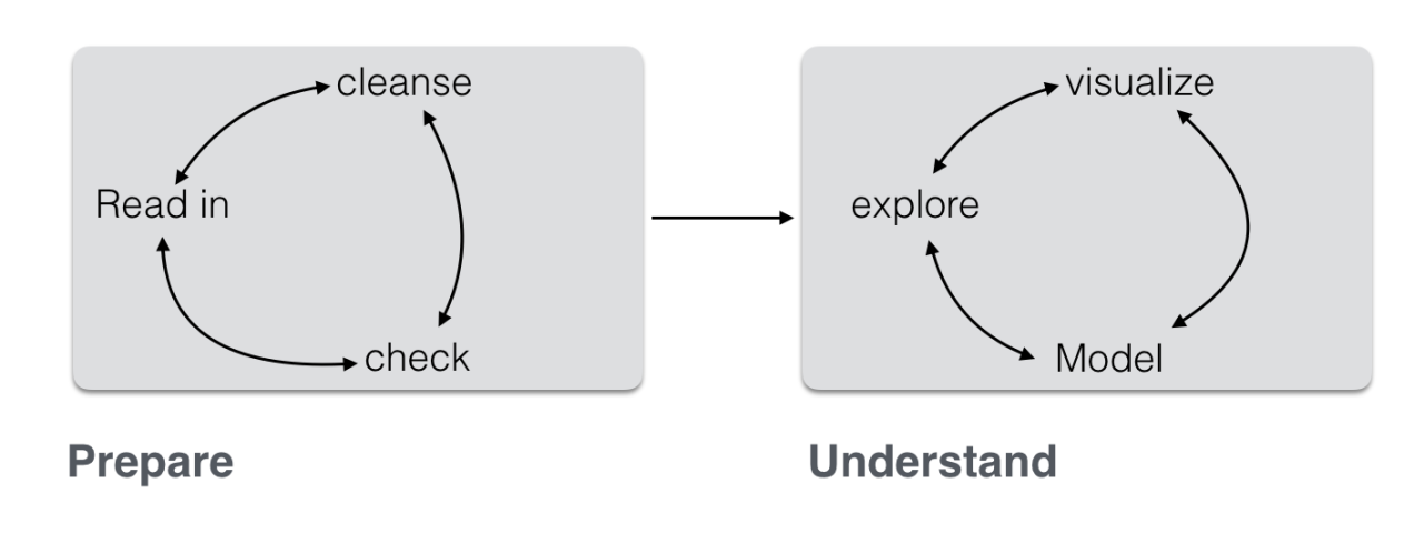
Data analysis, in practice, consists typically of some different steps which can be subsumed as “preparing data” and “model data” (not considering communication here):

(Inspired by this)

Often, the first major part — “prepare” — is the most time consuming. This can be lamented since many analysts prefer the cool modeling aspects (since I want to show my math!). In practice, one rather has to get his (her) hands dirt…

In this post, I want to put together some kind of checklist of frequent steps in data preparation. More precisely, I would like to detail some typical steps in “cleansing” your data. Such steps include:

  • identify missings
  • identify outliers
  • check for overall plausibility and errors (e.g, typos)
  • identify highly correlated variables
  • identify variables with (nearly) no variance
  • identify variables with strange names or values
  • check variable classes (eg. characters vs factors)
  • remove/transform some variables (maybe your model does not like categorial variables)
  • rename some variables or values (especially interesting if large number)
  • check some overall pattern (statistical/ numerical summaries)
  • center/scale variables

You can read the full post including source code here (Github). Here is an output file (html).

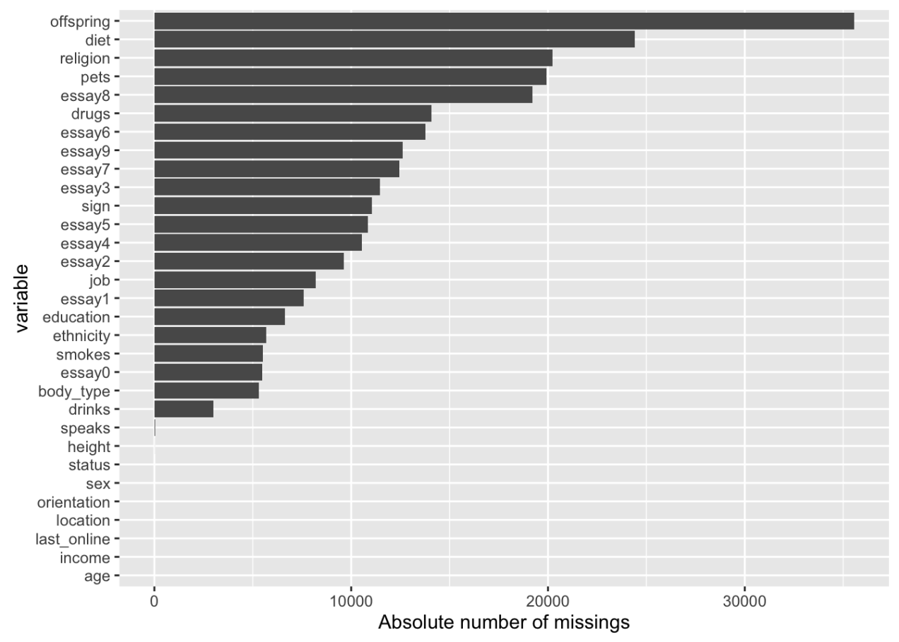
Example: Analyse missing values