Let’s get purrr. Recently, I ran across this issue: A data frame with many columns; I wanted to select all numeric columns and submit them to a t-test with some grouping variables.

As this is a quite common task, and the purrr-approach (package purrr by @HadleyWickham) is quite elegant, I present the approach in this post.

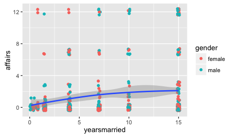
Let’s load the data, the Affairs data set, and some packages:

data(Affairs, package = "AER")
library(purrr)  # functional programming
library(dplyr)  # dataframe wrangling
library(ggplot2)  # plotting
library(tidyr)  # reshaping df

Don’t forget that the four packages need to be installed in the first place.

So, now let’s select all numeric variables from the data set. dplyr and purrr provide functions for that purpose, very convenient:

Affairs %>% 
select_if(is.numeric) %>% head
##    affairs age yearsmarried religiousness education occupation rating
## 4        0  37        10.00             3        18          7      4
## 5        0  27         4.00             4        14          6      4
## 11       0  32        15.00             1        12          1      4
## 16       0  57        15.00             5        18          6      5
## 23       0  22         0.75             2        17          6      3
## 29       0  32         1.50             2        17          5      5

In the next step, we “map” each of these columns to a function, here the t-test.

Affairs %>% 
  select_if(is.numeric) %>%
  map(~t.test(. ~ Affairs$gender)$p.value)
## $affairs
## [1] 0.7739606
## 
## $age
## [1] 2.848452e-06
## 
## $yearsmarried
## [1] 0.458246
## 
## $religiousness
## [1] 0.8513998
## 
## $education
## [1] 9.772643e-24
## 
## $occupation
## [1] 8.887471e-35
## 
## $rating
## [1] 0.8533625

the map function may look obscure if you have not seen it before. As said, the map function maps each column to the function you mention. The ~t.test() bit means that you define an anonymous function, just as you would for normal apply calls, for example. So equivalently, one could write:

Affairs %>% 
  select_if(is.numeric) %>%
  #map(~t.test(. ~ Affairs$gender)$p.value) %>% 
  map(function(x) t.test(x ~ Affairs$gender)$p.value)
## $affairs
## [1] 0.7739606
## 
## $age
## [1] 2.848452e-06
## 
## $yearsmarried
## [1] 0.458246
## 
## $religiousness
## [1] 0.8513998
## 
## $education
## [1] 9.772643e-24
## 
## $occupation
## [1] 8.887471e-35
## 
## $rating
## [1] 0.8533625

The ~ is just a convenient short hand for the normal way of writing anonymous functions. And the dot . is then again a shorthand for the column that is handed through the function (just as xin the normal apply call).

Well, that’s basically it! The $p.value bit just extracts the p-value statistic out of the t-test object.

The more familiar, lapply approach would be something like:

lapply(Affairs[c("affairs", "age", "yearsmarried")], function(x) t.test(x ~ Affairs$gender))
## $affairs
## 
## 	Welch Two Sample t-test
## 
## data:  x by Affairs$gender
## t = -0.28733, df = 594.01, p-value = 0.774
## alternative hypothesis: true difference in means is not equal to 0
## 95 percent confidence interval:
##  -0.6068861  0.4519744
## sample estimates:
## mean in group female   mean in group male 
##             1.419048             1.496503 
## 
## 
## $age
## 
## 	Welch Two Sample t-test
## 
## data:  x by Affairs$gender
## t = -4.7285, df = 575.26, p-value = 2.848e-06
## alternative hypothesis: true difference in means is not equal to 0
## 95 percent confidence interval:
##  -5.014417 -2.071219
## sample estimates:
## mean in group female   mean in group male 
##             30.80159             34.34441 
## 
## 
## $yearsmarried
## 
## 	Welch Two Sample t-test
## 
## data:  x by Affairs$gender
## t = -0.74222, df = 595.53, p-value = 0.4582
## alternative hypothesis: true difference in means is not equal to 0
## 95 percent confidence interval:
##  -1.2306829  0.5556058
## sample estimates:
## mean in group female   mean in group male 
##             8.017070             8.354608

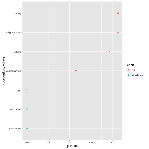
Now, finally, let’s plot the result for easier comprehension. Some minor wrangling of the data is necessary:

Affairs %>% 
  select_if(is.numeric) %>%
  #na.omit() %>% 
  map(~t.test(. ~ Affairs$gender)$p.value) %>% 
  as.data.frame %>% 
  gather %>% 
  mutate(signif = ifelse(value < .05, "significant", "ns")) %>% 
  ggplot(aes(x = reorder(key, value), y = value)) + 
  geom_point(aes(color = signif)) + 
  coord_flip() +
  ylab("p value")

output

reading time: 10 min.

Pearson’s correlation (short: correlation) is one of statistics’ all time classics. With an age of about a century, it is some kind of grand dad of analytic tools – but an oldie who is still very busy!

Formula, interpretation and application of correlation is well known.

In some non-technical lay terms, correlation captures the (linear) degree of co-variation of two linear variables. For example: if tall people have large feet (and small people small feet), on average, we say that height and foot size are correlated.

But what is maybe less well known is some intuitive understanding of correlation. That’s the plan of this post.

Roughly, correlation can be seen as the average deviation rectangle:

library(ggplot2)
data(tips, package = "reshape2")

(ggplot(tips) + 
 geom_hline(yintercept = mean(tips$tip), linetype = "dashed") + 
 geom_vline(xintercept = mean(tips$total_bill), linetype = "dashed") +
 annotate("rect",xmin = mean(tips$total_bill), ymin = mean(tips$tip),
 xmax = tips$total_bill[24], ymax = tips$tip[24], alpha = .1,
 color = "red", fill = "red") +
 annotate("text", x = 30, y = 8, 
 label = "X[i] - bar(X)", parse = T, colour = "Red") +
 annotate("text", x = 42, y = 5.5, 
 label = "Y[i] - bar(Y)", parse = T, colour = "Red") +
 geom_point(aes(x = total_bill, y = tip)) +
 geom_point(x = tips$total_bill[24], y = tips$tip[24], color = "red", 
 alpha = .1, size = 4) +
 theme(axis.title=element_text(size=28),
 plot.title = element_text(size = rel(4))))

“Deviation” means here distance from the mean. For example, if my height is 1.95 meters, and the mean height is 1.80 meters my “deviation” or “delta” would be 0.15 meters.

A bit more formally, this mean average deviation is ) , where means “mean of X” or “average X”.

This measure of “joint deviation” or let’s say coordinated deviation is called covariance as it measures the degree to which large deltas in X go together with large deltas in Y.

Looking at a more official formula we find:

.

Now, let’s do the same calculation not with the normal, raw data (such as my height of 1.95 meters) but use z-standardized values instead.

Computing the “average deviation rectangle” with z-values (instead of raw values) yields the correlation or Person’s correlation coefficient:

.

In words, the correlation (Cor) of X and Y is the mean z deviation rectangle.

Wait a minute! Does that mean that if correlation is zero, than the mean deviation rectangle equals zero? Yes, thats true! How can that be? Let’s visualize:

library(TeachingDemos)
library('MASS')
## 
## Attaching package: 'MASS'
## The following object is masked from 'package:dplyr':
## 
##     select
samples = 200

data_1 = mvrnorm(n=samples, mu=c(0, 0), Sigma=matrix(c(1, 0, 0, 1), nrow=2), empirical=TRUE)

data_df_1 <- data.frame(data_1)

cor.rect.plot(y = data_df_1$X1, x = data_df_1$X2)

We see that the average red rectangle appears roughly the average blue rectangle. Now, the red rectangle have a positive sign (+), whereas the blue ones have a negative sign.

This is because in the upper right corner, both X and Y delta is positive (my height and my foot size is above average), yielding a positive product value (eg., +10 * +3 = +30). Similarly, in the lower left (red) corner, both deltas are negative (values below average), yielding a positive product (eg., -10 * -3 = -30).

In the “blue corners” (upper left, lower right), one delta has a negative sign and one delta has a positive sign, yielding a negative sign for their product (e.g, -10 * + 3 = -30).

Hence, some rectangles have a positive value, some a negative. In sum, the average rectangle is zero. Zero mean rectangle means zero correlation.

To the contrary, in the following diagram we see that the average rectangle is positive and quite large (as their are only few blue ones):

library(TeachingDemos)
library('MASS')


data_2 = mvrnorm(n=samples, mu=c(0, 0), Sigma=matrix(c(1, .9, .9, 1), nrow=2), empirical=TRUE)

data_df_2 <- data.frame(data_2)


cor.rect.plot(y = data_df_2$X1, x = data_df_2$X2)

The “averaging rectangles process” can be visualized like this:

Sum up the value (area) of the deviation rectangles. Then divide by the number of rectangles to get the average rectangle (or average value). This value is the covariance (if you started with raw values). Or the correlation, if you started with z-values.

For more in depth voyage, have a look at the paper where 13 ways to look at the correlation coefficient are discussed.

What is “data cleansing” about?

Data analysis, in practice, consists typically of some different steps which can be subsumed as “preparing data” and “model data” (not considering communication here):

(Inspired by this)

Often, the first major part — “prepare” — is the most time consuming. This can be lamented since many analysts prefer the cool modeling aspects (since I want to show my math!). In practice, one rather has to get his (her) hands dirt…

In this post, I want to put together some kind of checklist of frequent steps in data preparation. More precisely, I would like to detail some typical steps in “cleansing” your data. Such steps include:

  • identify missings
  • identify outliers
  • check for overall plausibility and errors (e.g, typos)
  • identify highly correlated variables
  • identify variables with (nearly) no variance
  • identify variables with strange names or values
  • check variable classes (eg. characters vs factors)
  • remove/transform some variables (maybe your model does not like categorial variables)
  • rename some variables or values (especially interesting if large number)
  • check some overall pattern (statistical/ numerical summaries)
  • center/scale variables

You can read the full post including source code here (Github). Here is an output file (html).

Example: Analyse missing values

Ok, there are heaps of them on the net. Here comes my YACSDA. Maybe the only thing about it to mention is that it comes in German language.

  • Analytical language: R (3.3)
  • Purpose: Demonstrate basic exploratory and modeling techniques
  • Packages used: dplyr, ggplot2
  • Data set: Affair; source R package COUNT
  • Analytical topics covered: descriptive statistics, visualization, liner model, logistic linear model
  • Reproducibility: Rmarkdown, knitr, github

Code on Github

Some impression of the tutorial:

One main business for psychologists is to examine questionnaire data. Extraversion, intelligence, attitudes… That’s bread-and-butter job for (research) psychologists.

Similarly, it is common to take the metric level of questionnaire data for granted. Well, not for the item level, it is said. But for the aggregated level, oh yes, that’s OK.

Despite its popularity, the measurement basics of such practice are less clear. On which grounds can this comfortable practice be defended?

In psychology, the classical text book surely is Lord and Novick’s text book (1968) on classical test theory. There, the authors hold some quite lax view on the quantitative attribute of psychological data. Basically, they appear to follow S. S. Stephens theory, that everything can be measured. Stephen’s theory is surely the most liberal definition of measurement (and maybe counter-intuitive for most people). However, his idea makes sense viewed from the broad idea of mapping some empirical domain to a numerical one. The question remaining open is of course: Do the relations of the empirical domain hold in the numerical domain? This is no automatism (probably because in the measurement of length the relations do hold, we assume that they will always hold, which is mistaken).

In measurement theory (particularly for psychology), a authoritative text book is the Foundations of Measurement by Krantz, Luce, Suppes, Tversky. While a definitive resource, it may be more of a resource than one would be happy with for a smooth couch evening :-)

I found this book of Joel Michell to be enlightening; Michell’s criticism on the current practice of measurement is the most pronounced, summarized eg in this paper with the punchy title Normal Science, Pathological Science and Psychometrics. There, Michell argues against the resistance of taking the question of scale level as an empirical one. Surprisingly, psychologists paid little attention and interest to the empirical investigation whether a certain variable possesses metric level; a fact Michell calls a neglect and even a pathology.

One reason of this posited neglect is that methodology is assumed to be missing, that there are no tools for checking whether (or not) a certain variable is metric. However, this view is not quite correct. Psychologist Duncan Luce and statistician John Tukey proposed a theory (conjoint measurement) which can be used for investigating whether a variable is quantitative or not (see 1964 paper).

It is beyond the scope of this article to describe this theory; rather, I would like to demonstrate that metric level cannot be taken for granted. Again, example and intuition based!

Imagine four students (Anna, Berta, Carla, Dora) probing some math test. Anna solves one item; Berta two; Carla three; Dora four. Thus, the math scores (X) range from 1 (Anna) to 4 (Dora). Let’s assume that higher scores (performance) implies higher math ability (latent psychometric variable, $\theta$. So, the order of ability would be Anna < Berta < Carla < Dora, or, Dora > Carla > Berta > Anna, respectively. Solving one more item translates down to a “gain” in the individual value of the latent variable. In a nutshell, we have established (or assumed) ordinal niveau.

So, let’s look at metric level next. Let’s stick to interval level; ratio level appears out of question for many a psychological variable.

If we look more closely to the items solved we see that they appear to be of different difficulty. Some easier (2+3), some of intermediate difficulty (23*23), and some demanding more advanced knowledge ($e^{lne}$).

So, Berta solved two of the easy items, one easy more item than Anna. But Carla solved a a more difficult item compared to those which were solved by Berta. Thus, the additional ability needed for solving those three items (“gain” in ability) appears greater than the additional ability needed for solving two easy items instead of one. It appears plausible that the ability difference between Anna and Berta is smaller than the ability difference between Berta and Carla. The same reasoning applies for the difference between Carla and Dora.

In sum, equidistance of ability gains appears questionable, at least in this example. More generally, we cannot readily assume equidistance of difficulty/ability differences between adjacent levels. In other words: There are no grounds for assuming metric level just because we have a sum score.

One may argue that the differences could be more or less equal, so that the error should not be too grave. I think a sensible answer would be to test this assertion, and not take it for granted. Given the pivotal of measurement for any empirical science, we should take great care. As a side note, it has been reported that advance in physical science was accompagnied by advance in measurement technology. This alarms us of the importance of measurement theory and practice.

Just as there are optimistic voices about measurement in psychology (“hey no worries, it just works, no need to check”) there are pessimistic voices as well (“there is no quantitative measurement in psychology, just not possible”), see e.g. Guenter Trendler. For example, one could ask whether psychometric variables possess nominal or ordinal level. Consider this example:

Carla has solved three items ($X_B = 3$) whereas Berta has only solved two ($X_A=2$); one less than Carla. Following the reasoning above, we conclude that Carla exhibits a higher ability compared to Berta.

Looking at the contents of the items, one may doubt whether the ability exhibited by Carla really is greater than Berta’s, because Berta solved more difficult items than Carla did.

Of course there are a number of different aspects that warrant attention, such as whether the items can be seen as of “one type””, so that they are “allowed”” to be summed up. Or whether the Rasch model solves the problem, and guaranties for metric level (it does not).

In sum, the message is that we cannot take metric level for granted. We need to empirically investigate. If we do take metric level for granted, we are prone to a bias of unknown size.