The last months (years? since ever???) have seen a surge in populism and a rise in nationalism. Not only in Russia, the United States, Turkey, but also in some EU countries the ghost of nationalism-populism seems to be marching and gaining ground.

As to Germany, in September 24, 2017, the 19. German federal elections took place. The newly founded alt-right AfD (Alternative for Deutschland) has made a leap and moved in the Bundestag. In some electoral districts, its share rose to 35%, being the strongest party (although normally its share was lower), and in total, the AfD collect 12.6% of the votes, according to the official results.

Given the “hell and back” Europe and the world had to witness in the 20th century, this backlash seems surprising and alarming. Of course, a number of ideas on the origin of populist thought and countermeasures are out there.

What’s populism?

Populism is hard to define, see Laclau, On Populist Reason. So maybe authoritarianism and nationalism are concepts more adequate to deal with enemies of open society. Another idea would be to follow Popper’s idea of what makes a society open and what are the components of a “closed” society.

Without worrying much on ongoing discussions, I have tried to define and measure populism as manifest in Tweets of German politicians. The theoretical concept is not too much elaborated (as yet), I confess, but it builds on a well-known and intriguing source, Poppers Open Society.

Poppers idea of populism

Basically, the following theoretical aspects were used for gauging populism.

The roots of the (Western) civilization may be traced to societies such as the ancient Greek clans. In the beginning (but in parts, later on too), those clans were patriarchal in the sense that there one men or one family or one cast who was ruling without any democratic basis. Basically, someone was telling what to do. And every one had to follow. Even more, know only what to do but rather what was right and what was wrong. There is, as a consequence, no place for questions and questioning or doubt and doubting in such societies. It’s pretty clear and easy what’s right and wrong, and what you ought to now. Now, modern society is quite complex, and as a consequence, it is difficult to say what will happen, and what you should do. There are much less guides and less guidance as to what the “right” way of living consists of. Poppers argues that people are suffering from this insecurity, albeit to a different degree. Especially in times of crisis, rapid change, and strong progress the desire too come back to “good old days”, with all their simplicity and security offered by strong men and strong ideas (in the sense of that they provide sure answers), rises.

Moreover, those old tribal communities consisted (often) of kinship, there were genetic similarity among the members of a tribe, compared to the people of other tribes. As a result, such tribes or rather such tribal thinking rejoices in evoking the “blood is thicker than water” ideas. You should prefer your relatives more than strangers; sounds plausible, doesn’t it? But taken farer this leads a walling-off from the outside, in the sense that outsiders are considered negative or eve as enemies. In short, the “we” as a group - family, caste, tribe, culture, people, folk - should hold together, and should regard outsiders with suspicion.

Similarly, not only our “blood” but also our “soil” is what defined (defines) us as tribal society. This is our land. Not yours. We have always, okay, at least for a long time, been inhabiting this land.

More coherently, this is our group, our land, our stories. Nobody (including myself and you, as possible parts of this group) may object to this notion. We may not even doubt, we must obey to the law of what the strong man says, and he says he knows what to know, that’s why he is strong. Admitting “I don’t know” would be considered as a sign of weakness, not of strength. Don’t propose that things could be like this, but also like that, and even this may vary from time to time or according to some unknown boundary conditions…

Such ideas provide the base of “closed society thinking”, and populism is nothing more than alluding to this thinking and supporting it.

Indicators of populism in the present research

Much more down to earth, and certainly cum grano salis to say the least, I have tried to translate Popper’s ideas into these eight indicators:

  • word length or rather word brevity
  • Number of negative connotated words vs. number of positively connotated words (odds)
  • Proportion of negatively connotated words
  • Proportion of emotional words
  • Score (intensity) of emotion
  • Score (intensity) of negative emotion
  • Proportion of words in CAPITAL LETTERS (shouted)
  • Number of adjectives vs. number of adverbs

Out of these indicators, I formed one populism measure, and I then compared political parties based on this measure. I did not want to tap too much into the individual persons, partly because an aggregated measure may be more reliable, and partly because not too be to nasty to individual persons.

Data material

I collected around 400k tweets via the Twitter API; plus approx. 30k Tweets by Donald Trump. In sum, about 200 politicians donated about 6 millions words for this analysis. Not all parties are included, only seven important, the remainder is ignored (sorry). Data was collected from several years, as provided by the API.

I think that the API prefers providing newer tweets. Note that Trump data has been accessed from the Trump Twitter Archive.

Not all parties tweet the same amount. As I have recently read on Twitter, the only 12 hours, Donald Trump did not tweet was the day he was elected President…

From some parties, I was able to find a lot of accounts, from other parties, not so many. This may of course provide some basis for bias. I have tried to find some overview or “official” list of politicians’ twitter accounts. What I found was this. In addition, I added the accounts from the Bundesvorstaende of the AfD and the FDP, because these parties were especially lacking accounts.

Reproducibility

The code is on Github, completely. In this post, I will not discuss all technical aspects, but rather invite everyone interested to read the code.

Tweets per day

Who is the greatest… tweep? Who “does it” most frequently? Well, not too much surprising, Donald Trump is ahead of the pack (again).

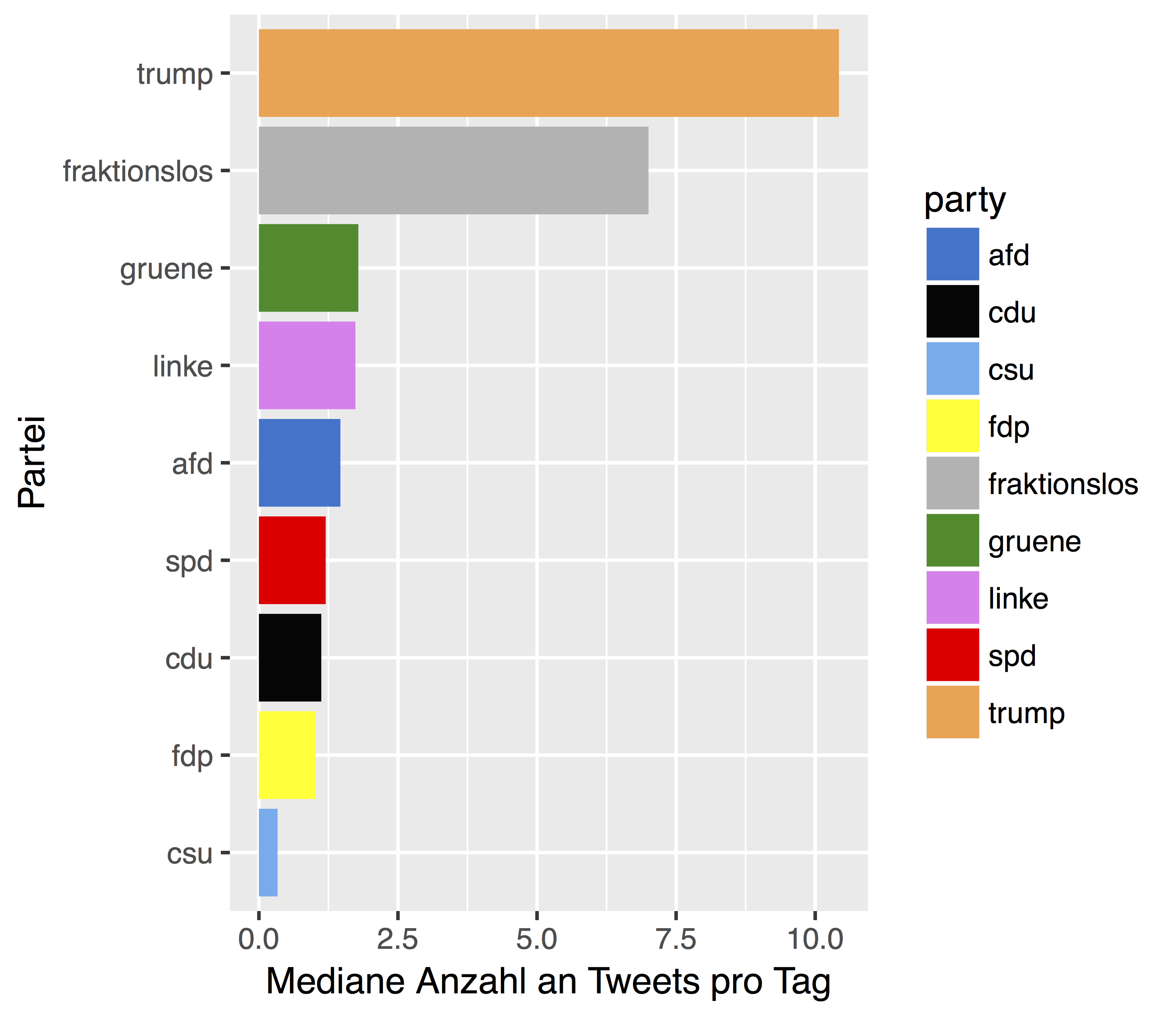
But considering only the German parties, we find that the Greens are leading.

Populism score

Averaged (by median) over the 8 indicators, one finds that the populism scores are … not too much of a surprise, in some regard.

Trump gets the largest part, the highest score. But maybe it would be better to leave him out of this “ranking”, as the different languages (German vs. English) cannot readily be compared with regard to such nuanced things like populism. Anyhow, the two most extreme parties, the AfD (alt-right) and the Linke (Leftists) are the ones with highest populism scores. Not that zero has been centered as the median over all accounts.

Cave and conclusion

Whereas Poppers theory certainly is compelling, the choice of indicators remains subjective. This is not unique for the present analysis, but still different sets of indicators may provide different pictures. Still, this picture appears well backup by the data. What’s your impression, your thoughts? Feel free to discuss your ideas.

On September 2017, the 19. German Bundestag has been elected. As of this writing, the parties are still busy sorting out whether they want to part of the government, with whom, and maybe whether they even want to form a government at all. This post is about providing the data in machine friendly form, and in English language.

All data presented in this post regarding this (and previous) elections are published by the Bundeswahlleiter. The data may be used without restriction as long as it is credited duely.

Let me be clear that the all data presented here were drawn from this source. So, for each dataset the copyright notice is:


The raw data is published by the Bundeswahlleiter 2017 (c) Der Bundeswahlleiter, Wiesbaden 2017 https://www.bundeswahlleiter.de/info/impressum.html


The contribution by me is only to render the data more machine friendly, as the presented CSVs have multiple header lines, German Umlaute, non-UTF8 coding, and some other minor hickups.

Of course, data itself has not been touched by me; I hae only changed some wordings and the structure of the dataset in order to render analysis more comfortable. Analysts can easily access the raw data and check the correctness.

Setup:

library(tidyverse)

Package prada contains the data

Maybe the easiest way is to use my package prada, which can be downloaded/installed from Github:

Install the package once:

devtools::install_github("sebastiansauer/prada")
library(prada)

There you will find the relevant data.

Parties running the election

  • parties_de - a dataframe of the 43 parties than ran for the election
data(parties_de)
glimpse(parties_de)
#> Observations: 43
#> Variables: 2
#> $ party_short <chr> "CDU", "SPD", "Linke", "Gruene", "CSU", "FDP", "Af...
#> $ party_long  <chr> "Christlich Demokratische Union Deutschlands", "So...
  • elec_results - a dataframe of the results (first/second) votes of the parties plus some more data
data(elec_results)
head(elec_results)
#> # A tibble: 6 x 191
#>   district_nr                     district_name parent_district_nr
#>         <int>                             <chr>              <int>
#> 1           1             Flensburg – Schleswig                  1
#> 2           2 Nordfriesland – Dithmarschen Nord                  1
#> 3           3      Steinburg – Dithmarschen Süd                  1
#> 4           4             Rendsburg-Eckernförde                  1
#> 5           5                              Kiel                  1
#> 6           6                 Plön – Neumünster                  1
#> # ... with 188 more variables: registered_voters_1 <int>,
#> #   registered_voters_2 <int>, registered_voters_3 <int>,
#> #   registered_voters_4 <int>, votes_1 <dbl>, votes_2 <int>,
#> #   votes_3 <dbl>, votes_4 <int>, votes_unvalid_1 <int>,
#> #   votes_unvalid_2 <int>, votes_unvalid_3 <dbl>, votes_unvalid_4 <int>,
#> #   votes_valid_1 <int>, votes_valid_2 <int>, votes_valid_3 <int>,
#> #   votes_valid_4 <int>, CDU_1 <int>, CDU_2 <chr>, CDU_3 <int>,
#> #   CDU_4 <dbl>, SPD_1 <int>, SPD_2 <int>, SPD_3 <int>, SPD_4 <int>,
#> #   Linke_1 <int>, Linke_2 <int>, Linke_3 <int>, Linke_4 <int>,
#> #   Gruene_1 <int>, Gruene_2 <int>, Gruene_3 <dbl>, Gruene_4 <dbl>,
#> #   CSU_1 <int>, CSU_2 <int>, CSU_3 <int>, CSU_4 <int>, FDP_1 <int>,
#> #   FDP_2 <int>, FDP_3 <int>, FDP_4 <int>, AfD_1 <int>, AfD_2 <int>,
#> #   AfD_3 <dbl>, AfD_4 <dbl>, Piraten_1 <int>, Piraten_2 <int>,
#> #   Piraten_3 <int>, Piraten_4 <dbl>, NPD_1 <int>, NPD_2 <int>,
#> #   NPD_3 <int>, NPD_4 <int>, FW_1 <int>, FW_2 <int>, FW_3 <int>,
#> #   FW_4 <int>, Mensch_1 <int>, Mensch_2 <int>, Mensch_3 <int>,
#> #   Mensch_4 <dbl>, ÖDP_1 <dbl>, ÖDP_2 <int>, ÖDP_3 <int>, ÖDP_4 <int>,
#> #   Arbeit_1 <int>, Arbeit_2 <int>, Arbeit_3 <int>, Arbeit_4 <int>,
#> #   Bayern_1 <int>, Bayern_2 <int>, Bayern_3 <int>, Bayern_4 <int>,
#> #   Volk_1 <int>, Volk_2 <int>, Volk_3 <int>, Volk_4 <int>,
#> #   Vernunft_1 <int>, Vernunft_2 <int>, Vernunft_3 <int>,
#> #   Vernunft_4 <int>, MLPD_1 <int>, MLPD_2 <int>, MLPD_3 <int>,
#> #   MLPD_4 <int>, Soli_1 <int>, Soli_2 <int>, Soli_3 <int>, Soli_4 <int>,
#> #   Sozialist_1 <int>, Sozialist_2 <chr>, Sozialist_3 <int>,
#> #   Sozialist_4 <int>, Rechte_1 <int>, Rechte_2 <chr>, Rechte_3 <int>,
#> #   Rechte_4 <int>, ADD_1 <chr>, ADD_2 <chr>, ADD_3 <int>, ADD_4 <chr>,
#> #   ...

Note that this data set is structured as follows: For each column AFTER ‘parent_district_nr’, ie., from column 4 onward, 4 columns build one bundle. In each bundle, column 1 refers to the Erststimme in the present election; column 2 to the Erststimme in the previous election. Column 3 refers to the Zweitstimme of the present election, and column 4 to the Zweitstimme of the previous election. For example, ‘CDU_3’ refers to the number of Zweitstimmen in the present (2017) elections.

That is:

  • _1” - first vote in present election
  • _2” - first vote in previous election
  • _3” - second vote in present election
  • _4” - second vote in previous election

Please also check the package documentation for additional information.

Geometric shapes of the electoroal districts (Wahlkreise)

  • wahlkreise_shp - a dataframe with ID of the Wahlkreise (electoral districts) plus their geometric shape for plotting
data(wahlkreise_shp)
glimpse(wahlkreise_shp)
#> Observations: 299
#> Variables: 5
#> $ WKR_NR    <int> 1, 2, 3, 4, 5, 6, 7, 8, 9, 10, 11, 12, 13, 14, 15, 1...
#> $ LAND_NR   <fctr> 01, 01, 01, 01, 01, 01, 01, 01, 01, 01, 01, 13, 13,...
#> $ LAND_NAME <fctr> Schleswig-Holstein, Schleswig-Holstein, Schleswig-H...
#> $ WKR_NAME  <fctr> Flensburg – Schleswig, Nordfriesland – Dithmarschen...
#> $ geometry  <S3: sfc_MULTIPOLYGON> [543474.9, 547528.6, 547598.2, 5479...

See this post for a usecase of the shapefile data.

Socioeconomic data of Germany

  • socec - a dataframe with socio economic information (eg., unemployment rate) for each wahlkreis.
data(socec)
head(socec)
#> # A tibble: 6 x 51
#>                   V1    V2                                V3    V4     V5
#>                <chr> <int>                             <chr> <int>  <dbl>
#> 1 Schleswig-Holstein     1             Flensburg – Schleswig   130 2128.1
#> 2 Schleswig-Holstein     2 Nordfriesland – Dithmarschen Nord   197 2777.0
#> 3 Schleswig-Holstein     3      Steinburg – Dithmarschen Süd   178 2000.5
#> 4 Schleswig-Holstein     4             Rendsburg-Eckernförde   163 2164.8
#> 5 Schleswig-Holstein     5                              Kiel     3  143.0
#> 6 Schleswig-Holstein     6                 Plön – Neumünster    92 1302.0
#> # ... with 46 more variables: V6 <dbl>, V7 <dbl>, V8 <dbl>, V9 <dbl>,
#> #   V10 <dbl>, V11 <dbl>, V12 <dbl>, V13 <dbl>, V14 <dbl>, V15 <dbl>,
#> #   V16 <dbl>, V17 <dbl>, V18 <dbl>, V19 <dbl>, V20 <dbl>, V21 <dbl>,
#> #   V22 <dbl>, V23 <dbl>, V24 <dbl>, V25 <dbl>, V26 <int>, V27 <int>,
#> #   V28 <dbl>, V29 <chr>, V30 <dbl>, V31 <dbl>, V32 <dbl>, V33 <dbl>,
#> #   V34 <dbl>, V35 <dbl>, V36 <dbl>, V37 <dbl>, V38 <dbl>, V39 <chr>,
#> #   V40 <chr>, V41 <chr>, V42 <chr>, V43 <dbl>, V44 <dbl>, V45 <dbl>,
#> #   V46 <dbl>, V47 <dbl>, V48 <dbl>, V49 <dbl>, V50 <dbl>, V51 <dbl>

The names of the indicators can be accessed via the dictionary socec_dict or via the documentation of socec. In addition, of course, the Bundeswahlleiter provides this information.

data(socec_dict)
glimpse(socec_dict)

Use case

You can use the data eg., for determining association of right-wing (AfD) results with unemployment rate per electoral district - see here for an example.

Of course those data can easily be saved as csv:

write_csv(elec_results, path = "elec_results.csv")
write_csv(socec, path = "socec.csv")
write_csv(parties_de, path = "parties_de.csv")
write_csv(wahlkreise_shp, path = "wahlkreise_shp.csv")

Watch our for wahlkreise_shp though as it contains a list column.

Data at osf.io

The Open Science Framework is a great place to store data openly. You can easily access the data from that source, too. Look at this repository.

Data are provided in csv and RData form.

Concluding

It was quite fun to me to play around with the data, and I think quite some valuable insights can be inferred. Of course, electoral data has a unique value as it features the most important action of a democracy.

In a previous post, we have shed some light on the idea that populism - as manifested in AfD election results - is associated with socioeconomic deprivation, be it subjective or objective. We found some supporting pattern in the data, although that hypothesis is far from being complete; ie., most of the variance remained unexplained.

In this post, we test the hypothesis that AfD election results are negatively associated with the proportion of foreign nationals in a Wahlkreis. The idea is this: Many foreigners in your neighborhood, and you will get used to it. You will perceive those type of people as normal. To the contrary, if there are few of them, they are perceived as rather alien.

To be honest, this idea is rather vague; and it maybe built on the simple fact that in the eastern part of Germany, there are (relatively) few foreign nationals, as compared to the western parts of the country. However, animosity towards foreign nationals and AfD results are particularly strong in the East. Put shortly, much more theory would be needed to understand causal pathways explaining populism flourishing in some regions of Germany, particularly in Sachsen (Saxonia).

Packages

library(sf)
library(stringr)
library(tidyverse)
library(magrittr)
library(huxtable)
library(broom)
library(viridis)

Geo data

:attention: The election ratios are unequal to the district areas (as far as I know, not complete identical to the very least). So will need to get some special geo data. This geo data is available here and the others links on that page.

Download and unzip the data; store them in an appropriate folder. Adjust the path to your needs:

my_path_wahlkreise <- "~/Documents/datasets/geo_maps/btw17_geometrie_wahlkreise_shp/Geometrie_Wahlkreise_19DBT.shp"
file.exists(my_path_wahlkreise)
#> [1] TRUE
wahlkreise_shp <- st_read(my_path_wahlkreise)
#> Reading layer `Geometrie_Wahlkreise_19DBT' from data source `/Users/sebastiansauer/Documents/datasets/geo_maps/btw17_geometrie_wahlkreise_shp/Geometrie_Wahlkreise_19DBT.shp' using driver `ESRI Shapefile'
#> Simple feature collection with 299 features and 4 fields
#> geometry type:  MULTIPOLYGON
#> dimension:      XY
#> bbox:           xmin: 280387.7 ymin: 5235855 xmax: 921025.5 ymax: 6101444
#> epsg (SRID):    NA
#> proj4string:    +proj=utm +zone=32 +ellps=GRS80 +units=m +no_defs
glimpse(wahlkreise_shp)
#> Observations: 299
#> Variables: 5
#> $ WKR_NR    <int> 1, 2, 3, 4, 5, 6, 7, 8, 9, 10, 11, 12, 13, 14, 15, 1...
#> $ LAND_NR   <fctr> 01, 01, 01, 01, 01, 01, 01, 01, 01, 01, 01, 13, 13,...
#> $ LAND_NAME <fctr> Schleswig-Holstein, Schleswig-Holstein, Schleswig-H...
#> $ WKR_NAME  <fctr> Flensburg – Schleswig, Nordfriesland – Dithmarschen...
#> $ geometry  <simple_feature> MULTIPOLYGON (((543474.9057..., MULTIPOLY...
wahlkreise_shp %>% 
  ggplot() +
  geom_sf()

plot of chunk unnamed-chunk-4

That was easy, right? The sf package fits nicely with the tidyverse. Hence not much to learn in that regard. I am not saying that geo data is simple, quite the contrary. But luckily the R functions fit in a well known schema.

Foreign nationals ratios

These data can as well be fetched from the same site as above, as mentioned above, we need to make sure that we have the statistics according to the election areas, not the administrative areas.

foreign_file <- "~/Documents/datasets/Strukturdaten_De/btw17_Strukturdaten-utf8.csv"

file.exists(foreign_file)
#> [1] TRUE


foreign_raw <- read_delim(foreign_file, 
    ";", escape_double = FALSE, 
    locale = locale(decimal_mark = ",", 
        grouping_mark = "."), 
    trim_ws = TRUE, 
    skip = 8)  # skipt the first 8 rows

#glimpse(foreign_raw)
  

Jezz, we need to do some cleansing before we can work with this dataset.

foreign_names <- names(foreign_raw)

foreign_df <- foreign_raw

names(foreign_df) <- paste0("V",1:ncol(foreign_df))

The important columns are:

foreign_df <- foreign_df %>% 
  rename(state = V1,
         area_nr = V2,
         area_name = V3,
         for_prop = V8,
         pop_move = V11,
         pop_migr_background = V19,
         income = V26,
         unemp = V47)  # total, as to March 2017

AfD election results

Again, we can access the data from the same source, the Bundeswahlleiter here. I have prepared the column names of the data and the data structure, to render the file more accessible to machine parsing. Data points were not altered. You can access my version of the file here.

elec_file <- "~/Documents/datasets/Strukturdaten_De/btw17_election_results.csv"
file.exists(elec_file)
#> [1] TRUE

elec_results <- read_csv(elec_file)

For each party, four values are reported:

  1. primary vote, present election
  2. primary vote, previous election
  3. secondary vote, present election
  4. secondary vote, previous election

The secondary vote refers to the party, that’s what we are interested in (column 46). The primary vote refers to the candidate of that area; the primary vote may also be of similar interest, but that’s a slightly different question, as it taps more into the approval of a person, rather to a party (of course there’s a lot overlap between both in this situation).

# names(elec_results)
afd_prop <- elec_results %>% 
  select(1, 2, 46, 18) %>% 
  rename(afd_votes = AfD3,
         area_nr = Nr,
         area_name = Gebiet,
         votes_total = Waehler_gueltige_Zweitstimmen_vorlauefig) %>% 
  mutate(afd_prop = afd_votes / votes_total) %>% 
  na.omit

In the previous step, we have selected the columns of interest, changed their name (shorter, English), and have computed the proportion of (valid) secondary votes in favor of the AfD.

Match foreign national rated to AfD votes for each Wahlkreis

wahlkreise_shp %>% 
  left_join(foreign_df, by = c("WKR_NR" = "area_nr")) %>% 
  left_join(afd_prop, by = "area_name") -> chloro_data

Plot geo map with afd votes

chloro_data %>% 
  ggplot() +
  geom_sf(aes(fill = afd_prop)) -> p1
p1

plot of chunk unnamed-chunk-11

We might want to play with the fill color, or clean up the map (remove axis etc.)

p1 + scale_fill_distiller(palette = "Spectral") +
  theme_void()

plot of chunk unnamed-chunk-12

Geo map (of election areas) with foreign national data

chloro_data %>% 
  ggplot() +
  geom_sf(aes(fill = for_prop)) +
  scale_fill_distiller(palette = "Spectral") +
  theme_void() -> p2
p2

plot of chunk unnamed-chunk-13

As can be seen from the previous figure, foreign nationals are relatively rare in the East, but tend to concentrate on the big cities such as Munich, Frankfurt, and the Ruhr area.

“AfD to foreigner density”

In a similar vein, we could compute the ratio of AfD votes and foreigner quote. That would give us some measure of covariability. Let’s see.

chloro_data %>% 
  mutate(afd_for_dens = afd_prop / (for_prop/100)) -> chloro_data
  
chloro_data %>% 
  ggplot +
  geom_sf(aes(fill = afd_for_dens)) +
  theme_void() +
  scale_fill_viridis()

plot of chunk unnamed-chunk-14

Let’s check that.

chloro_data %>% 
  select(afd_for_dens, afd_prop, for_prop) %>% 
  as.data.frame %>% 
  slice(1:3)
#> # A tibble: 3 x 4
#>   afd_for_dens afd_prop for_prop          geometry
#>          <dbl>    <dbl>    <dbl>  <simple_feature>
#> 1         1.20   0.0684      5.7 <MULTIPOLYGON...>
#> 2         1.21   0.0653      5.4 <MULTIPOLYGON...>
#> 3         1.71   0.0854      5.0 <MULTIPOLYGON...>

The diagram shows that in relation to foreigner rates, the AfD votes are strongest in Saxonian Wahlkreise primarily. Second, the East is surprisingly strong more “AfD dense” compared to the West. Don’t forget that this measure is an indication of co-occurrence, not of absolute AfD votes.

Correlation of foreign national quote and AfD votes

A simple, straight-forward and well-known approach to devise association strength is Pearson’s correlation coefficient. Oldie but Goldie. Let’s depict it.

chloro_data %>% 
  select(for_prop, afd_prop, area_name) %>% 
  ggplot +
  aes(x = for_prop, y = afd_prop) +
  geom_point() +
  geom_smooth()

plot of chunk unnamed-chunk-16

The pattern exhibited is quite striking: What we see might easily fit an exponential distribution: When foreigner rate begins to augment, the AfD success shrinks strongly, but this trend comes to an end as soon as some “saturation” process starts, maybe around some 8% of foreign national quote. It would surely be simplistic to speak of a “healthy proportion of around 8% foreigners”, to fence populism. However, the available data shows a quite obvious pattern.

The correlation itself is

chloro_data %>% 
  select(for_prop, afd_prop, area_name) %>% 
  as.data.frame %T>% 
  summarise(cor_afd_foreigners = cor(afd_prop, for_prop)) %>% 
  do(tidy(cor.test(.$afd_prop, .$for_prop)))
#>   estimate statistic  p.value parameter conf.low conf.high
#> 1   -0.465     -9.05 1.98e-17       297   -0.549    -0.371
#>                                 method alternative
#> 1 Pearson's product-moment correlation   two.sided

That is, $r = -.46$, which is quite strong an effect.


EDIT: A comment by Ilya Kashnitsky (@ikashnitsky) suggested to separate the trends for eastern and Western German electoral districts.

Let’s try that.

First, we create a binary variable coding East vs. West:

unique(chloro_data$LAND_NAME)
#>  [1] Schleswig-Holstein     Mecklenburg-Vorpommern Hamburg               
#>  [4] Niedersachsen          Bremen                 Brandenburg           
#>  [7] Sachsen-Anhalt         Berlin                 Nordrhein-Westfalen   
#> [10] Sachsen                Hessen                 Thüringen             
#> [13] Rheinland-Pfalz        Bayern                 Baden-Württemberg     
#> [16] Saarland              
#> 16 Levels: Baden-Württemberg Bayern Berlin Brandenburg Bremen ... Thüringen

Being a German citizen, I know which is East; although I am unsure about Berlin.


east <- c("Mecklenburg-Vorpommern", "Brandenburg", "Sachsen-Anhalt", "Sachsen", "Thüringen")

chloro_data %>%
  mutate(east = LAND_NAME %in% east) -> chloro_data


chloro_data %>% 
  select(east, LAND_NAME) %>% 
  count(LAND_NAME, east)
#> Simple feature collection with 16 features and 3 fields
#> geometry type:  GEOMETRY
#> dimension:      XY
#> bbox:           xmin: 280387.7 ymin: 5235855 xmax: 921025.5 ymax: 6101444
#> epsg (SRID):    NA
#> proj4string:    +proj=utm +zone=32 +ellps=GRS80 +units=m +no_defs
#> # A tibble: 16 x 4
#>                 LAND_NAME  east     n          geometry
#>                    <fctr> <lgl> <int>  <simple_feature>
#>  1      Baden-Württemberg FALSE    38 <MULTIPOLYGON...>
#>  2                 Bayern FALSE    46 <POLYGON ((61...>
#>  3                 Berlin FALSE    12 <POLYGON ((79...>
#>  4            Brandenburg  TRUE    10 <POLYGON ((89...>
#>  5                 Bremen FALSE     2 <MULTIPOLYGON...>
#>  6                Hamburg FALSE     6 <MULTIPOLYGON...>
#>  7                 Hessen FALSE    22 <POLYGON ((49...>
#>  8 Mecklenburg-Vorpommern  TRUE     6 <MULTIPOLYGON...>
#>  9          Niedersachsen FALSE    30 <MULTIPOLYGON...>
#> 10    Nordrhein-Westfalen FALSE    64 <MULTIPOLYGON...>
#> 11        Rheinland-Pfalz FALSE    15 <POLYGON ((45...>
#> 12               Saarland FALSE     4 <POLYGON ((36...>
#> 13                Sachsen  TRUE    16 <POLYGON ((75...>
#> 14         Sachsen-Anhalt  TRUE     9 <POLYGON ((72...>
#> 15     Schleswig-Holstein FALSE    11 <MULTIPOLYGON...>
#> 16              Thüringen  TRUE     8 <POLYGON ((68...>

And now let’s plot again:

chloro_data %>% 
  select(for_prop, afd_prop, area_name, east) %>% 
  ggplot +
  aes(x = for_prop, y = afd_prop) +
  geom_point() +
  geom_smooth(aes(color = east), method = "lm")

plot of chunk unnamed-chunk-20

Quite remarkably, we see that the association in the West is weak; in the East it is (comparatively) strong. Many foreigners, fewer AfD votes. So we might update our thinking saying that there appears to be different mindsets between East and West in this regard.

Of course, this is observational data only, so all this reasoning should be taken cum grano salis. There are surely more variables in the play, so we cannot be sure what true influential (causal) patterns look like. Ilya suggested that some additional variable(s) with different distributions in East and West may explain the data (Simpson case).

BTW: Data are now available in my package pradadata on Github, and can be installed via

devtools::install_github("sebastiansauer/pradadata")

Regression residuals of predicting foreigner quote by afd_score

Let’s predict the AfD vote score taking the unemployment as an predictor. Then let’s plot the residuals to see how good the prediction is, ie., how close (or rather, far) the association of unemployment and AfD voting is.


lm2 <- lm(afd_prop ~ for_prop, data = chloro_data)

glance(lm2)
#>   r.squared adj.r.squared  sigma statistic  p.value df logLik  AIC  BIC
#> 1     0.216         0.213 0.0484      81.8 1.98e-17  2    482 -958 -947
#>   deviance df.residual
#> 1    0.697         297
tidy(lm2)
#>          term estimate std.error statistic  p.value
#> 1 (Intercept)  0.17513   0.00596     29.40 5.90e-90
#> 2    for_prop -0.00471   0.00052     -9.05 1.98e-17


chloro_data %>% 
  mutate(afd_lm2 = lm(afd_prop ~ for_prop, data = .)$residuals) -> chloro_data

We have an $R^2$ of .21, quite a bit. Maybe the most important message: For each percentage point more foreigners, the AfD results decreases about a half percentage point.

And now plot the residuals:

chloro_data %>% 
  select(afd_lm2) %>% 
  ggplot() +
  geom_sf(aes(fill = afd_lm2)) +
  scale_fill_gradient2() +
  theme_void()

plot of chunk unnamed-chunk-23

Interesting! This model shows a clear-cut picture: The eastern part is too “afd-ic” for its foreigner ratio; the North-West is less afd-ic than what would be expected by the foreigner rate. The rest (middle and south) parts over-and-above show the AfD levels that would be expected by their foreigner rate.


EDIT: Let’s include east as a predictor to the linear model:

lm3 <- lm(afd_prop ~ for_prop*east, data = chloro_data)

glance(lm3)
#>   r.squared adj.r.squared  sigma statistic  p.value df logLik   AIC   BIC
#> 1     0.672         0.669 0.0314       202 3.85e-71  4    612 -1215 -1196
#>   deviance df.residual
#> 1    0.291         295
tidy(lm3)
#>                term  estimate std.error statistic  p.value
#> 1       (Intercept)  0.112378   0.00495    22.692 1.17e-66
#> 2          for_prop -0.000371   0.00040    -0.928 3.54e-01
#> 3          eastTRUE  0.166620   0.01302    12.798 3.97e-30
#> 4 for_prop:eastTRUE -0.013637   0.00302    -4.521 8.93e-06

R squared increased dramatically, fostering the line of thought in the EDIT above. Now, we see that the general foreigner quote is not significiant anymore; we may infer that it plays no important role. But whether a wahlrkeis is East or not does play a strong role. For the East, the slope decreases quite a bit indicating some negative effect on foreigner quotes to AfD success.

Thanks Ilya Kashnitsky (@ikashnitsky)!


Conclusion

The regression model provides a quite clear-cut picture. The story of the data may thus be summarized in easy words: The higher the foreigner ratio, the lower the AfD ratio. However, this is only part of the story. The foreigner explains a rather small fraction of AfD votes. Yet, given the multitude of potential influences on voting behavior, a correlation coefficient of -.46 is strikingly strong.

For statistical modeling, it is typical to separate a train sample from a test sample. The training sample is used to build (“train”) the model, whereas the test sample is used to gauge the predictive quality of the model.

There are many ways to split off a test sample from the train sample. One quite simple, tidyverse-oriented way, is the following.

First, load the tidyverse. Next, load some data.

library(tidyverse)
data(Affairs, package = "AER")

Then, create an index vector of the length of your train sample, say 80% of the total sample size.

set.seed(42)
index <- sample(1:601, size = trunc(.8 * 601))

Put bluntly, we draw 480 (.8*601) cases from the dataset, and note their row numbers.

a_train <- Affairs %>%
  filter(row_number() %in% index)

The test set is the complement of the train set, drawn similarly:

a_test <- Affairs %>%
  filter(!(row_number() %in% index))

I kept wondering who to plot two R plots side by side (ie., in one “row”) in a .Rmd chunk. Here’s a way, well actually a number of ways, some good, some … not.

library(tidyverse)
library(gridExtra)
library(grid)
library(png)
library(downloader)
library(grDevices)


data(mtcars)

Plots from ggplot

Say, you have two plots from ggplot2, and you would like them to put them next to each other, side by side (not underneath each other):


ggplot(mtcars) +
  aes(x = hp, y = mpg) +
  geom_point() -> p1

ggplot(mtcars) +
  aes(x = factor(cyl), y = mpg) +
  geom_boxplot() +
  geom_smooth(aes(group = 1), se = FALSE) -> p2

grid.arrange(p1, p2, ncol = 2)

plot of chunk p-test

So, grid.arrange is the key.

Plots from png-file

comb2pngs <- function(imgs, bottom_text = NULL){
  img1 <-  grid::rasterGrob(as.raster(readPNG(imgs[1])),
                            interpolate = FALSE)
  img2 <-  grid::rasterGrob(as.raster(readPNG(imgs[2])),
                            interpolate = FALSE)
  grid.arrange(img1, img2, ncol = 2, bottom = bottom_text)
}

The code of this function was inspired by code from Ben from this SO post.

Now, let’s load two pngs and then call the function above.

png1_path <- "https://sebastiansauer.github.io/images/2016-08-30-03.png"
png2_path <- "https://sebastiansauer.github.io/images/2016-08-31-01.png"


png1_dest <- "https://sebastiansauer.github.io/images/2017-10-12/img1.png"
png2_dest <- "https://sebastiansauer.github.io/images/2017-10-12/img2.png"


#download(png1_path, destfile = png1_dest)
#download(png2_path, destfile = png2_dest)

comb2pngs(c(png1_dest, png2_dest))

plot of chunk unnamed-chunk-3

This works, it produces two plots from png files side by side.

Two plots side-by-side the knitr way. Does not work.

But what about the standard knitr way?

knitr::include_graphics(c(png1_dest,png2_dest))

<img src=”“https://sebastiansauer.github.io/images/2017-10-12/img1.png” title=”plot of chunk unnamed-chunk-4” alt=”plot of chunk unnamed-chunk-4” width=”30%” style=”display: block; margin: auto;” /><img src=”“https://sebastiansauer.github.io/images/2017-10-12/img2.png” title=”plot of chunk unnamed-chunk-4” alt=”plot of chunk unnamed-chunk-4” width=”30%” style=”display: block; margin: auto;” />

Does not work.

Maybe with only one value for out.width??

knitr::include_graphics(c(png1_dest, png2_dest))

plot of chunk unnamed-chunk-5plot of chunk unnamed-chunk-5

Nope. Does not work.

Does not work either, despite some saying so.

Maybe two times include_graphics?

imgs <- c(png1_dest, png2_dest)
imgs
#> [1] "https://sebastiansauer.github.io/images/2017-10-12/img1.png"
#> [2] "https://sebastiansauer.github.io/images/2017-10-12/img2.png"

knitr::include_graphics(png1_dest);  knitr::include_graphics(png2_dest)

plot of chunk unnamed-chunk-6plot of chunk unnamed-chunk-6

An insight why include_graphics fails

No avail. Looking at the html code in the md-file which is produced by the knitr -call shows one interesting point: all this version of include_graphics produce the same code. And all have this style="display: block; margin: auto;" part in it. That obviously created problems. I am unsure who to convince include_graphics to divorce from this argument. I tried some versions of the chunk argument fig.show = hold, but to no avail.

Plain markdown works

Try this code ![](https://sebastiansauer.github.io/images/2017-10-12/img1.png){ width=30% } ![](https://sebastiansauer.github.io/images/2017-10-12/img2.png){ width=40% } The two commands ![]... need not appear in one row. However, no new paragraph may separate them (no blank line between, otherwise the images will appear one below the other).

{ width=30% } { width=40% }

Works. But the markdown way does not give the fill comfort and power. So, that’s not quite perfect.

Conclusion

A partial solution is there; but it’s not optimal. There wil most probably be different alternatives. For example, using plain html or Latex. But it’s a kind of pity, the include_graphics call does not work as expected (by me).