Case study in data analysis using R package dplyr in German language.
Praktische Datenanalyse mit dplyr
Das R-Paket dplyr von Hadley Wickham ist ein Stargast auf der R-Showbühne; häufig diskutiert in einschlägigen Foren. Mit dyplr kann man Daten “verhackstücken” - umformen und aufbereiten (“to wrangle” auf Englisch); “praktische Datenanalyse” ist vielleicht eine gute Bezeichnung. Es finden sich online viele Einführungen, z.B. hier oder hier.
Dieser Text ist nicht als Einführung oder Erläuterung gedacht, sondern als Übung, um (neu erworbenen Fähigkeiten) in der praktischen Datenanalyse im Rahmen einer Fallstudie auszuprobieren.
Stellen Sie sich folgendes Szenario zur Fallstudie vor: Sie sind Unternehmensberäter bei einer (nach eigenen Angaben) namhaften Gesellschaft. Ihr erster Auftrag führt Sie direkt nach New York City (normal). Ihr Chef hat irgendwie den Eindruck, dass Sie Zahlen- und Computer-affin sind… “Sag mal, schon mal von R gehört?”, fragt er mal eines Abends (22h, noch voll bei der Arbeit). “Eine Programmiersprache zur Datenanalyse und -visualisierung”, antworten Sie wie aus der Pistole geschossen. Das gefällt Ihrem Chef. “Pass mal auf. Bis morgen brauche ich eine Analyse aller Flüge von NYC, Anzahl, nach Origin, nach Destination.. Du weißt schon…”. Natürlich wissen Sie.. “Reicht bis morgen früh um acht”, sagt er noch, bevor er das Büro verlässt.
Ok, also dann sollten wir keine Zeit verlieren…
Aufgaben (und Lösungen)
Laden wir zuerst die nötigen Pakete und Daten; denken Sie daran, dass R-Pakete zuerst installiert werden müssen (einmalig), bevor Sie sie laden können.
# install.packages("nycflights13")
library(dplyr)
library(ggplot2) # Diagramme
data(flights, package = "nycflights13")
Wie viele Flüge starteten in den NYC-Flughäfen in 2013?
flights %>%
  summarise(n_flights = n())
## # A tibble: 1 × 1
##   n_flights
##       <int>
## 1    336776
Ah, eine Menge :-).
Welche Flughäfen gibt es in NYC? Wie viele Flüge starteten von dort jeweils?
flights %>%
  group_by(origin) %>%
  summarise(Anzahl = n())
## # A tibble: 3 × 2
##   origin Anzahl
##    <chr>  <int>
## 1    EWR 120835
## 2    JFK 111279
## 3    LGA 104662
Das könnten wir auch plotten. Allerdings… 3 Zahlen, das kann man auch ohne Diagramm gut erkennen…
Die internationalen Codes von Flughäfen können z.B. hier nachgelesen werden.
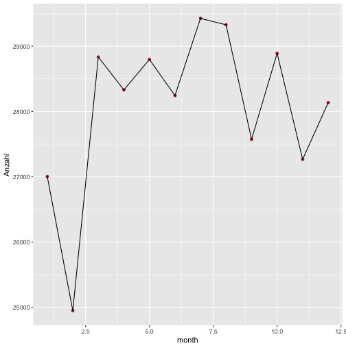
Wie viele Flughäfen starteten pro Monat aus NYC?
Das ist praktische die gleiche Frage in grün…
flights %>%
  group_by(month) %>%
  summarise(Anzahl = n())
## # A tibble: 12 × 2
##    month Anzahl
##    <int>  <int>
## 1      1  27004
## 2      2  24951
## 3      3  28834
## 4      4  28330
## 5      5  28796
## 6      6  28243
## 7      7  29425
## 8      8  29327
## 9      9  27574
## 10    10  28889
## 11    11  27268
## 12    12  28135
Das lohnt sich schon eher als Diagramm:
flights %>%
  group_by(month) %>%
  summarise(Anzahl = n()) %>%
  ggplot(aes(x = month, y = Anzahl)) + geom_point(color = "firebrick") +
  geom_line()
Welche Ziele wurden angeflogen? Wurden MUC und FRA angeflogen?
flights %>%
  group_by(dest) %>%
  summarise(Anzahl = n()) %>%
  select(dest) %>% print(n = 200)
## # A tibble: 105 × 1
##      dest
##     <chr>
## 1     ABQ
## 2     ACK
## 3     ALB
## 4     ANC
## 5     ATL
## 6     AUS
## 7     AVL
## 8     BDL
## 9     BGR
## 10    BHM
## 11    BNA
## 12    BOS
## 13    BQN
## 14    BTV
## 15    BUF
## 16    BUR
## 17    BWI
## 18    BZN
## 19    CAE
## 20    CAK
## 21    CHO
## 22    CHS
## 23    CLE
## 24    CLT
## 25    CMH
## 26    CRW
## 27    CVG
## 28    DAY
## 29    DCA
## 30    DEN
## 31    DFW
## 32    DSM
## 33    DTW
## 34    EGE
## 35    EYW
## 36    FLL
## 37    GRR
## 38    GSO
## 39    GSP
## 40    HDN
## 41    HNL
## 42    HOU
## 43    IAD
## 44    IAH
## 45    ILM
## 46    IND
## 47    JAC
## 48    JAX
## 49    LAS
## 50    LAX
## 51    LEX
## 52    LGA
## 53    LGB
## 54    MCI
## 55    MCO
## 56    MDW
## 57    MEM
## 58    MHT
## 59    MIA
## 60    MKE
## 61    MSN
## 62    MSP
## 63    MSY
## 64    MTJ
## 65    MVY
## 66    MYR
## 67    OAK
## 68    OKC
## 69    OMA
## 70    ORD
## 71    ORF
## 72    PBI
## 73    PDX
## 74    PHL
## 75    PHX
## 76    PIT
## 77    PSE
## 78    PSP
## 79    PVD
## 80    PWM
## 81    RDU
## 82    RIC
## 83    ROC
## 84    RSW
## 85    SAN
## 86    SAT
## 87    SAV
## 88    SBN
## 89    SDF
## 90    SEA
## 91    SFO
## 92    SJC
## 93    SJU
## 94    SLC
## 95    SMF
## 96    SNA
## 97    SRQ
## 98    STL
## 99    STT
## 100   SYR
## 101   TPA
## 102   TUL
## 103   TVC
## 104   TYS
## 105   XNA
Eine lange Liste… wäre vielleicht übersichtlicher, die nicht abzubilden ;)
Schauen wir mal, ob MUC (München) oder FRA (Frankfurt) dabei waren.
flights %>%
  filter(dest == "MUC" | dest == "FRA")
## # A tibble: 0 × 19
## # ... with 19 variables: year <int>, month <int>, day <int>,
## #   dep_time <int>, sched_dep_time <int>, dep_delay <dbl>, arr_time <int>,
## #   sched_arr_time <int>, arr_delay <dbl>, carrier <chr>, flight <int>,
## #   tailnum <chr>, origin <chr>, dest <chr>, air_time <dbl>,
## #   distance <dbl>, hour <dbl>, minute <dbl>, time_hour <dttm>
Die resultierende Tabelle (“tibble”) hat 0 Zeilen. Diese Ziele wurden also nicht angeflogen.
Das Zeichen “|” bedeutet “oder” (im logischen Sinne). Demnach kann man die die ganze “Pfeife” so lesen:
Nimm flights
Filter Zeilen mit Ziel gleich MUC oder Zeilen mit Ziel gleich FRA.
Welche Ziele am häufigsten angeflogen?
flights %>%
  group_by(dest) %>%
  summarise(n_per_dest = n()) %>%
  arrange(desc(n_per_dest))
## # A tibble: 105 × 2
##     dest n_per_dest
##    <chr>      <int>
## 1    ORD      17283
## 2    ATL      17215
## 3    LAX      16174
## 4    BOS      15508
## 5    MCO      14082
## 6    CLT      14064
## 7    SFO      13331
## 8    FLL      12055
## 9    MIA      11728
## 10   DCA       9705
## # ... with 95 more rows
Das könnte man auch wieder “plotten”, aber lieber nur die Top-10.
flights %>%
  group_by(dest) %>%
  summarise(n_per_dest = n()) %>%
  arrange(desc(n_per_dest)) %>%
  filter(min_rank(n_per_dest) < 11) %>%
  ggplot(aes(x = dest, y = n_per_dest)) + geom_bar(stat = "identity")
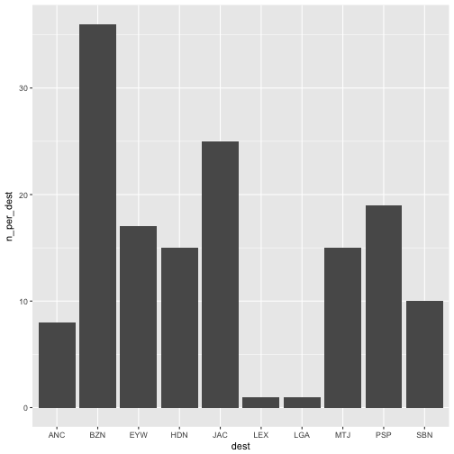
Der Befehl min_rank(n_per_dest) < 11 liefert die 10 kleinsten Rangplätze der Variablen n_per_dest zurück.
Beim Plotten brauchen wir beim Geom bar (Balken) den Zusatz stat = "identity", weil das Geom bar standardgemäß zählen möchte, wie viele Zeilen z.B. “LGA” enthalten. Wir haben aber das Zählen der Zeilen schon vorher mit n() gemacht, so dass der Befehl einfach den Wert, so wie er in unserem Dataframe steht (daher identity) nehmen soll.
Welche Ziele werden mehr als 10000 Mal pro Jahr angeflogen?
flights %>%
  group_by(dest) %>%
  summarise(n_dest = n()) %>%
  filter(n_dest > 10000)
## # A tibble: 9 × 2
##    dest n_dest
##   <chr>  <int>
## 1   ATL  17215
## 2   BOS  15508
## 3   CLT  14064
## 4   FLL  12055
## 5   LAX  16174
## 6   MCO  14082
## 7   MIA  11728
## 8   ORD  17283
## 9   SFO  13331
Welche Flüge gingen von JFK nach PWM (Portland) im Januar zwischen Mitternach und 5 Uhr?
library(knitr)
filter(flights, origin == "JFK" & month == 1, dest == "PWM", dep_time < 500) %>%
  kable
| year | month | day | dep_time | sched_dep_time | dep_delay | arr_time | sched_arr_time | arr_delay | carrier | flight | tailnum | origin | dest | air_time | distance | hour | minute | time_hour |
|---|---|---|---|---|---|---|---|---|---|---|---|---|---|---|---|---|---|---|
| 2013 | 1 | 4 | 106 | 2245 | 141 | 201 | 2356 | 125 | B6 | 608 | N192JB | JFK | PWM | 44 | 273 | 22 | 45 | 2013-01-04 22:00:00 |
| 2013 | 1 | 31 | 54 | 2250 | 124 | 152 | 2359 | 113 | B6 | 608 | N281JB | JFK | PWM | 41 | 273 | 22 | 50 | 2013-01-31 22:00:00 |
Der Befehl knitr::kable erstellt eine (einigermaßen) schöne Tabelle (man muss aber das Paket knitr vorher geladen haben.)
Warum Ihr Chef das wissen will, weiß er nur allein…
Welche Flüge starteten von JFK, dieeine Ankunftsverspätung hatten doppelt so groß wie die Abflugverspätung, und die nach Atlanta geflogen sind?
Selten eine Aufgabe gelesen, die aus so einem langen Satz bestand …
filter(flights, origin == "JFK", arr_delay > 2 * dep_delay, month == 1, dest == "ATL") %>%
  kable
| year | month | day | dep_time | sched_dep_time | dep_delay | arr_time | sched_arr_time | arr_delay | carrier | flight | tailnum | origin | dest | air_time | distance | hour | minute | time_hour |
|---|---|---|---|---|---|---|---|---|---|---|---|---|---|---|---|---|---|---|
| 2013 | 1 | 1 | 807 | 810 | -3 | 1043 | 1043 | 0 | DL | 269 | N308DE | JFK | ATL | 126 | 760 | 8 | 10 | 2013-01-01 08:00:00 |
| 2013 | 1 | 1 | 1325 | 1330 | -5 | 1606 | 1605 | 1 | DL | 2043 | N318US | JFK | ATL | 131 | 760 | 13 | 30 | 2013-01-01 13:00:00 |
| 2013 | 1 | 2 | 606 | 610 | -4 | 846 | 845 | 1 | DL | 1743 | N387DA | JFK | ATL | 129 | 760 | 6 | 10 | 2013-01-02 06:00:00 |
| 2013 | 1 | 2 | 808 | 810 | -2 | 1049 | 1045 | 4 | DL | 269 | N971DL | JFK | ATL | 124 | 760 | 8 | 10 | 2013-01-02 08:00:00 |
| 2013 | 1 | 2 | 1551 | 1548 | 3 | 1838 | 1830 | 8 | DL | 95 | N702TW | JFK | ATL | 119 | 760 | 15 | 48 | 2013-01-02 15:00:00 |
| 2013 | 1 | 2 | 2027 | 2030 | -3 | 2309 | 2314 | -5 | DL | 1447 | N947DL | JFK | ATL | 127 | 760 | 20 | 30 | 2013-01-02 20:00:00 |
| 2013 | 1 | 3 | 612 | 615 | -3 | 912 | 850 | 22 | DL | 2057 | N707TW | JFK | ATL | 135 | 760 | 6 | 15 | 2013-01-03 06:00:00 |
| 2013 | 1 | 3 | 811 | 810 | 1 | 1053 | 1042 | 11 | DL | 269 | N319NB | JFK | ATL | 134 | 760 | 8 | 10 | 2013-01-03 08:00:00 |
| 2013 | 1 | 3 | 1847 | 1855 | -8 | 2130 | 2142 | -12 | DL | 951 | N181DN | JFK | ATL | 129 | 760 | 18 | 55 | 2013-01-03 18:00:00 |
| 2013 | 1 | 5 | 805 | 810 | -5 | 1039 | 1041 | -2 | DL | 269 | N339NB | JFK | ATL | 116 | 760 | 8 | 10 | 2013-01-05 08:00:00 |
| 2013 | 1 | 5 | 1540 | 1548 | -8 | 1820 | 1829 | -9 | DL | 95 | N710TW | JFK | ATL | 119 | 760 | 15 | 48 | 2013-01-05 15:00:00 |
| 2013 | 1 | 6 | 612 | 615 | -3 | 846 | 848 | -2 | DL | 2057 | N397DA | JFK | ATL | 126 | 760 | 6 | 15 | 2013-01-06 06:00:00 |
| 2013 | 1 | 6 | 809 | 810 | -1 | 1044 | 1042 | 2 | DL | 269 | N316NB | JFK | ATL | 125 | 760 | 8 | 10 | 2013-01-06 08:00:00 |
| 2013 | 1 | 6 | 1326 | 1330 | -4 | 1605 | 1605 | 0 | DL | 2043 | N3734B | JFK | ATL | 126 | 760 | 13 | 30 | 2013-01-06 13:00:00 |
| 2013 | 1 | 6 | 1545 | 1548 | -3 | 1842 | 1830 | 12 | DL | 95 | N387DA | JFK | ATL | 139 | 760 | 15 | 48 | 2013-01-06 15:00:00 |
| 2013 | 1 | 7 | 803 | 810 | -7 | 1029 | 1042 | -13 | DL | 269 | N344NB | JFK | ATL | 105 | 760 | 8 | 10 | 2013-01-07 08:00:00 |
| 2013 | 1 | 8 | 612 | 615 | -3 | 901 | 855 | 6 | 9E | 3856 | N153PQ | JFK | ATL | 124 | 760 | 6 | 15 | 2013-01-08 06:00:00 |
| 2013 | 1 | 8 | 823 | 810 | 13 | 1112 | 1043 | 29 | DL | 269 | N377NW | JFK | ATL | 126 | 760 | 8 | 10 | 2013-01-08 08:00:00 |
| 2013 | 1 | 8 | 1549 | 1548 | 1 | 1846 | 1830 | 16 | DL | 95 | N376DA | JFK | ATL | 117 | 760 | 15 | 48 | 2013-01-08 15:00:00 |
| 2013 | 1 | 8 | 1843 | 1855 | -12 | 2142 | 2142 | 0 | DL | 951 | N1611B | JFK | ATL | 126 | 760 | 18 | 55 | 2013-01-08 18:00:00 |
| 2013 | 1 | 9 | 807 | 810 | -3 | 1045 | 1042 | 3 | DL | 269 | N316NB | JFK | ATL | 124 | 760 | 8 | 10 | 2013-01-09 08:00:00 |
| 2013 | 1 | 9 | 1857 | 1855 | 2 | 2151 | 2142 | 9 | DL | 951 | N173DZ | JFK | ATL | 120 | 760 | 18 | 55 | 2013-01-09 18:00:00 |
| 2013 | 1 | 10 | 809 | 810 | -1 | 1041 | 1042 | -1 | DL | 269 | N361NB | JFK | ATL | 111 | 760 | 8 | 10 | 2013-01-10 08:00:00 |
| 2013 | 1 | 11 | 807 | 810 | -3 | 1056 | 1042 | 14 | DL | 269 | N345NB | JFK | ATL | 117 | 760 | 8 | 10 | 2013-01-11 08:00:00 |
| 2013 | 1 | 13 | 612 | 615 | -3 | 853 | 855 | -2 | 9E | 3856 | N146PQ | JFK | ATL | 118 | 760 | 6 | 15 | 2013-01-13 06:00:00 |
| 2013 | 1 | 13 | 1848 | 1855 | -7 | 2204 | 2142 | 22 | DL | 951 | N1609 | JFK | ATL | 116 | 760 | 18 | 55 | 2013-01-13 18:00:00 |
| 2013 | 1 | 15 | 612 | 615 | -3 | 927 | 855 | 32 | 9E | 3856 | N181PQ | JFK | ATL | 134 | 760 | 6 | 15 | 2013-01-15 06:00:00 |
| 2013 | 1 | 15 | 1324 | 1330 | -6 | 1605 | 1605 | 0 | DL | 2043 | N704X | JFK | ATL | 133 | 760 | 13 | 30 | 2013-01-15 13:00:00 |
| 2013 | 1 | 16 | 615 | 615 | 0 | 905 | 855 | 10 | 9E | 3856 | N232PQ | JFK | ATL | 131 | 760 | 6 | 15 | 2013-01-16 06:00:00 |
| 2013 | 1 | 16 | 1324 | 1330 | -6 | 1603 | 1605 | -2 | DL | 2043 | N3763D | JFK | ATL | 129 | 760 | 13 | 30 | 2013-01-16 13:00:00 |
| 2013 | 1 | 17 | 612 | 615 | -3 | 906 | 855 | 11 | 9E | 3856 | N176PQ | JFK | ATL | 129 | 760 | 6 | 15 | 2013-01-17 06:00:00 |
| 2013 | 1 | 17 | 810 | 810 | 0 | 1048 | 1042 | 6 | DL | 269 | N340NB | JFK | ATL | 127 | 760 | 8 | 10 | 2013-01-17 08:00:00 |
| 2013 | 1 | 17 | 1325 | 1330 | -5 | 1600 | 1605 | -5 | DL | 2043 | N3756 | JFK | ATL | 127 | 760 | 13 | 30 | 2013-01-17 13:00:00 |
| 2013 | 1 | 19 | 614 | 615 | -1 | 857 | 855 | 2 | 9E | 3856 | N187PQ | JFK | ATL | 127 | 760 | 6 | 15 | 2013-01-19 06:00:00 |
| 2013 | 1 | 19 | 803 | 810 | -7 | 1031 | 1041 | -10 | DL | 269 | N320NB | JFK | ATL | 115 | 760 | 8 | 10 | 2013-01-19 08:00:00 |
| 2013 | 1 | 20 | 1851 | 1855 | -4 | 2135 | 2142 | -7 | DL | 951 | N1605 | JFK | ATL | 114 | 760 | 18 | 55 | 2013-01-20 18:00:00 |
| 2013 | 1 | 21 | 1723 | 1730 | -7 | 2010 | 2017 | -7 | DL | 951 | N175DN | JFK | ATL | 131 | 760 | 17 | 30 | 2013-01-21 17:00:00 |
| 2013 | 1 | 22 | 614 | 615 | -1 | 857 | 855 | 2 | 9E | 3856 | N153PQ | JFK | ATL | 132 | 760 | 6 | 15 | 2013-01-22 06:00:00 |
| 2013 | 1 | 22 | 820 | 810 | 10 | 1107 | 1042 | 25 | DL | 269 | N359NB | JFK | ATL | 130 | 760 | 8 | 10 | 2013-01-22 08:00:00 |
| 2013 | 1 | 24 | 612 | 615 | -3 | 855 | 855 | 0 | 9E | 3856 | N197PQ | JFK | ATL | 117 | 760 | 6 | 15 | 2013-01-24 06:00:00 |
| 2013 | 1 | 25 | 810 | 810 | 0 | 1056 | 1042 | 14 | DL | 269 | N366NB | JFK | ATL | 123 | 760 | 8 | 10 | 2013-01-25 08:00:00 |
| 2013 | 1 | 25 | 1850 | 1855 | -5 | 2151 | 2142 | 9 | DL | 951 | N646DL | JFK | ATL | 150 | 760 | 18 | 55 | 2013-01-25 18:00:00 |
| 2013 | 1 | 26 | 1543 | 1548 | -5 | 1821 | 1829 | -8 | DL | 95 | N723TW | JFK | ATL | 107 | 760 | 15 | 48 | 2013-01-26 15:00:00 |
| 2013 | 1 | 28 | 610 | 615 | -5 | 856 | 855 | 1 | 9E | 3856 | N187PQ | JFK | ATL | 126 | 760 | 6 | 15 | 2013-01-28 06:00:00 |
| 2013 | 1 | 28 | 808 | 810 | -2 | 1041 | 1042 | -1 | DL | 269 | N327NB | JFK | ATL | 120 | 760 | 8 | 10 | 2013-01-28 08:00:00 |
| 2013 | 1 | 28 | 1320 | 1330 | -10 | 1547 | 1605 | -18 | DL | 2043 | N3748Y | JFK | ATL | 117 | 760 | 13 | 30 | 2013-01-28 13:00:00 |
| 2013 | 1 | 28 | 1546 | 1548 | -2 | 1835 | 1830 | 5 | DL | 95 | N3745B | JFK | ATL | 160 | 760 | 15 | 48 | 2013-01-28 15:00:00 |
| 2013 | 1 | 29 | 1325 | 1330 | -5 | 1559 | 1605 | -6 | DL | 2043 | N712TW | JFK | ATL | 119 | 760 | 13 | 30 | 2013-01-29 13:00:00 |
| 2013 | 1 | 30 | 807 | 810 | -3 | 1105 | 1042 | 23 | DL | 269 | N361NB | JFK | ATL | 128 | 760 | 8 | 10 | 2013-01-30 08:00:00 |
| 2013 | 1 | 30 | 1853 | 1855 | -2 | 2152 | 2142 | 10 | DL | 951 | N686DA | JFK | ATL | 131 | 760 | 18 | 55 | 2013-01-30 18:00:00 |
| 2013 | 1 | 31 | 616 | 615 | 1 | 905 | 855 | 10 | 9E | 3856 | N181PQ | JFK | ATL | 126 | 760 | 6 | 15 | 2013-01-31 06:00:00 |
| 2013 | 1 | 31 | 810 | 810 | 0 | 1054 | 1042 | 12 | DL | 269 | N355NB | JFK | ATL | 127 | 760 | 8 | 10 | 2013-01-31 08:00:00 |
| 2013 | 1 | 31 | 1853 | 1855 | -2 | 2149 | 2142 | 7 | DL | 951 | N175DZ | JFK | ATL | 129 | 760 | 18 | 55 | 2013-01-31 18:00:00 |
Auch diese Tabelle ist recht lang. Aber sei’s drum :)
Welche Airlines hatten die meiste “Netto-Verspätung”?
f_2 <- group_by(flights, carrier)
f_3 <- mutate(f_2, delay = dep_delay - arr_delay)
f_4 <- filter(f_3, !is.na(delay))
f_5 <- summarise(f_4, delay_mean = mean(delay))
arrange(f_5, delay_mean)
## # A tibble: 16 × 2
##    carrier delay_mean
##      <chr>      <dbl>
## 1       F9 -1.7195301
## 2       FL -1.5099213
## 3       MQ -0.3293526
## 4       OO  0.6551724
## 5       US  1.6150976
## 6       YV  3.3419118
## 7       B6  3.5095746
## 8       EV  4.0424982
## 9       DL  7.5796089
## 10      WN  8.0125374
## 11      AA  8.2048393
## 12      UA  8.4588972
## 13      9E  9.0599052
## 14      VX 10.9921814
## 15      HA 11.8157895
## 16      AS 15.7616361
Etwas umständlich mit den ganzen Zwischenspeichern… Vielleicht besser so:
flights %>%
  group_by(carrier) %>%
  mutate(delay = dep_delay - arr_delay) %>%
  filter(!is.na(delay)) %>%
  summarise(delay_mean = mean(delay)) %>%
  arrange(-delay_mean)
## # A tibble: 16 × 2
##    carrier delay_mean
##      <chr>      <dbl>
## 1       AS 15.7616361
## 2       HA 11.8157895
## 3       VX 10.9921814
## 4       9E  9.0599052
## 5       UA  8.4588972
## 6       AA  8.2048393
## 7       WN  8.0125374
## 8       DL  7.5796089
## 9       EV  4.0424982
## 10      B6  3.5095746
## 11      YV  3.3419118
## 12      US  1.6150976
## 13      OO  0.6551724
## 14      MQ -0.3293526
## 15      FL -1.5099213
## 16      F9 -1.7195301
Das könnten wir mal wieder visualisieren:
flights %>%
  group_by(carrier) %>%
  mutate(delay = dep_delay - arr_delay) %>%
  filter(!is.na(delay)) %>%
  summarise(delay_mean = mean(delay)) %>%
  arrange(-delay_mean) -> f_summarised

  ggplot(f_summarised, aes(x = carrier, y = delay_mean)) + geom_point(color = "firebrick")
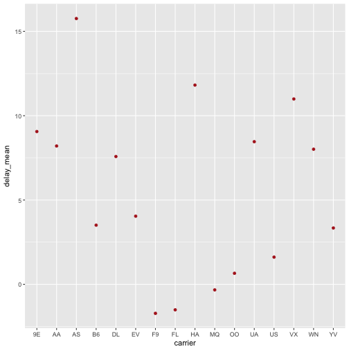
ggplot2 ordnet die X-Achse hier automatisch alphanumerisch. Wenn wir wollen, dass die Achse nach den Werten der Y-Achse (delay_mean) geordnet wird (was sinnvoll ist), können wir das so erreichen:
  ggplot(f_summarised, aes(x = reorder(carrier, delay_mean), y = delay_mean)) +
    geom_point(color = "firebrick")
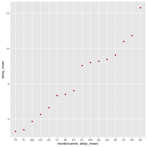
Der Befehl reorder(carrier, delay_mean) ordnet die Werte der Varialbne carrier anhand der Werte der Variablen delay_mean.
Berechnen Sie die mittlere Verspätung aller Flüge mit deutlicher Verspätung (> 1 Stunde)!
flights %>%
  mutate(delay = dep_delay - arr_delay) %>%
  filter(delay > 60) %>%
  summarise(delay_mean = mean(delay),
            n = n()) %>%  # Anzahl
  arrange(delay_mean)
## # A tibble: 1 × 2
##   delay_mean     n
##        <dbl> <int>
## 1   65.18182   154
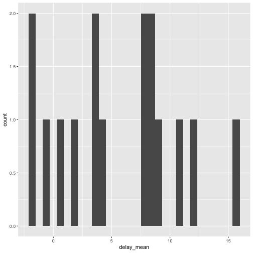
Wie sind die Verspätungen verteilt?
ggplot(f_summarised, aes(x = delay_mean)) + geom_histogram()
## `stat_bin()` using `bins = 30`. Pick better value with `binwidth`.
Hängen Flugzeit und Verspätung zusammen?
flights %>%
  mutate(delay = dep_delay - arr_delay) %>%
  na.omit() %>%
  ggplot(aes(x = distance, y = delay)) +
  geom_point(alpha = .1) +
  geom_smooth()
## `geom_smooth()` using method = 'gam'
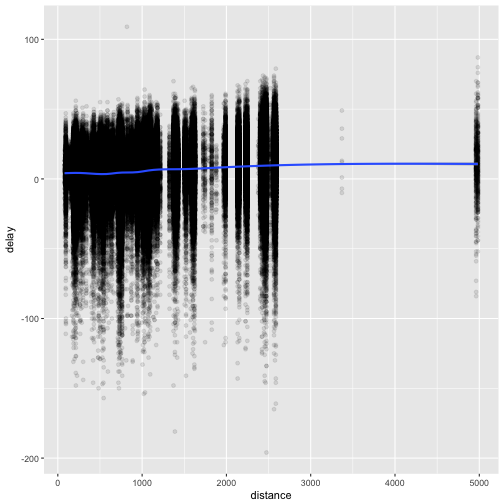
Sag mal, plotten wir gerade wirklich 300.000 Punkte??? Das kann dauern…
Das alpha = .1 macht die Punkte blässlich, fast durchsichtig. Ganz praktisch, wenn viele Punkte aufeinander liegen.
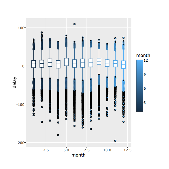
Hängen Verspätung und Jahreszeit zusammen?
Auch eine ganz interessante Frage. Schauen wir mal:
cor(flights$month, flights$dep_delay, use = "complete")
## [1] -0.02005702
Das use = complete sagt, dass wir Zeilen mit fehlenden Werten ignorieren.
Sieht also nicht nach einem Zusammenhang aus. Das sollte uns ein Diagramm auch bestätigen:
flights %>%
  group_by(month) %>%
  na.omit() %>%  # alle Zeilen mit fehlenden Werten löschen
  mutate(delay = dep_delay - arr_delay) %>%
  ggplot(aes(x = month, y = delay)) + geom_boxplot()
## Warning: Continuous x aesthetic -- did you forget aes(group=...)?
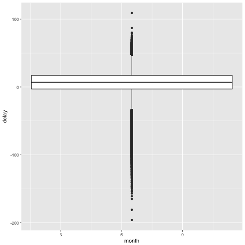
Upps, das sieht ja komisch aus… Hm..ggplot schlägt vor, wir sollen irgendwie group mit reinwursten… Naja, unsere Gruppen könnten die Monate sein. Also probieren wir’s mal…
flights %>%
  group_by(month) %>%
  na.omit() %>%  # alle Zeilen mit fehlenden Werten löschen
  mutate(delay = dep_delay - arr_delay) %>%
  ggplot(aes(x = month, y = delay, group = month)) + geom_boxplot()
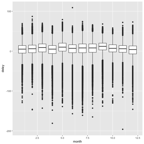
Die X-Achse sieht noch nicht so toll aus (mit den Nachkommastellen), aber das heben wir uns für eine andere Gelegenheit auf :-)
Noch ein kleiner Bonus zum Abschluss: Interaktive Diagramme!
Dazu müssen wir erstmal ein neues Paket laden: plotly (und ggf. vorher installieren).
# install.packages("plotly")
library(plotly)
plotly kann man ein ggplot-Objekt übergeben, welches dann automatisch in ein interaktives Diagramm übersetzt wird. Macht natürlich nur Sinn, wenn man das am Computer anschaut; ausgedruckt ist es dann nicht interaktiv…
flights %>%
  group_by(month) %>%
  na.omit() %>%  # alle Zeilen mit fehlenden Werten löschen
  mutate(delay = dep_delay - arr_delay) %>%
  ggplot(aes(x = month, y = delay, group = month, color = month)) + geom_boxplot() -> flights_plot

ggplotly(flights_plot)
Für heute reicht’s!