In dieser Fallstudie (YACSDA: Yet another case study of data analysis) wird der Datensatz TopGear analysiert, vor allem mit grafischen Mitteln. Es handelt sich weniger um einen “Rundumschlag” zur Beantwortung aller möglichen interessanten Fragen (oder zur Demonstration aller möglichen Analysewerkzeuge), sondern eher um einen Einblick zu einfachen explorativen Verfahren.
library(robustHD)
## Loading required package: perry
## Loading required package: parallel
## Loading required package: robustbase
data(TopGear)  # Daten aus Package laden
library(tidyverse)
Numerischer Überblick
glimpse(TopGear)
## Observations: 297
## Variables: 32
## $ Maker              <fctr> Alfa Romeo, Alfa Romeo, Aston Martin, Asto...
## $ Model              <fctr> Giulietta, MiTo, Cygnet, DB9, DB9 Volante,...
## $ Type               <fctr> Giulietta 1.6 JTDM-2 105 Veloce 5d, MiTo 1...
## $ Fuel               <fctr> Diesel, Petrol, Petrol, Petrol, Petrol, Pe...
## $ Price              <dbl> 21250, 15155, 30995, 131995, 141995, 396000...
## $ Cylinders          <dbl> 4, 4, 4, 12, 12, 12, 12, 8, 8, 4, 4, 4, 4, ...
## $ Displacement       <dbl> 1598, 1368, 1329, 5935, 5935, 5935, 5935, 4...
## $ DriveWheel         <fctr> Front, Front, Front, Rear, Rear, Rear, Rea...
## $ BHP                <dbl> 105, 105, 98, 517, 517, 510, 573, 420, 420,...
## $ Torque             <dbl> 236, 95, 92, 457, 457, 420, 457, 346, 346, ...
## $ Acceleration       <dbl> 11.3, 10.7, 11.8, 4.6, 4.6, 4.2, 4.1, 4.7, ...
## $ TopSpeed           <dbl> 115, 116, 106, 183, 183, 190, 183, 180, 180...
## $ MPG                <dbl> 64, 49, 56, 19, 19, 17, 19, 20, 20, 55, 54,...
## $ Weight             <dbl> 1385, 1090, 988, 1785, 1890, 1680, 1739, 16...
## $ Length             <dbl> 4351, 4063, 3078, 4720, 4720, 4385, 4720, 4...
## $ Width              <dbl> 1798, 1720, 1680, NA, NA, 1865, 1910, 1865,...
## $ Height             <dbl> 1465, 1446, 1500, 1282, 1282, 1250, 1294, 1...
## $ AdaptiveHeadlights <fctr> optional, optional, no, standard, standard...
## $ AdjustableSteering <fctr> standard, standard, standard, standard, st...
## $ AlarmSystem        <fctr> standard, standard, no/optional, no/option...
## $ Automatic          <fctr> no, no, optional, standard, standard, no, ...
## $ Bluetooth          <fctr> standard, standard, standard, standard, st...
## $ ClimateControl     <fctr> standard, optional, standard, standard, st...
## $ CruiseControl      <fctr> standard, standard, standard, standard, st...
## $ ElectricSeats      <fctr> optional, no, no, standard, standard, stan...
## $ Leather            <fctr> optional, optional, no, standard, standard...
## $ ParkingSensors     <fctr> optional, standard, no, standard, standard...
## $ PowerSteering      <fctr> standard, standard, standard, standard, st...
## $ SatNav             <fctr> optional, optional, standard, standard, st...
## $ ESP                <fctr> standard, standard, standard, standard, st...
## $ Verdict            <dbl> 6, 5, 7, 7, 7, 7, 7, 8, 7, 6, 7, 6, 5, 7, 6...
## $ Origin             <fctr> Europe, Europe, Europe, Europe, Europe, Eu...
summary(TopGear)
##            Maker                      Model
##  Mercedes-Benz: 19   Roadster            :  2
##  Audi         : 18   1 Series            :  1
##  BMW          : 18   1 Series Convertible:  1
##  Vauxhall     : 17   1 Series Coupe      :  1
##  Volkswagen   : 15   107                 :  1
##  Toyota       : 11   207 CC              :  1
##  (Other)      :199   (Other)             :290
##                             Type         Fuel         Price
##  107 1.0 68 Active 5d         :  1   Diesel:112   Min.   :   6950
##  118d SE 5d                   :  1   Petrol:180   1st Qu.:  18910
##  120d SE Convertible 2d       :  1   NA's  :  5   Median :  26495
##  120i M Sport Coupe 2d        :  1                Mean   :  50784
##  12C 3.8 V8 TT 625 Standard 2d:  1                3rd Qu.:  44195
##  207 CC 1.6 VTi 120 GT 2d     :  1                Max.   :1139985
##  (Other)                      :291
##    Cylinders       Displacement  DriveWheel       BHP
##  Min.   : 0.000   Min.   : 647   4WD  : 67   Min.   : 17.0
##  1st Qu.: 4.000   1st Qu.:1560   Front:147   1st Qu.:112.0
##  Median : 4.000   Median :1995   Rear : 78   Median :160.0
##  Mean   : 5.055   Mean   :2504   NA's :  5   Mean   :218.3
##  3rd Qu.: 6.000   3rd Qu.:2988               3rd Qu.:258.0
##  Max.   :16.000   Max.   :7993               Max.   :987.0
##  NA's   :4        NA's   :9                  NA's   :4
##      Torque       Acceleration       TopSpeed          MPG
##  Min.   : 42.0   Min.   : 0.000   Min.   : 50.0   Min.   : 10.00
##  1st Qu.:151.0   1st Qu.: 5.900   1st Qu.:112.0   1st Qu.: 34.00
##  Median :236.0   Median : 9.100   Median :126.0   Median : 47.00
##  Mean   :255.4   Mean   : 8.839   Mean   :132.7   Mean   : 48.11
##  3rd Qu.:324.0   3rd Qu.:11.400   3rd Qu.:151.0   3rd Qu.: 57.00
##  Max.   :922.0   Max.   :16.900   Max.   :252.0   Max.   :470.00
##  NA's   :4                        NA's   :4       NA's   :12
##      Weight         Length         Width          Height
##  Min.   : 210   Min.   :2337   Min.   :1237   Min.   :1115
##  1st Qu.:1244   1st Qu.:4157   1st Qu.:1760   1st Qu.:1421
##  Median :1494   Median :4464   Median :1815   Median :1484
##  Mean   :1536   Mean   :4427   Mean   :1811   Mean   :1510
##  3rd Qu.:1774   3rd Qu.:4766   3rd Qu.:1877   3rd Qu.:1610
##  Max.   :2705   Max.   :5612   Max.   :2073   Max.   :1951
##  NA's   :33     NA's   :11     NA's   :16     NA's   :11
##  AdaptiveHeadlights AdjustableSteering      AlarmSystem     Automatic
##  no      :137       no      : 73       no/optional:112   no      :111
##  optional: 28       standard:224       standard   :185   optional: 87
##  standard:132                                            standard: 99
##
##
##
##
##     Bluetooth    ClimateControl  CruiseControl  ElectricSeats
##  no      : 55   no      : 83    no      : 87   no      :187
##  optional: 46   optional: 35    optional: 35   optional: 35
##  standard:196   standard:179    standard:175   standard: 75
##
##
##
##
##      Leather     ParkingSensors  PowerSteering      SatNav
##  no      :124   no      : 72    no      : 27   no      : 86
##  optional: 56   optional: 61    standard:270   optional:116
##  standard:117   standard:164                   standard: 95
##
##
##
##
##        ESP         Verdict          Origin
##  no      : 24   Min.   : 1.000   Asia  : 74
##  optional: 16   1st Qu.: 5.000   Europe:198
##  standard:257   Median : 7.000   USA   : 25
##                 Mean   : 6.339
##                 3rd Qu.: 7.000
##                 Max.   :10.000
##                 NA's   :2
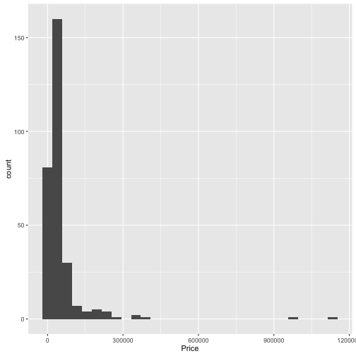
Wie verteilen sich die Preise?
Die Funktion qplot() ist ein einfacher Weg, um Daten zu visualisieren.
qplot(data = TopGear, x = Price, geom = "histogram")
## `stat_bin()` using `bins = 30`. Pick better value with `binwidth`.
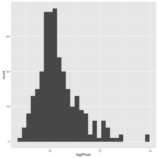
qplot(data = TopGear, x = log(Price), geom = "histogram")
## `stat_bin()` using `bins = 30`. Pick better value with `binwidth`.
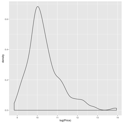
qplot(data = TopGear, x = log(Price), geom = "density")
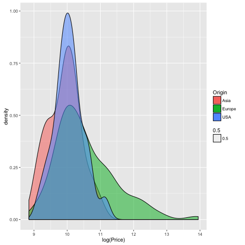
qplot(data = TopGear, x = log(Price), geom = "density", fill = Origin,
      alpha = .5)
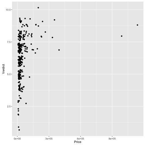
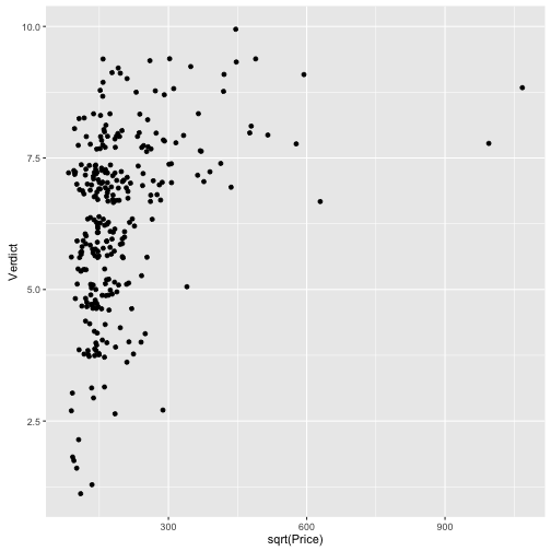
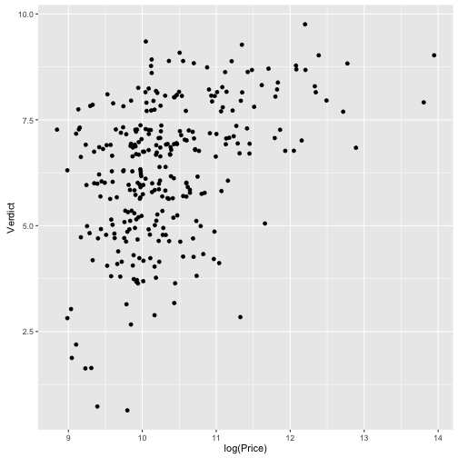
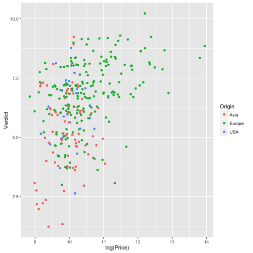
Wie ist der Zusammenhang von Preis und Beurteilung des Autos?
qplot(data = TopGear, x = Price, y = Verdict, geom = "jitter")
## Warning: Removed 2 rows containing missing values (geom_point).
qplot(data = TopGear, x = sqrt(Price), y = Verdict, geom = "jitter")
## Warning: Removed 2 rows containing missing values (geom_point).
qplot(data = TopGear, x = log(Price), y = Verdict, geom = "jitter")
## Warning: Removed 2 rows containing missing values (geom_point).
qplot(data = TopGear, x = log(Price), y = Verdict, geom = "jitter",
      color = Origin)
## Warning: Removed 2 rows containing missing values (geom_point).
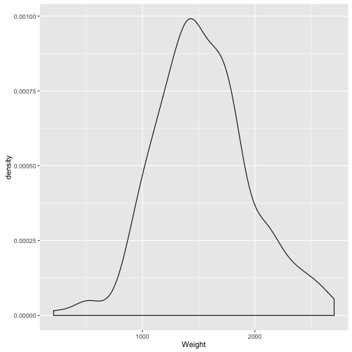
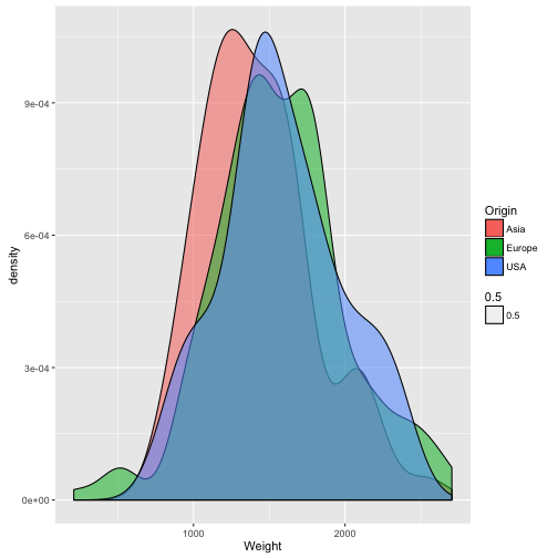
Wie verteilt sich das Gewicht der Autos?
qplot(data = TopGear, x = Weight, geom = "density")
## Warning: Removed 33 rows containing non-finite values (stat_density).
qplot(data = TopGear, x = Weight, geom = "density", fill = Origin, alpha = .5)
## Warning: Removed 33 rows containing non-finite values (stat_density).
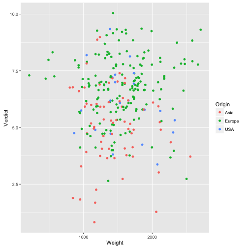
Hängt Gewicht mit Preis zusammen?
qplot(data = TopGear, x = Weight, y = Verdict, geom = "jitter",
      color = Origin)
## Warning: Removed 35 rows containing missing values (geom_point).
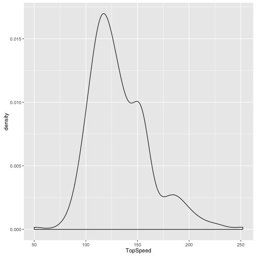
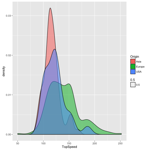
Wie verteilt sich die Geschwindigkeit der Autos?
qplot(data = TopGear, x = TopSpeed, geom = "density")
## Warning: Removed 4 rows containing non-finite values (stat_density).
qplot(data = TopGear, x = TopSpeed, geom = "density", fill = Origin, alpha = .5)
## Warning: Removed 4 rows containing non-finite values (stat_density).
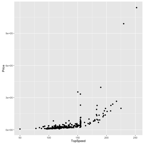
Hängt Preis mit Geschwindigkeit zusammen?
qplot(data = TopGear, x = TopSpeed, y = Price, geom = "jitter")
## Warning: Removed 4 rows containing missing values (geom_point).
qplot(data = TopGear, x = TopSpeed, y = log(Price), geom = "jitter")
## Warning: Removed 4 rows containing missing values (geom_point).
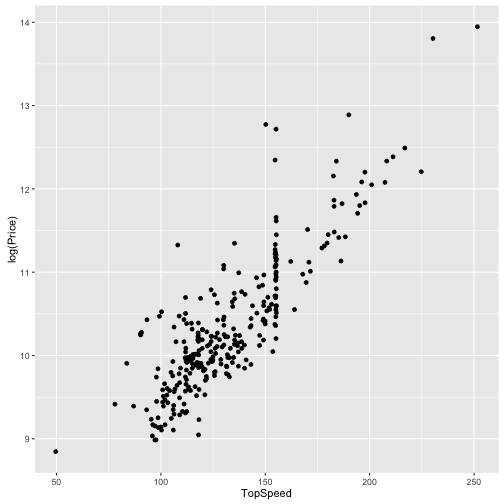
Deutlicher Unterschied zwischen Roh-Preiswerten und log-Preiswerten!
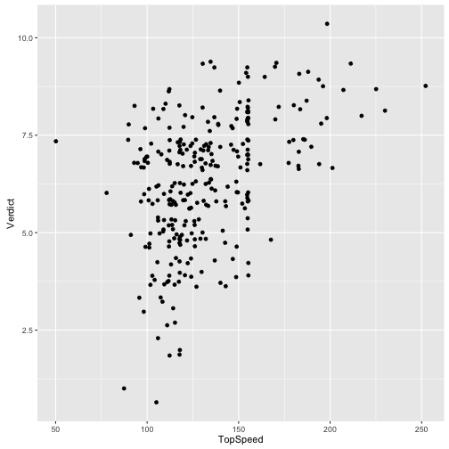
Wie hängt Geschwindigkeit mit Beurteilung zusammen?
qplot(data = TopGear, x = TopSpeed, y = Verdict, geom = "jitter")
## Warning: Removed 6 rows containing missing values (geom_point).
summary(TopGear$Maker)
##    Alfa Romeo  Aston Martin          Audi       Bentley           BMW
##             2             7            18             4            18
##       Bugatti      Caterham     Chevrolet      Chrysler       Citroen
##             1             2             7             4            10
##      Corvette         Dacia       Ferrari          Fiat          Ford
##             1             2             4             7            10
##         Honda       Hyundai      Infiniti        Jaguar          Jeep
##             6             9             4             6             3
##           Kia   Lamborghini    Land Rover         Lexus         Lotus
##             8             2             6             4             3
##      Maserati         Mazda       McLaren Mercedes-Benz          Mini
##             2             3             1            19             6
##    Mitsubishi        Morgan        Nissan         Noble        Pagani
##             5             3             8             1             1
##       Perodua       Peugeot       Porsche        Proton       Renault
##             1            10             4             3             6
##   Rolls-Royce          SEAT         Skoda         Smart     Ssangyong
##             3             5             4             1             1
##        Subaru        Suzuki        Toyota      Vauxhall    Volkswagen
##             4             7            11            17            15
##         Volvo
##             8
Welche Hersteller hat die meisten Autotypen?
TopGear %>%
  select(Maker) %>%
  count(Maker) %>%
  arrange(desc(Maker))
## # A tibble: 51 × 2
##         Maker     n
##        <fctr> <int>
## 1       Volvo     8
## 2  Volkswagen    15
## 3    Vauxhall    17
## 4      Toyota    11
## 5      Suzuki     7
## 6      Subaru     4
## 7   Ssangyong     1
## 8       Smart     1
## 9       Skoda     4
## 10       SEAT     5
## # ... with 41 more rows
Maker_freq <-
  TopGear %>%
  select(Maker) %>%
  count(Maker) %>%
  arrange(desc(Maker))


Maker_Verdict <-
  TopGear %>%
  group_by(Maker)  %>%
  summarise(n = n(),
            Verdict_mean = mean(Verdict),
            Price_mean = mean(Price, na.rm = T)) %>%
  arrange(desc(Verdict_mean))

glimpse(Maker_Verdict)
## Observations: 51
## Variables: 4
## $ Maker        <fctr> Bugatti, McLaren, Noble, Land Rover, Lotus, Roll...
## $ n            <int> 1, 1, 1, 6, 3, 3, 4, 1, 4, 6, 2, 2, 10, 19, 7, 1,...
## $ Verdict_mean <dbl> 9.000000, 9.000000, 9.000000, 8.333333, 8.333333,...
## $ Price_mean   <dbl> 1139985.00, 176000.00, 200000.00, 48479.17, 49883...
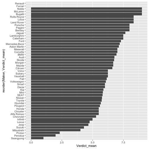
ggplot(Maker_Verdict, aes(x = reorder(Maker, Verdict_mean), y = Verdict_mean)) +
  geom_bar(stat = "identity") +
  coord_flip()
## Warning: Removed 2 rows containing missing values (position_stack).
Die 10% größten Hersteller
Big10perc <-
  Maker_Verdict %>%
  filter(percent_rank(n) > .9)
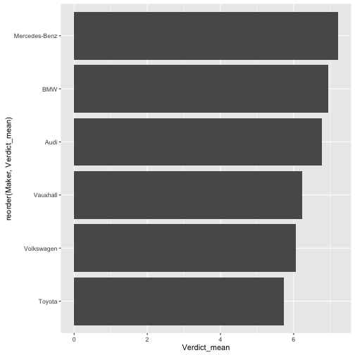
Beliebtheit der 10% größten Hersteller
Maker_Verdict %>%
  filter(percent_rank(n) > .89) %>%
  ggplot(., aes(x = reorder(Maker, Verdict_mean), y = Verdict_mean)) +
           geom_bar(stat = "identity") +
  coord_flip()
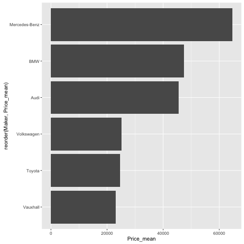
Milttlerer Preis der 10% größten Hersteller
Maker_Verdict %>%
  filter(percent_rank(n) > .89) %>%
  ggplot(., aes(x = reorder(Maker, Price_mean), y = Price_mean)) +
  geom_bar(stat = "identity") +
  coord_flip()
Überblick zu den 10% größten Hersteller
TopGear %>%
  filter(Maker %in% Big10perc$Maker) %>%
 summary()
##            Maker                     Model
##  Mercedes-Benz:19   1 Series            : 1
##  Audi         :18   1 Series Convertible: 1
##  BMW          :18   1 Series Coupe      : 1
##  Vauxhall     :17   3 Series            : 1
##  Volkswagen   :15   3 Series Convertible: 1
##  Toyota       :11   4 Series Coupe      : 1
##  (Other)      : 0   (Other)             :92
##                           Type        Fuel        Price
##  118d SE 5d                 : 1   Diesel:39   Min.   :  9450
##  120d SE Convertible 2d     : 1   Petrol:59   1st Qu.: 22689
##  120i M Sport Coupe 2d      : 1               Median : 31850
##  325i M Sport 2d Convertible: 1               Mean   : 40239
##  328i Luxury 4d 2012        : 1               3rd Qu.: 49961
##  428i Luxury 2d             : 1               Max.   :176895
##  (Other)                    :92
##    Cylinders       Displacement  DriveWheel      BHP
##  Min.   : 2.000   Min.   : 647   4WD  :27   Min.   : 67.0
##  1st Qu.: 4.000   1st Qu.:1598   Front:40   1st Qu.:140.0
##  Median : 4.000   Median :1995   Rear :31   Median :189.5
##  Mean   : 4.969   Mean   :2501              Mean   :224.0
##  3rd Qu.: 6.000   3rd Qu.:2986              3rd Qu.:258.0
##  Max.   :10.000   Max.   :6208              Max.   :571.0
##
##      Torque       Acceleration       TopSpeed          MPG
##  Min.   : 66.0   Min.   : 3.100   Min.   : 93.0   Min.   : 19.00
##  1st Qu.:184.0   1st Qu.: 5.900   1st Qu.:118.0   1st Qu.: 36.00
##  Median :258.0   Median : 8.000   Median :137.0   Median : 43.50
##  Mean   :275.0   Mean   : 8.387   Mean   :135.8   Mean   : 50.36
##  3rd Qu.:367.8   3rd Qu.: 9.900   3rd Qu.:155.0   3rd Qu.: 55.00
##  Max.   :590.0   Max.   :16.900   Max.   :196.0   Max.   :470.00
##
##      Weight         Length         Width          Height
##  Min.   : 800   Min.   :2985   Min.   :1615   Min.   :1244
##  1st Qu.:1395   1st Qu.:4316   1st Qu.:1781   1st Qu.:1416
##  Median :1600   Median :4616   Median :1826   Median :1470
##  Mean   :1629   Mean   :4538   Mean   :1829   Mean   :1502
##  3rd Qu.:1831   3rd Qu.:4836   3rd Qu.:1881   3rd Qu.:1590
##  Max.   :2555   Max.   :5179   Max.   :1983   Max.   :1951
##  NA's   :13     NA's   :2      NA's   :2      NA's   :2
##  AdaptiveHeadlights AdjustableSteering      AlarmSystem    Automatic
##  no      :26        no      :12        no/optional:26   no      :23
##  optional:13        standard:86        standard   :72   optional:33
##  standard:59                                            standard:42
##
##
##
##
##     Bluetooth   ClimateControl  CruiseControl  ElectricSeats     Leather
##  no      : 9   no      :18     no      :17    no      :48    no      :23
##  optional:22   optional:14     optional:19    optional:24    optional:25
##  standard:67   standard:66     standard:62    standard:26    standard:50
##
##
##
##
##   ParkingSensors  PowerSteering      SatNav         ESP
##  no      : 9     no      : 6    no      :13   no      : 3
##  optional:28     standard:92    optional:49   optional: 3
##  standard:61                    standard:36   standard:92
##
##
##
##
##     Verdict         Origin
##  Min.   :3.000   Asia  :11
##  1st Qu.:6.000   Europe:87
##  Median :7.000   USA   : 0
##  Mean   :6.571
##  3rd Qu.:8.000
##  Max.   :9.000
##
Anzahl Modellytypen der großen Hersteller als Torte (hüstel)
ggplot(Big10perc, aes(x = Maker, y = n, fill = Maker)) + coord_polar() +
  geom_bar(stat="identity")
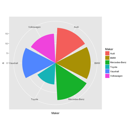
Torten stehen nicht auf dem Speiseplan…
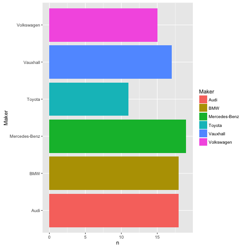
Anzahl Modellytypen der großen Hersteller
ggplot(Big10perc, aes(x = Maker, y = n, fill = Maker)) +
  geom_bar(stat="identity") + coord_flip()
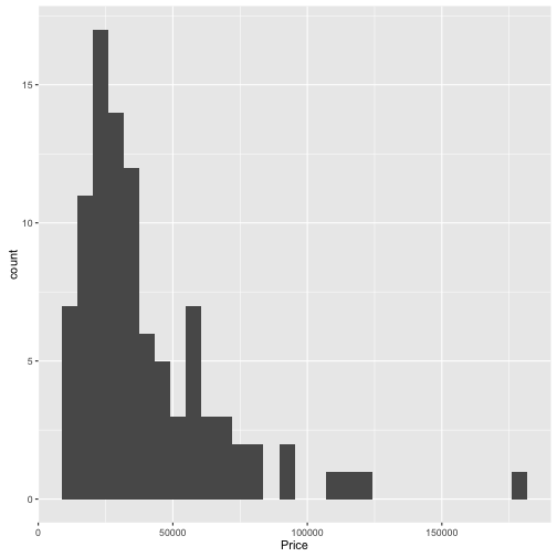
Preisverteilung der 10% größten Hersteller
TopGear %>%
  filter(Maker %in% Big10perc$Maker) %>%
  qplot(data = ., x = Price)
## `stat_bin()` using `bins = 30`. Pick better value with `binwidth`.
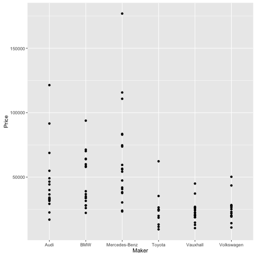
TopGear %>%
  filter(Maker %in% Big10perc$Maker) %>%
  qplot(data = ., y = Price, x = Maker)
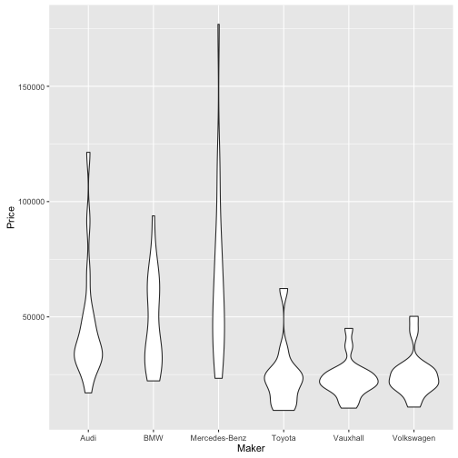
TopGear %>%
  filter(Maker %in% Big10perc$Maker) %>%
  qplot(data = ., y = Price, x = Maker, geom = "violin")
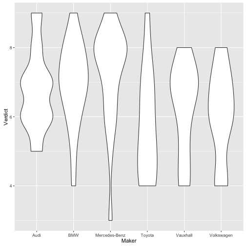
Beliebtheitsverteilung der 10% größten Hersteller
TopGear %>%
  filter(Maker %in% Big10perc$Maker) %>%
  qplot(data = ., y = Verdict, x = Maker, geom = "violin")
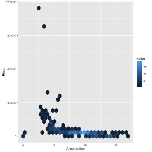
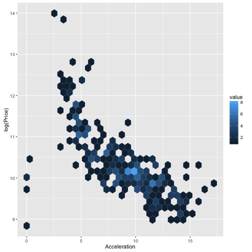
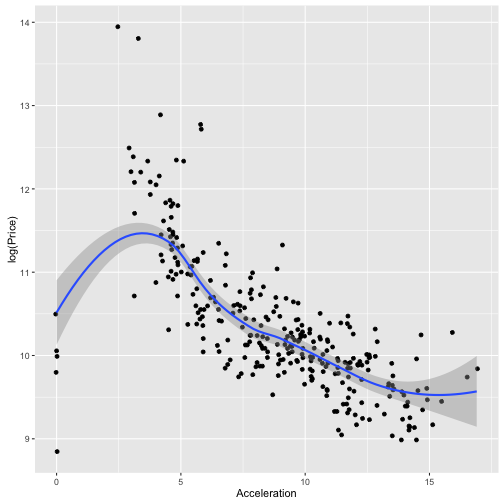
Hängt Beschleunigung mit dem Preis zusammen?
ggplot(TopGear, aes(x = Acceleration, y = Price)) + geom_hex()
ggplot(TopGear, aes(x = Acceleration, y = log(Price))) + geom_hex()
ggplot(TopGear, aes(x = Acceleration, y = log(Price))) + geom_jitter() +
  geom_smooth()
## `geom_smooth()` using method = 'loess'
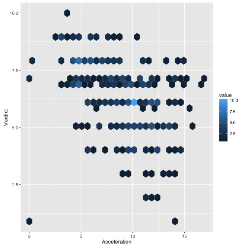
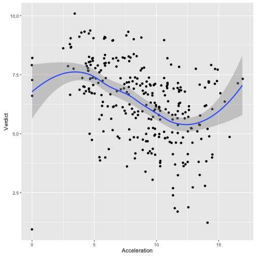
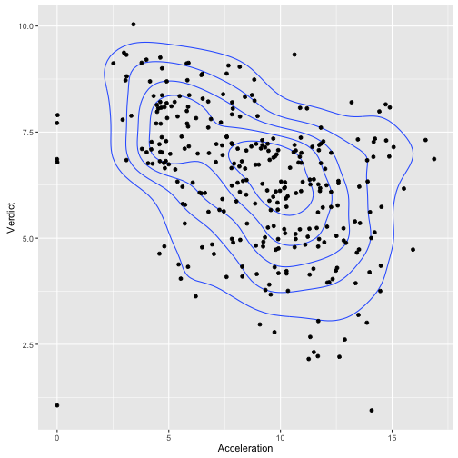
Hängt Beschleunigung mit Beurteilung zusammen?
ggplot(TopGear, aes(x = Acceleration, y = Verdict)) + geom_hex()
## Warning: Removed 2 rows containing non-finite values (stat_binhex).
ggplot(TopGear, aes(x = Acceleration, y = Verdict)) + geom_jitter() +
  geom_smooth()
## `geom_smooth()` using method = 'loess'
## Warning: Removed 2 rows containing non-finite values (stat_smooth).
## Warning: Removed 2 rows containing missing values (geom_point).
ggplot(TopGear, aes(x = Acceleration, y = Verdict)) + geom_density2d() +
  geom_jitter()
## Warning: Removed 2 rows containing non-finite values (stat_density2d).

## Warning: Removed 2 rows containing missing values (geom_point).
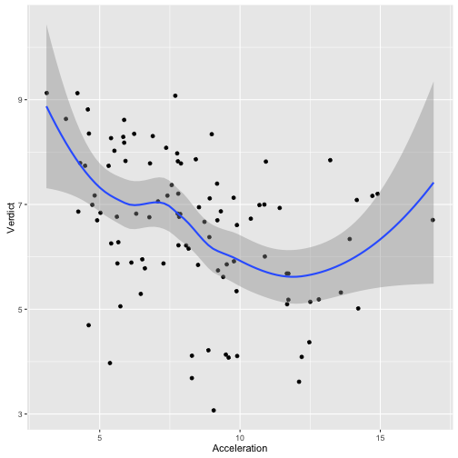
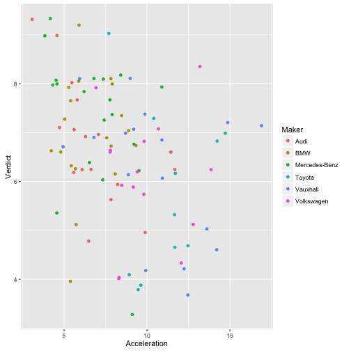
Hängt Beschleunigung mit Beurteilung zusammen? - Nur die großen Hersteller
ggplot(filter(TopGear, Maker %in% Big10perc$Maker) ,
       aes(x = Acceleration, y = Verdict)) + geom_jitter() +
  geom_smooth()
## `geom_smooth()` using method = 'loess'
ggplot(filter(TopGear, Maker %in% Big10perc$Maker) ,
       aes(x = Acceleration, y = Verdict, color = Maker)) + geom_jitter()
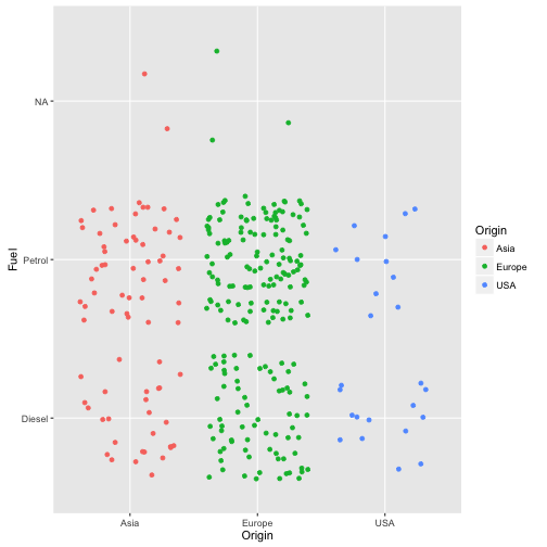
Hängt die Verwendung bestimmter Sprit-Arten mit dem Kontinent zusammen?
ggplot(TopGear, aes(x = Origin, y = Fuel, color = Origin)) + geom_jitter()

 .
.