We are often interested in the question whether two variables are “associated”, “correlated” (I mean the normal English term) or “dependent”. What exactly, or rather in normal words, does that mean? Let’s look at some easy case.

NOTE: The example has been updated to reflect a more tangible and sensible scenario (find the old one in the previous commit at Github).

Titanic data

For example, let’s look at survival rates of the Titanic disaster, to see whether the probability of survival (event A) depends on the whether you embarked for 1st class (event B).

Let’s load the data and have a look at them.

data(titanic_train, package = "titanic")

library(tidyverse)  # plotting and data mungling
library(pander)  # for markdown tables

data <- titanic_train
glimpse(data)
## Observations: 891
## Variables: 12
## $ PassengerId <int> 1, 2, 3, 4, 5, 6, 7, 8, 9, 10, 11, 12, 13, 14, 15,...
## $ Survived    <int> 0, 1, 1, 1, 0, 0, 0, 0, 1, 1, 1, 1, 0, 0, 0, 1, 0,...
## $ Pclass      <int> 3, 1, 3, 1, 3, 3, 1, 3, 3, 2, 3, 1, 3, 3, 3, 2, 3,...
## $ Name        <chr> "Braund, Mr. Owen Harris", "Cumings, Mrs. John Bra...
## $ Sex         <chr> "male", "female", "female", "female", "male", "mal...
## $ Age         <dbl> 22, 38, 26, 35, 35, NA, 54, 2, 27, 14, 4, 58, 20, ...
## $ SibSp       <int> 1, 1, 0, 1, 0, 0, 0, 3, 0, 1, 1, 0, 0, 1, 0, 0, 4,...
## $ Parch       <int> 0, 0, 0, 0, 0, 0, 0, 1, 2, 0, 1, 0, 0, 5, 0, 0, 1,...
## $ Ticket      <chr> "A/5 21171", "PC 17599", "STON/O2. 3101282", "1138...
## $ Fare        <dbl> 7.2500, 71.2833, 7.9250, 53.1000, 8.0500, 8.4583, ...
## $ Cabin       <chr> "", "C85", "", "C123", "", "", "E46", "", "", "", ...
## $ Embarked    <chr> "S", "C", "S", "S", "S", "Q", "S", "S", "S", "C", ...

Look at the package description for some details on the variables.

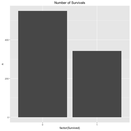
Let’s look at the survival rate in general, that is to say to probability of A - irrespective of the the class (1st class or not 1st class).

data %>% 
  count(Survived) %>% 
  ggplot + 
  aes(x = factor(Survived), y = n) +
  geom_bar(stat = "identity") +
  ggtitle("Number of Survivals") +
  theme(plot.title = element_text(hjust = .5))

plot of chunk unnamed-chunk-3

Maybe that’s a better plot:

data %>% 
  count(Survived) %>% 
  ggplot + 
  aes(x = factor(1), fill = factor(Survived), y = n) +
  geom_bar(stat = "identity") +
  ggtitle("Number of Survivals") +
  theme(plot.title = element_text(hjust = .5)) +
  xlab("")

plot of chunk unnamed-chunk-4

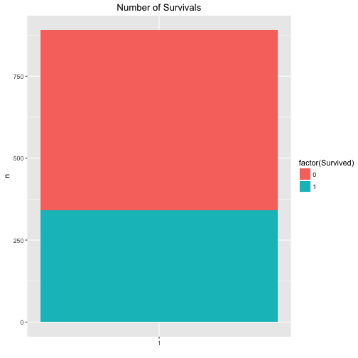
The exact figures are for the survivals are:

data %>% 
  count(Survived)
## # A tibble: 2 × 2
##   Survived     n
##      <int> <int>
## 1        0   549
## 2        1   342

The exact figures are for the classes (1st vs. other) are:

data %>% 
  mutate(Pclass_bin = ifelse(Pclass == 1, "1st", "not_1st")) %>% 
  count(Pclass_bin)
## # A tibble: 2 × 2
##   Pclass_bin     n
##        <chr> <int>
## 1        1st   216
## 2    not_1st   675

… and the number of passengers per class (1st class vs. other classes) is:

data %>% 
  mutate(Pclass_bin = ifelse(Pclass == 1, "1st", "not_1st")) %>% 
  count(Survived, Pclass_bin)
## Source: local data frame [4 x 3]
## Groups: Survived [?]
## 
##   Survived Pclass_bin     n
##      <int>      <chr> <int>
## 1        0        1st    80
## 2        0    not_1st   469
## 3        1        1st   136
## 4        1    not_1st   206

So, that was warming up. Let’s see what the probability (percentage) of survival is for both 1st class and non-first class.

data %>% 
  mutate(Pclass_bin = ifelse(Pclass == 1, "1st", "not_1st")) %>% 
  count(Pclass_bin, Survived) %>% 
  ggplot + 
  aes(x = factor(Pclass_bin), fill = factor(Survived), y = n, labels = n) +
  geom_bar(stat = "identity") +
  ggtitle("Probability of Survivals given Passenager class") +
  theme(plot.title = element_text(hjust = .5))

plot of chunk unnamed-chunk-8

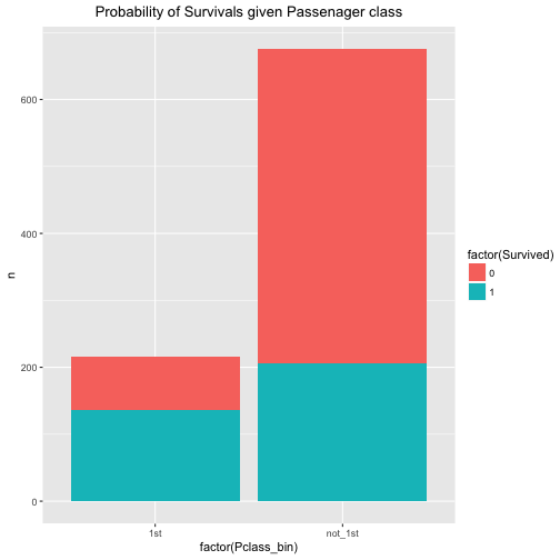
We easily conclude that the probability of survival is associated with passenger class. The probability of survival (event A) given 1st class (event B) is considerably higher than the probability of A given non-B (event B is “not 1st class”).

The exact numbers are:

data %>% 
  mutate(Pclass_bin = ifelse(Pclass == 1, "1st", "not_1st")) %>% 
  count(Pclass_bin, Survived) -> data_2

data_2
## Source: local data frame [4 x 3]
## Groups: Pclass_bin [?]
## 
##   Pclass_bin Survived     n
##        <chr>    <int> <int>
## 1        1st        0    80
## 2        1st        1   136
## 3    not_1st        0   469
## 4    not_1st        1   206
pandoc.table(data_2, style = "rmarkdown")
Pclass_bin Survived n
1st 0 80
1st 1 136
not_1st 0 469
not_1st 1 206

General notion of stochastic independence

A typical definition of stochastic (or statistic) independence is this:

That means in plain English, that the probability of A (survival) given B (1st class) is equal to A irrespective of B, that means irrespective of B is the case or non-B is the case. In short, that would mean the survival probability is equal in both cases (B or non-B).

In math-speak:

Here, the “cup” means “OR”.

It than follows that if we deduce

Or more verbose in our Titanic example:

$$p(Survival 1stClass) = p(Survival 1stclass) OR non1stCalss}) = p(Survial non1stClass)$$.

In words, whether someone survives is independent from the question of his or her passenger class: Survival probability is the the same in 1st class and in the other classes (“non 1st class”).

Let’s look at the data of our example:

In R:

p_A <- 342 / (549+342)
p_nonA <- 549 / (549+342)

p_B <- 216 / (216 + 675)
p_nonB <- 549 / (549+342)


p_B <- 216 / (216 + 675)
p_nonB <- 675 / (216 + 675)
p_A_given_B <- 136 / (80+136)
P_nonA_given_B <- 80 / (80+136)

p_A_given_nonB <- 206 / (206+469)
p_nonA_given_nonB <- 469 / (206+469)


p_diff <- p_A_given_B - p_A_given_nonB
p_diff
## [1] 0.3244444

The difference p(A|B) - p(A|nonB) is not zero. Actually it is quite far away: If you are in 1st, your survival rate is 32% higher if you were not in 1st class. Quite strong. However, note that this last step is subjective, no job for statistics.

Finally, let’s look for two variable which are not associated. For example: Shoe size (of adults) and their bank account number.

In our dataset, what about port of Embarkement: Southampton vs. not Southampton and Survival rate.

data %>% 
  mutate(Embarked_bin = ifelse(Embarked == "S", "S", "not_S")) %>% 
  select(Embarked_bin, Survived) %>% 
  count(Embarked_bin, Survived) %>% 
  ggplot +
  aes(x = Embarked_bin, y = n, fill = factor(Survived)) +
  geom_bar(stat = "identity")

plot of chunk unnamed-chunk-12

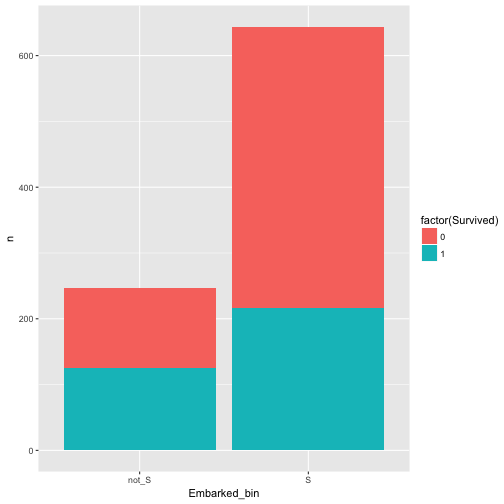
Hm, appears to be related/associated/dependent/correlated.

Maybe better plot like this:

data %>% 
  mutate(Embarked_bin = ifelse(Embarked == "S", "S", "not_S")) %>% 
  select(Embarked_bin, Survived) %>% 
  count(Embarked_bin, Survived) %>% 
  ggplot +
  aes(x = Embarked_bin, y = n, fill = factor(Survived)) +
  geom_bar(stat = "identity", position = "fill")

plot of chunk unnamed-chunk-13

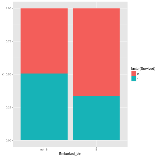
Ah, yes, there is some dependence.

Ok, last try, this is should be a save win: Whether fare is an odd number (eg., 7 Pound) and survival are related.

data %>% 
  mutate(Fare_odd = ifelse(round(Fare) %% 2 == 0, "even", "odd")) %>% 
  select(Fare_odd, Survived) %>% 
  count(Fare_odd, Survived) %>% 
  ggplot +
  aes(x = Fare_odd, y = n, fill = factor(Survived)) +
  geom_bar(stat = "identity", position = "fill")

plot of chunk unnamed-chunk-14

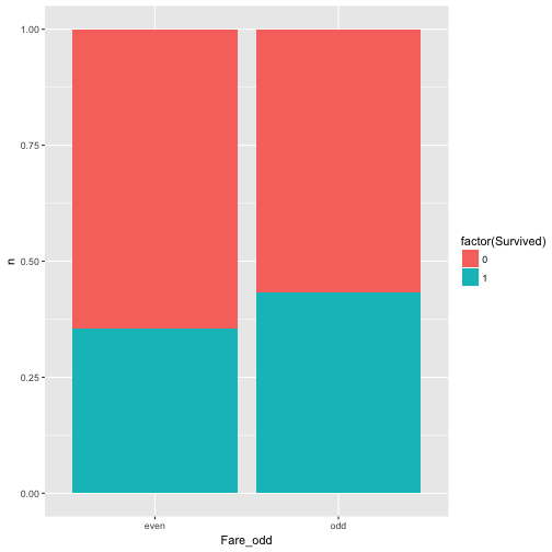
Well, nearly equal, approximately independent, or independent enough for me (as said, that’s subjective).

Concluding remarks

Of course there are numerous ways to “measure” the strength of assocation. Odds ratios, for example, a popular choice. The reason why I like or presented this version is that I find it intuitively appealing. In my teaching I found that the Odds Ratio was somewhat more difficult to grasp at first.

Also note that we where looking at discrete events, not continuous.

I found myself doing the following: I had a bunch of predictors, one (numeric) outcome, and wanted to run I simple regression for each of the predictors. Having a bunch of model results, I would like to have them bundled in one data frame.

So, here is one way to do it.

First, load some data.

data(mtcars)
str(mtcars)
## 'data.frame':	32 obs. of  11 variables:
##  $ mpg : num  21 21 22.8 21.4 18.7 18.1 14.3 24.4 22.8 19.2 ...
##  $ cyl : num  6 6 4 6 8 6 8 4 4 6 ...
##  $ disp: num  160 160 108 258 360 ...
##  $ hp  : num  110 110 93 110 175 105 245 62 95 123 ...
##  $ drat: num  3.9 3.9 3.85 3.08 3.15 2.76 3.21 3.69 3.92 3.92 ...
##  $ wt  : num  2.62 2.88 2.32 3.21 3.44 ...
##  $ qsec: num  16.5 17 18.6 19.4 17 ...
##  $ vs  : num  0 0 1 1 0 1 0 1 1 1 ...
##  $ am  : num  1 1 1 0 0 0 0 0 0 0 ...
##  $ gear: num  4 4 4 3 3 3 3 4 4 4 ...
##  $ carb: num  4 4 1 1 2 1 4 2 2 4 ...

Say, mpg is our outcome/ criterion. The rest of the variables are predictors.

Then, some packages.

library(dplyr)
library(purrr)
library(tibble)
library(ggplot2)
library(stringr)
library(tidyr)
library(broom)
library(scales)

For illustration, let’s run a regression with each and all of the predictors as a preliminary step.

lm(mpg ~ ., data = mtcars) %>% glance
##   r.squared adj.r.squared    sigma statistic      p.value df    logLik
## 1 0.8690158     0.8066423 2.650197  13.93246 3.793152e-07 11 -69.85491
##        AIC      BIC deviance df.residual
## 1 163.7098 181.2986 147.4944          21
lm(mpg ~ ., data = mtcars) %>% summary %>% tidy
##           term    estimate   std.error  statistic    p.value
## 1  (Intercept) 12.30337416 18.71788443  0.6573058 0.51812440
## 2          cyl -0.11144048  1.04502336 -0.1066392 0.91608738
## 3         disp  0.01333524  0.01785750  0.7467585 0.46348865
## 4           hp -0.02148212  0.02176858 -0.9868407 0.33495531
## 5         drat  0.78711097  1.63537307  0.4813036 0.63527790
## 6           wt -3.71530393  1.89441430 -1.9611887 0.06325215
## 7         qsec  0.82104075  0.73084480  1.1234133 0.27394127
## 8           vs  0.31776281  2.10450861  0.1509915 0.88142347
## 9           am  2.52022689  2.05665055  1.2254035 0.23398971
## 10        gear  0.65541302  1.49325996  0.4389142 0.66520643
## 11        carb -0.19941925  0.82875250 -0.2406258 0.81217871

Of interest, no p-value is below .05.

Now come the main part, let’s run multiple regression and then combine the results.

mtcars %>% 
  dplyr::select(-mpg) %>% 
  map(~lm(mtcars$mpg ~ .x, data = mtcars)) %>% 
  map(summary) %>% 
  map("coefficients") %>% 
  do.call(rbind.data.frame, .) %>% 
  rownames_to_column %>% 
  as_tibble %>% 
  setNames(c("predictor", "b", "SE", "t", "p")) %>% 
  dplyr::arrange(p) %>% 
  dplyr::filter(!str_detect(predictor, "(Intercept)")) %>% 
  mutate(predictor = str_sub(predictor, start = 1, end = str_length(predictor)-3))
## # A tibble: 10 × 5
##    predictor           b          SE         t            p
##        <chr>       <dbl>       <dbl>     <dbl>        <dbl>
## 1         wt -5.34447157 0.559101045 -9.559044 1.293959e-10
## 2        cyl -2.87579014 0.322408883 -8.919699 6.112687e-10
## 3       disp -0.04121512 0.004711833 -8.747152 9.380327e-10
## 4         hp -0.06822828 0.010119304 -6.742389 1.787835e-07
## 5       drat  7.67823260 1.506705108  5.096042 1.776240e-05
## 6         vs  7.94047619 1.632370025  4.864385 3.415937e-05
## 7         am  7.24493927 1.764421632  4.106127 2.850207e-04
## 8       carb -2.05571870 0.568545640 -3.615750 1.084446e-03
## 9       gear  3.92333333 1.308130699  2.999191 5.400948e-03
## 10      qsec  1.41212484 0.559210130  2.525213 1.708199e-02

Some explanation:

  • l2: deselect the outcome variable, so that we can address “all” variables in the next lines
  • l3: map each list element to lm; .x is a placeholder for all the list elements (here predictors)
  • l4: now get the summary of each lm. More specifically, we have a number of lm models, which are stored as list elements. Now we apply the summary function to each of those list elements (lm results).
  • l5: address (extract) the coefficients subelement from each list element
  • l6: rownames should be their own column
  • l7: tibbles are nic
  • l8: make the col names typing-friendly
  • l9: filter those lines, where predictor is not equal to “(Intercept)”.
  • l10: change the values of predictor such that the strange end part “..x” is removed

Puh, quite some hassle.

Now, for completeness, let’s look at the $R^2$.

mtcars %>% 
  dplyr::select(-mpg) %>% 
  map(~lm(mtcars$mpg ~ .x, data = mtcars)) %>% 
  map(glance) %>% 
  do.call(rbind.data.frame, .) %>% 
  rownames_to_column %>% 
  as_tibble 
## # A tibble: 10 × 12
##    rowname r.squared adj.r.squared    sigma statistic      p.value    df
##      <chr>     <dbl>         <dbl>    <dbl>     <dbl>        <dbl> <int>
## 1      cyl 0.7261800     0.7170527 3.205902 79.561028 6.112687e-10     2
## 2     disp 0.7183433     0.7089548 3.251454 76.512660 9.380327e-10     2
## 3       hp 0.6024373     0.5891853 3.862962 45.459803 1.787835e-07     2
## 4     drat 0.4639952     0.4461283 4.485409 25.969645 1.776240e-05     2
## 5       wt 0.7528328     0.7445939 3.045882 91.375325 1.293959e-10     2
## 6     qsec 0.1752963     0.1478062 5.563738  6.376702 1.708199e-02     2
## 7       vs 0.4409477     0.4223126 4.580827 23.662241 3.415937e-05     2
## 8       am 0.3597989     0.3384589 4.902029 16.860279 2.850207e-04     2
## 9     gear 0.2306734     0.2050292 5.373695  8.995144 5.400948e-03     2
## 10    carb 0.3035184     0.2803024 5.112961 13.073646 1.084446e-03     2
## # ... with 5 more variables: logLik <dbl>, AIC <dbl>, BIC <dbl>,
## #   deviance <dbl>, df.residual <int>

Ok, I admit, I like plotting, particularly with ggplot2.

First, the $R^2$ for all models:

mtcars %>% 
  dplyr::select(-mpg) %>% 
  map(~lm(mtcars$mpg ~ .x, data = mtcars)) %>% 
  map(glance) %>% 
  do.call(rbind.data.frame, .) %>% 
  rownames_to_column %>% 
  as_tibble %>% 
  ggplot(aes(x = reorder(rowname, -adj.r.squared), y = adj.r.squared)) +
  geom_point() +
  coord_flip() + 
  scale_y_continuous(labels = scales::percent)

plot of chunk p1

Last, the p-values of each predictor (OMG).

mtcars %>% 
  dplyr::select(-mpg) %>% 
  map(~lm(mtcars$mpg ~ .x, data = mtcars)) %>% 
  map(summary) %>% 
  map("coefficients") %>% 
  do.call(rbind.data.frame, .) %>% 
  rownames_to_column %>% 
  as_tibble %>% 
  setNames(c("predictor", "b", "SE", "t", "p")) %>% 
  dplyr::arrange(p) %>% 
  dplyr::filter(!str_detect(predictor, "(Intercept)")) %>% 
  mutate(predictor = str_sub(predictor, start = 1, end = str_length(predictor)-3)) %>% 
  ggplot(aes(x = reorder(predictor,p), y = p)) +
  geom_point() +
  geom_hline(yintercept = .05, color = "red")

plot of chunk p2

At times it is convenient to draw a frequency bar plot; at times we prefer not the bare frequencies but the proportions or the percentages per category. There are lots of ways doing so; let’s look at some ggplot2 ways.

First, let’s load some data.

data(tips, package = "reshape2")

And the typical libraries.

library(dplyr)
library(ggplot2)
library(tidyr)
library(scales)  # for percentage scales

Way 1

tips %>% 
  count(day) %>% 
  mutate(perc = n / nrow(tips)) -> tips2

ggplot(tips2, aes(x = day, y = perc)) + geom_bar(stat = "identity")

plot of chunk plot1

Way 2

ggplot(tips, aes(x = day)) +  
  geom_bar(aes(y = (..count..)/sum(..count..)))

plot of chunk unnamed-chunk-1

Way 3

myplot <- ggplot(tips, aes(day)) + 
          geom_bar(aes(y = (..count..)/sum(..count..))) + 
          scale_y_continuous(labels=scales::percent) +
  ylab("relative frequencies")

myplot

plot of chunk unnamed-chunk-2

Way 4

myplot <- ggplot(tips, aes(day, group = sex)) + 
          geom_bar(aes(y = ..prop.., fill = factor(..x..)), stat="count") + 
          scale_y_continuous(labels=scales::percent) +
          ylab("relative frequencies") +
          facet_grid(~sex)

myplot

plot of chunk unnamed-chunk-3

Way 5

ggplot(tips, aes(x= day,  group=sex)) + 
    geom_bar(aes(y = ..prop.., fill = factor(..x..)), stat="count") +
    geom_text(aes( label = scales::percent(..prop..),
                   y= ..prop.. ), stat= "count", vjust = -.5) +
    labs(y = "Percent", fill="day") +
    facet_grid(~sex) +
    scale_y_continuous(labels = scales::percent)

plot of chunk unnamed-chunk-4

Markdown is thought as a “lightweight” markup language, hence the name markdown. That’s why formatting options are scarce. However, there are some extensions, for instance brought by RMarkdown.

One point of particular interest is the sizing of figures. Let’s look at some ways how to size a figure with RMarkdown.

We take some data first:

data(mtcars) 
names(mtcars) 
##  [1] "mpg"  "cyl"  "disp" "hp"   "drat" "wt"   "qsec" "vs"   "am"   "gear"
## [11] "carb"

Not let’s plot.

Define size in YAML header

We can define the size of figures globally in the YAML part, like this for example.

--- 
title: "My Document" 
output: html_document: 
fig_width: 6 
fig_height: 4 
--- 

Defining figures size for R plots

Define figure size as global chunk option

As a first R-chunk in your RMD document, define the general chunk settings like this:

knitr::opts_chunk$set(fig.width=12, fig.height=8) 

Chunk options

We can set the chunk options for each chunk too. With figh.height and fig.width we can define the size. Note that the numbers default to inches as unit: {r fig1, fig.height = 3, fig.width = 5}.

plot(pressure) 

plot of chunk fig1

For a plot of different size, change simple the numbers: {r fig2, fig.height = 3, fig.width = 3, fig.align = "center"}.

plot(pressure) 

plot of chunk fig2

Alternatively, you may change the aspect ratio of the image: {r fig3, fig.width = 5, fig.asp = .62}.

plot(pressure) 

plot of chunk fig3

Note that the aspect ratio is based on the fig.width specified by you. See here.

Different options for different output formats

The options for figure sizing also depend on the output format (HTML vs. Latex, we do not mention Word here). For instance, in Latex percentage is allowed, as is specified on the options page: {r fig4, out.width = '40%'}.

plot(pressure) 

plot of chunk fig4

But note that it appears to work in HTML too.

Differnce between figure size and output size

We are allowed to specify the figure size, and secondly the size of the figure as to appear in the output. For example, if you set the size of a ggplot figure to large, then fonts etc. will appear tiny. Better do not scale up fig.height, but set out.width accordingly, eg., like this out.width = "70%".

Using Pandoc’s Markdown for figure sizing

Alternatively, instead of using R for plotting, you can just load an image. Of course, it is possible to just use markdown for that: ![](path/to/figure/figure.png).

Change the figure size like this: ![](file.jpg){ width=50% }. Note that no space are allowed around the = (equal sign), and the curly brace { needs to come right after the ) brace; no space allowed.

Similarly, with path to local folder:

![](../../sebastiansauer.github.io/images/2016-10-17/unnamed-chunk-5-1.png.png)

{ width=20% }

Centering is not really part of markdown. But there are some workarounds. See:

![](https://sebastiansauer.github.io/images/2016-10-17/unnamed-chunk-5-1.png){ width=20% }

I used this code:

<center>
![](https://sebastiansauer.github.io/images/2016-10-17/unnamed-chunk-5-1.png){
width=20% }
</center>

Using the knitr function include_graphics

We can use the knitr function include_graphics which is convenient, as it takes care for the different output formats and provides some more features (see here the help file).

plot of chunk fig5

Note that online sources are allowed. Don`t forget to load knitr previously.

plot of chunk }{r fig6

If all fails

Just resize the image with your favorite photo/image manager such as Gimp, Photoshop, Preview App etc.

Further reading Finde good advice on Yihui’s option page

here. The Book “R for Data Science” by Hadley Wickham and Garrett Grolemund (read here) is a great resource too. Read chapter 28 on diagrams here. Pandoc’s user guide has some helpful comments on figures sizing with Pandoc’s markdown .

In data analysis, we often ask “Do these two groups differ in the outcome variable”? Asking this question, a tacit assumption may be that the grouping variable is the cause of the difference in the outcome variable. For example, assume the two groups are “treatment group” and “control group”, and the outcome variable is “pain reduction”.

A typical approach would be to report the strenght of the difference by help of Cohen’s d. Even better (probably, but this atttitude is not undebated) is to report confidence intervals for d.

Although this approach is widely used, I think it is not ideal. One reason is that we (may) have tacitly changed our hypothesis. We are not asking anymore “Do individuals between the two groups differ?” but we ask now “Do the mean values differ?”, which is different. Although we are used to this approach, there are problems: Often, our theories do not state that e.g., some pill will change the mean of a group. Rather, the theory will (quite rightly, in principle) suggest that some chemical compound in an organism will change some molecules, thereby some cell metabolism products, and finally bringing about some biological and/or psychological change (to the better). This is complete different a theory. And the last theory makes sense (potentially) from a biological and logical perspective. The former does not make any sense. How can some chemical affect some group averages, some “average organism” which does not exist in reality? If we agre with that notion we would be forced, I believe, not to compare means.

But what can we do instead? In fact, some new methods have been proposed; for example James Grice developed what he has dubbed Observation Oriented Moeling. But maybe an easy, first step alternative could be using the “common language effect size” (CLES). CLES simply states “given the observed effect, how likely is it that if we draw two individuals, one from each of the two groups, that the individual from the experimental group will have a higher value in the variable of interest?” (see here).

The value of CLEs is observational, not a hypothetical parameter. It is quite straight-forward man-on-the-street logic. For example: “Draw 100 pairs from the two groups; in 83 cases the experimental group person will a higher value”. That makes sense from an observation or individual organism point of view.

Practically, there are R packages out there which help us computing CLES (or at least one package). The details of the computation are beyond the scope of this article; see here for mathematical details.

Rather, we will build a nice plot for displaying a number of CLES differences between two groups.

First, let’s get some data, and load the needed packages.

library(tidyverse)
# library(readr)
extra_file <- "https://raw.github.com/sebastiansauer/Daten_Unterricht/master/extra.csv"

extra_df <- read_csv(extra_file)

This dataset extra comprises answers to a survey tapping into extraversion as a psychometric variable plus some related behavior (e.g., binge drinking). The real-word details are not so much of interest here.

So, let’s pick all numeric variables plus one grouping variable (say, sex):

# library(dplyr)
extra_df %>% 
  na.omit() %>% 
  select_if(is.numeric) %>% 
  names -> extra_num_vars

First, we compute a t-test for each numeric variable (using our grouping variable “sex”):

# library(purrr)
extra_df %>% 
  dplyr::select(one_of(extra_num_vars)) %>% 
  # na.omit() %>% 
  map(~t.test(. ~ extra_df$Geschlecht)) %>% 
  map(~compute.es::tes(.$statistic,
                       n.1 = nrow(dplyr::filter(extra_df, Geschlecht == "Frau")),
                       n.2 = nrow(dplyr::filter(extra_df, Geschlecht == "Mann")))) %>% 
  map(~do.call(rbind, .)) %>% 
  as.data.frame %>% 
  t %>% 
  data.frame %>% 
  rownames_to_column %>% 
  rename(outcomes = rowname) -> 
  extra_effsize

Note: output hidden, tl;dr.


Puh, that’s a bit confusing. So, what did we do?

  1. We selected the numeric variables of the data frame; here one_of comes handy. This function gets the column names of a data frame as input, and allows to select all of them in the select function.
  2. We mapped a t-test to each of those columns, where extra_df$Geschlecht was the grouping variable. Note that the dot . is used as a shortcut for the lefthand side of the equation, ie., whatever is handed over by the pipe ` %>% ` in the previous line/step.
  3. Next, we computed the effect size using tes from package compute.es.
  4. For each variable submitted to a t-test, bind the results rowwise. Each t-test gives back a list of results. We want to bind those results in a list. As we have several list elements (for each t-test), we can use do.call to bind that all together in one go.
  5. Convert to data frame.
  6. Better turn matrix by 90° using t.
  7. As t gives back a matrix, we need to convert to data frame again.
  8. Rownames should be their own column with an appropriate name (outcomes).
  9. Save that in an own data frame.

And compute the differences in CLES, and plot it:

# library(ggplot2)
extra_effsize %>% 
  dplyr::select(outcomes, cl.d) %>% 
  mutate(sign = ifelse(cl.d > 50, "+", "-")) %>% 
  ggplot(aes(x = reorder(outcomes, cl.d), y = cl.d, color = sign)) + 
  geom_hline(yintercept = 50, alpha = .4) +
  geom_point(aes(shape = sign)) + 
  coord_flip() +
  ylab("effect size (Common Language Effect Size)") +
  xlab("outcome variables") + 
  ggtitle("CLES plot") -> CLES_plot


CLES_plot

The code above in more detail:

  1. select columns outcomes and cl.d; note that cl.d stands for CLES (here: Common Language Cohen’s d, as CLES is derived from Cohen’s d).
  2. Compute variable to tell in which direction the difference points, ie., whether it is greater or smaller than 50%, where 50% refers to ignorance towards the direction of difference.
  3. Well, now plot, but sort the outcomes by their CLES value; for the purpose of sorting we use reorder.
  4. Flip the axes because it is more beautiful here.