Below some consideration on what to read in summer times. In German language.

Lesezeit/reading time: 10-15 Min.

Literaturempfehlung Sommer 2016
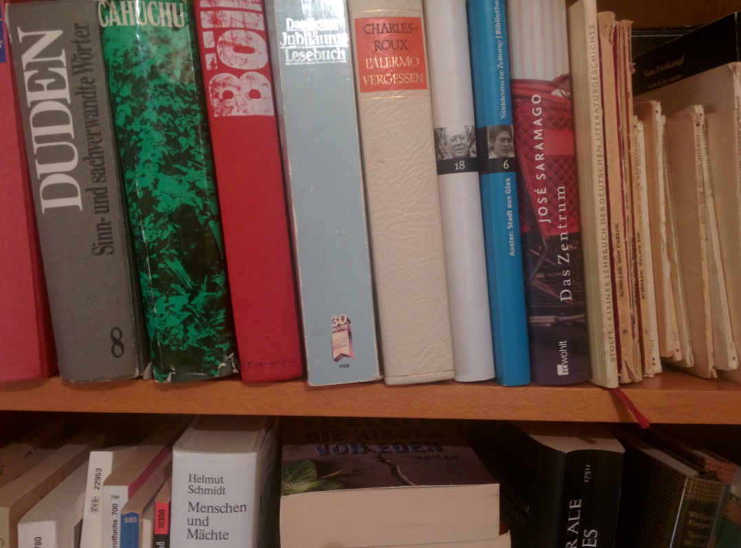
Was soll ich lesen?

Sommer, Sonne, Sonnenschein — ab in den Süden. Die Zeile “Lesen, lesen, lesen, lesen” würde sich nach meinem Dafürhalten auch ganz gut in den Song einpassen. Dafür hier ein paar Literaturempfehlungen. Von einer anständigen Sommerlektüre erwarte ich zweierlei: Dass die Kunst unterhaltsam sei. Zweitens, wenn als der Dampf sich nach dem Lesen erhebt, dass etwas zurückbleibt, außer dem Dampf. Beides gleichzeitig zu finden ist gar nicht so leicht.

Vielleicht denkt man das zu jeder Zeit, aber gerade aktuell die Welt besonders in Unruhe. Schlimme oder zumindest besorgende Nachrichten häufen sich; Tumult wohin man blickt. Da scheinen Anregungen zu Themen wie

Praktische Ethik, Grenzen, Grenzen der Ethik (Stichwort Flüchtlinge oder besser die Katastrophen, die Menschen zwingen zu fliehen) Demokratie, die offene Gesellschaft, ihr Ursprung und ihre Feinde Das Böse, sein Psychogramm und sein Phänomenologie am Fallbeispiel dem Zeitgeschehen auf den Nabel zu schauen. Manchmal frage ich mich, ob man in Anbetracht der Probleme der heutigen Zeit noch in Ruhe Grundlagenforschung betreiben darf (was ich tue). Jedenfalls heute und diesen Sommer keine Empfehlungen (auch deswegen) zur Grundlagenforschung, sondern drei Literaturempfehlungen zur Psycho-Philosophie des aktuellen Zeitgeschehens.

Empfehlung 1: Praktische Ethik von Peter Singer

Zugeben: kein Geheimtipp und schon gar nicht neu. Außerdem gibt es von demselben Autor aktuelle, ganz neue Werke, wie zB. effektiver Altruismus, in welchem der Autor seine Gedanken konsequent und mit praktischer Perspektive fortführt. Sein “Hauptwerk”, die Praktische Ethik ist und bleibt aber (für mich) eines der Bücher, die mich am meisten zum Nachdenken angeregt haben und meine Meinung zu vielen Themen der praktischen Ethik am stärksten beeinflusst haben, weitergebracht haben.

Peter Singer ist ein kontrovers diskutierter Philosoph; er wurde sogar vielfach angefeindet für seine Äußerungen (zB., dass hoch entwickelte Tiere schätzenswerter sind als Babies weil empfindungsfähiger). Wahrscheinlich ist er (trotzdem oder gerade deshalb) der bekannteste zeitgenössische Denker zur praktischen Ethik. Entscheidend ist auch nicht, ob und wie viele seine Thesen man selber unterstützt; seine Argumentationslinie ist einfach lehrreich. Seine Gedankenkette besticht durch Einfachheit, Klarheit und Stringenz. Brilliant! Ein großer Geist; Freude beim Lesen über soviel geistige Klarheit! Und: In Erinnerung geblieben ist mir auch folgender Satz von ihm. Und zwar wurde er bei einem Vortrag in — war es Deutschland oder Österreich? — so laut ausgepfiffen, dass er seinen Vortrag abbrechen musste. In dem Zusammenhang erwähnte er dieses Zitat (in etwa so): “Ihre Meinung mag von meiner diametral abweichen, aber ich werde bis zum Schluss Ihr Recht verteidigen, dass Sie reden dürfen”.

In der Praktischen Ethik diskutiert er auch Fragen im Zusammenhang mit Flüchtlingen; auch ein interessantes Gedankenexperiment ist in dem Kapitel enthalten. Das Buch ist dünn und klein; Reklam. Zumindest lässt das die Ausrede vom Gepäckaufstau nicht gelten:-)

Empfehlung 2: Die offene Gesellschaft von Karl Popper

OK, auch ein alter Herr des 20. Jahrhunderts. Aber einer, der es in sich hat. Ein Halb-Österreicher (ähnlich wie Singer, dessen Eltern vor den Nazis aus Österreich geflohen sind in die angelsächsische Welt nach Australien), da er wegen der Nazis nach Neuseeland und dann England ausgewandert ist. Ähnlich wie Singer benutzt er einfache Worte, um klare und tiefe Gedanken auszudrücken. Genuss!

Seine Hauptthese kann man wohl so zusammenfassen: Die Offene Gesellschaft ist die Überwindung der “Urhorde” — der archaischen Gesellschaft und ihre Weiterführung in Staatsformen wie Stammesgesellschaft, Monarchie und totalitären Regimen. Auch der Nationalstaat — die Nation ist wenig mehr als eine modernere Version der Horde — müsse letztlich überwunden werden. Totalitäres Gedankentum findet sich nicht erst in Hitler-Deutschland; vielmehr identifiziert er mit Platon der ersten mächtigen geistigen Vater der totalitären, nicht-offenen Gesellschaft aus. Aristoteles kommt da auch nicht gut weg; aber als neuzeitlicher Hansdampf der Verführer, Dünnbrettbohrer und schaumschlagende Laberbacke wird vor allem Hegel (und Fichte) gebrandmarkt. Marx wird zwar komplett für “falsizifiert” (ein Term von Popper) erklärt, aber vergleichsweise respektabel abgehandelt. Neben Marx ist Popper wohl (einer) der einflussreichste Denker des 20. Jahrhunderts. Sein Buch ist Bildung im besten Sinne; seine Theorie der freien Gesellschaft (vs. Horde bzw. geschlossen-totalitäre Gesellschaft) faszinierend im psychologisch-soziologischem Sinne. Gut, es ist einiges zu lesen (2 Bände, recht beleibt), aber ein Buch, dass für mich prägend im Denken war und ist. Lesen!

Empfehlung 3: Männerphantasien von Klaus Theweleit

Mit einem Buch dieses Titels könnte man in der Ubahn einige Blick ernten, deren Urheber eine andere Lektür vermute. Diesem Anspruch kommt das Buch nicht nach. Die Männerphantasien, die Klaus Theweleit hier analysiert, haben kaum, nichts! mit Erotik zu tun. Im Gegenteil, wahrscheinlich: Er beschreibt die Psyche des nationalsozialistischen Soldaten, die “aggresionsgesättigt” und nicht voll ich-ausgebildet ist, trotzem aber hochfunktional. Gekennzeichnet von Kühle, Beziehungsunfähigkeit, Gefühlskälte, Aggressivitätswalle, Heldenphantasien. Zwar bedient er sich stark einer tiefenpsychologisch-psychoanalytischen Denkschule, aber vor allem besticht (mich) seine Beobachtungs- und Interpretationsfähigkeit. Auf einer einzigen Leseseite findet sich mehr Reichhaltigkeit an gewagten Hypothesen (im besten Sinne) als in dem meisten an modern-wissenschaftlichem Papier, was in “hochgerankten” Fachzeitschriften publiziert ist. Das Psychogramm der Tötungslust oder die Lust am Bösen, könnte man sagen, führt er auf ein patriarchalisches Eltern- besser: Vaterhaus zurück. Eine umfassende (>1000 Seiten…) Analyse der Psyche von “richtig bösen” Menschen, wie Rudolph Höss, der auch besprochen wird neben einer ganzen Reihe weiterer Nazi-Größen. Ob das alles stimmt, was er schreibt? Weiß ich nicht; ich weiß nicht einmal, ob es darauf ankommt. Ob es übertragbar ist auf heute? Nicht sicher. Aber es ist lehrreich, fesselnd, originell, gewagt. Eine Aufarbeitung mit der Psychologie des Bösen in (unserer eigenen) deutschen Vergangenheit — tiefsichtiger als moderne Bücher wie die von Psychologen wie Baumeister oder Zimbardo oder (schon tiefgehender) Welzer. Keine leichte Kost, aber man kann viel Lernen über Bilder der bösen Psyche und ihre (Ab-) Gründe.

Was soll ich lesen?

Eine große Frage! Tja. Viel Spaß am Strand!

reading time (full): 30 min.

Data Wrangling with dplyr is a popular activity in data science/ statistics. A number of tutorial are available, but not so many in German language.

Data set analyzed in nycflights13::flights (R package). Available on CRAN. Ok, choosing this data set is not very creative, but, hey, quite nice data:)

Thus, here is a case study in German language; code (R)is on Github.

reading time: 5-10 min.

Cohen’s d is a widely known and extensively used measure of effect size. That is, d is used to gauge how strong an effect is (given the fact that the effect exists). For example, one way to estimate d is as follows:

data(tips, package = "reshape2")
library(compute.es)
t1 <- t.test(tip ~ sex, data = tips)
t1$statistic
##         t 
## -1.489536
table(tips$sex)
## 
## Female   Male 
##     87    157
tes(t1$statistic, 87, 157)
## Mean Differences ES: 
##  
##  d [ 95 %CI] = -0.2 [ -0.46 , 0.06 ] 
##   var(d) = 0.02 
##   p-value(d) = 0.14 
##   U3(d) = 42.11 % 
##   CLES(d) = 44.4 % 
##   Cliff's Delta = -0.11 
##  
##  g [ 95 %CI] = -0.2 [ -0.46 , 0.06 ] 
##   var(g) = 0.02 
##   p-value(g) = 0.14 
##   U3(g) = 42.13 % 
##   CLES(g) = 44.42 % 
##  
##  Correlation ES: 
##  
##  r [ 95 %CI] = 0.1 [ -0.03 , 0.22 ] 
##   var(r) = 0 
##   p-value(r) = 0.14 
##  
##  z [ 95 %CI] = 0.1 [ -0.03 , 0.22 ] 
##   var(z) = 0 
##   p-value(z) = 0.14 
##  
##  Odds Ratio ES: 
##  
##  OR [ 95 %CI] = 0.7 [ 0.43 , 1.12 ] 
##   p-value(OR) = 0.14 
##  
##  Log OR [ 95 %CI] = -0.36 [ -0.84 , 0.12 ] 
##   var(lOR) = 0.06 
##   p-value(Log OR) = 0.14 
##  
##  Other: 
##  
##  NNT = -19.61 
##  Total N = 244

However, what does Cohen’s d mean eventually?

Ok, the formula of d is well-known. In essence, d is computed as the difference between two means, normalized by the average variation. So one could say: “Wow, the experimental group was about 0.5 sd above the control! Jippaa!”” Not sure whether “lay persons”” would follow.

How can one get a more intuitive understanding of d?

A first step is to recognize that the two distributions overlap less if d gets larger.

As a sidenote: The size of the overlap can be computed quite easily:

  • Take the half of the mean difference (eg., 1-0 = 1, divided by 2 equals 0.5)
  • This is exactly the point where the two curves intersect (see figure)
  • Assuming that the “left”” mean is zero, you will now have a quantile at 0.5
  • Look up the percentile of that quantile (or in R, use pnorm()), ie., about 0.70
  • Now you know that at the right of this point, there is about 0.30 of probability mass

So in total, the overlap area amounts to 0.60 ie. 60%. Ok, good, but what does overlap really means?

A more approachable statistics is CLES. CLES stands for common language effect size. Basically, it answers the question:

“If I draw 100 guys from distribution 1 and 100 from distribution 2, what is the chance that guy from 1 has a higher value than guy from 2?”

Ah! This makes sense! At least to me. We have now an observable, practical description of what this effect size means.

From our example above: The chance is 44% that a woman will tip more willingly than a man. To put it differently: Pick 100 pairs (woman/man). On average, 44 of these women will tip more than their male counterpart.

reading time: 15-20 min.

Slidify is a cool tool to render HTML5 slide decks, see here, here or here for examples.

Features include:

  • reproducibility. You write your slide deck as you would write any other text, similar to Latex/Beamer. But you write using Markdown, which is easier and less clumsy. As you write plain text, you are free to use git.
  • modern look. Just a website, nothing more. But with cool, modern features.
  • techiwecki. Well, probably techie-minded persons will love that more than non-techies… Check this tutorial out as a starter.

Basically, slidify procudes a website:

While it is quite straight forward to write up your slidify presentations, some customization is a bit more of a hassle.

Let’s assume you would like to include a logo to your presentation. How to do that?

Logo page

There is an easy solution: In your slidify main file (probably something like index.Rmd) you will find the YAML header right at the start of the file:

---
title : "Test with Logo"
author : "Dr. Zack"
widgets : [mathjax, quiz, bootstrap, interactive] # {mathjax, quiz, bootstrap}
ext_widgets : {rCharts: [libraries/nvd3, libraries/leaflet, libraries/dygraphs]}
mode : selfcontained # {standalone, draft}
logo : logo.png
biglogo : logo.png
---

To get your logo page, do the following two steps:

  1. In your project folder, go to assets/img. Drop your logo file there (png and jpg will both work)
  2. Then adjust your YAML header by adding two lines:
logo : logo.png
biglogo : logo.png

Done!

Two changes will now take place. First, you will have a logo page, where nothing but your logo will show up (biglogo.png):

Second, a following page, the title page, will also show you logo (logo.png), but smaller and with a little animation (in the default):

Note that there are a number of other variables that you can define in the YAML header.

Background image on title page

Now, a little more fancy. What about a cool background image on your first page? OK, let’s check it out. This will be the output:

So what did I do?

I defined a CSS class as follows:

.title-slide {
 background-image: url(https://goo.gl/gAeQqj);
}

The picture is from WikiMedia Commons, published in the public domain.

Then, I saved this code as a css file (name does not matter; in my case title_slide_bg.css) in this folder:

[project_folder]/assets/css.

That’s it. Wait, don’t forget to slidify("my_deck").

You will say, that’s ok, but I want a footer or a header line, because that’s where I like to put my logo (accustomed to…).

The solution I used (there are surely a number of different) consisted of rewriting/customizing the template of the standard slide slide.html, adding the footer/header with logo.

So, the basic slide template looks like this:

<slide class="" id="" style="background:};">

<hgroup>
}
</hgroup>

<article data-timings="">
}
</article>
<!-- Presenter Notes -->

<aside class="note" id="">
<section>
}
</section>
</aside>

</slide>

I added some lines to add an object (logo) at a certain position; so my slide.html file looked like this:

<slide class="" id="">
<hgroup>
}
</hgroup>
<article>
}
<footer class = 'logo'>
<div style="position: absolute; left: 1000px; top: 50px; z-index:100">
<img src = "assets/img/logo.png" height="80" width="80">
</div>
</footer>
</article>
</slide>

Now, we have to save this file under [project folder]/assets/layouts.

The name does not matter; any html-file in this folder will be parsed by slidify. Here come the header with logo:

You can adapt size and position of the logo with the img html function.

That’s it! Happy slidifying!

You will find the code on this github repo, along with the slidify-presentation.

reading time: 10 min.

A quite common task in data analysis is to change a dataset from wide to long format.

For example, this is a dataset in wide format:

Is is called wide, as, well, it is wide – several columns side by side.

For example, assume, we have measured a number of predictors (here: predictor_1, predictor_2, predictor_3), and an outcome measure (here: outcome). In this case, each variable is dichotomous (either yes or no).

For plotting, eg. using ggplot2, we have to convert this format to long format. Long datasets look like this:

So, non really surprising, the dataset is now longer than in wide format. Hence the name…

It was converted in a certain way. Look at the two figures (and the color scheme). The 4 columns are now 3: All of the predictors are now paired in two colums: key and value. In the key column we find the names of the former columns as entries; in the value column we find the entries of those columns as entries (check the colors).

We easily see that the variable outcome was not paired. Before and after the convertion, it happily resides in its own, whole column. We often want a non-paired column, as we need it for eg., facetting.

Let’s visualize this transformation. First, we look at the transformation of the values:

Second, let’s look at the transformation of the keys (column headers), and the outcome variable, which will not be paires (remains in its own, complete, tidy column):

So let’s see the tidyr and dplyr code:

library(dplyr)
library(tidyr)
library(ggplot2)

data(Wage, package = "ISLR")

Wage %>%
  mutate(wage_f = ntile(wage, 2)) %>%  # bin it
  mutate(wage_f = factor(wage_f, labels = c("low_wage","high_wage"))) %>%
  select(health, race, wage_f) %>%
  gather(key = predictor, value = pred_value, -wage_f) %>%
  ggplot(aes(x = pred_value, fill = predictor)) + geom_bar() + facet_wrap(~wage_f) +
  coord_flip()
## Warning: attributes are not identical across measure variables; they will
## be dropped

The plot itself is not particular useful as it is, but at times you will want such a type of plot. And many R functions built on the long format.