reading time: 15-20 min.
Recently, I analyzed some data of a study where the efficacy of online psychotherapy was investigated. The investigator had assessed whether or not a participant suffered from some comorbidities (such as depression, anxiety, eating disorder…).
I wanted to know whether each of these (10 or so) comorbidities was associated with the outcome (treatment success, yes vs. no).
Of course, an easy solution would be to “half-manually” check the association, eg. using table() in R. But I wanted a more reproducible, more automated solution (ok, I confess, I justed wanted it to be cooler, probably…).
As a starter, consider the old question of the Titanic disaster: Did class correlate with survival? Let’s see:
data(titanic, package = "COUNT")  # package need be installed
attach(titanic)  # save some typing
table(class, survived)# tabulate the two variables
##            survived
## class        no yes
##   1st class 122 203
##   2nd class 167 118
##   3rd class 528 178
##   crew        0   0
prop.table(table(class, survived)) # get the percentages/proportions
##            survived
## class               no        yes
##   1st class 0.09270517 0.15425532
##   2nd class 0.12689970 0.08966565
##   3rd class 0.40121581 0.13525836
##   crew      0.00000000 0.00000000
The tabulation results look like this:
Alas! Money can buy you life, it appears…
Note that we are talking about nominal variables with two levels, ie. dichotomous variables. In other words, we are looking at frequencies.
So my idea was:
- take a column of a predictor (say, depression)
- take the column of the outcome variable (treatment success)
- Cross-tabulate the association.
- Repeat those steps for each of the comorbidities
- Make sure it looks (sufficiently) cool…
Have I already told that I like the R-package dplyr? Check it out. Let’s see how to do the job with dplyr. Let’s use the Wages dataset from package ISLR.
This dataset from ISLR shows the wage of some male professionals in the Atlantic US area; along with the wage there are also some “risk factors” for the wage such as health status, education, race. Let’s see if there is an association.
First, load the package and the data:
# don't forget to install the packages upfront.
library(dplyr)
##
## Attaching package: 'dplyr'
## The following objects are masked from 'package:stats':
##
##     filter, lag
## The following objects are masked from 'package:base':
##
##     intersect, setdiff, setequal, union
library(ggplot2)
data(Wage, package = "ISLR")
Now, here comes dplyr:
Wage %>%
  mutate(wage_f = ntile(wage, 2)) %>%  # bin it
  group_by(wage_f, health, race) %>%
  summarise(count = n()) %>%  # summarise by each group
  ggplot(aes(x = factor(wage_f), y = count, fill = race)) +
  geom_bar(stat = "identity") +
  facet_wrap(~health)
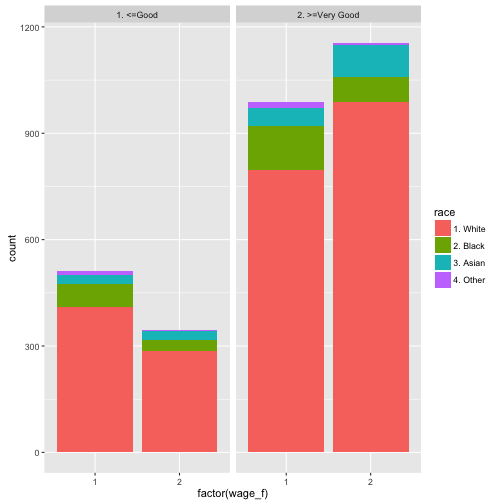
Let’s discuss the code a bit (not every bit), looking briefly the lines:
- build a column where wage is binned in two groups (low vs. high wage)
- group by wage group, health status and race (image 222 sub-spreadsheets)
- count the row number in each group (ie., 8 mini-spreadsheets)
- plot it, with some parameters