Recently, ggplot2 2.2.0 was released. Among other news, stacking bar plot was improved. Here is a short demonstration.

Load libraries

library(tidyverse)
library(htmlTable)

… and load data

data <- read.csv("https://osf.io/meyhp/?action=download")

DOI for this piece of data is 10.17605/OSF.IO/4KGZH.

The data consists of results of a survey on extraversion and associated behavior.

Say, we would like to visualize the responsed to the extraversion items (there are 10 of them).

So, let’s see. First, compute summary of the responses.

data %>% 
  select(i01:i10) %>% 
  gather %>% 
  dplyr::count(key, value) %>% 
  ungroup -> data2
  
htmlTable(head(data2))
key value n
1 i01 1 7
2 i01 2 39
3 i01 3 230
4 i01 4 223
5 i01 2
6 i02 1 176

Ok, so now let’s plot.

ggplot(data2) +
  geom_col(aes(x = key, fill = value, y = n))

plot of chunk unnamed-chunk-4

Note that geom_col is short-hand vor geom_bar(stat = "identity").

Of interest, “negative” stacking is now possible.

data %>% 
  select(i01:i10) %>% 
  gather %>% 
  na.omit %>% 
  count(key, value) %>% 
  ungroup %>% 
  group_by(key) %>% 
  mutate(rel_n = round(n - mean(n), 2)) %>% 
  ungroup -> data3


htmlTable(head(data3))
key value n rel_n
1 i01 1 7 -117.75
2 i01 2 39 -85.75
3 i01 3 230 105.25
4 i01 4 223 98.25
5 i02 1 176 51.5
6 i02 2 224 99.5
ggplot(data3) +
  geom_col(aes(x = key, fill = value, y = rel_n))

plot of chunk unnamed-chunk-6

Hm, at it comes to the color, we need to change to discrete colors. It appears that the color scheme is not able (out of the box) to adapt to this “negative stacking”.

So:

ggplot(data3) +
  geom_col(aes(x = key, fill = factor(value), y = rel_n))

plot of chunk unnamed-chunk-7

sessionInfo()
## R version 3.3.2 (2016-10-31)
## Platform: x86_64-apple-darwin13.4.0 (64-bit)
## Running under: macOS Sierra 10.12.1
## 
## locale:
## [1] en_US.UTF-8/en_US.UTF-8/en_US.UTF-8/C/en_US.UTF-8/en_US.UTF-8
## 
## attached base packages:
## [1] stats     graphics  grDevices utils     datasets  methods   base     
## 
## other attached packages:
## [1] purrr_0.2.2.9000 readr_1.0.0      tibble_1.2       tidyverse_1.0.0 
## [5] knitr_1.15       htmlTable_1.7    ggplot2_2.2.0    tidyr_0.6.0     
## [9] dplyr_0.5.0     
## 
## loaded via a namespace (and not attached):
##  [1] Rcpp_0.12.7         magrittr_1.5        munsell_0.4.3      
##  [4] colorspace_1.3-0    R6_2.2.0            highr_0.6          
##  [7] stringr_1.1.0       plyr_1.8.4          tools_3.3.2        
## [10] grid_3.3.2          gtable_0.2.0        DBI_0.5-1          
## [13] htmltools_0.3.5     yaml_2.1.13         lazyeval_0.2.0.9000
## [16] assertthat_0.1      digest_0.6.10       rprojroot_1.1      
## [19] rsconnect_0.5       evaluate_0.10       rmarkdown_1.1.9016 
## [22] labeling_0.3        stringi_1.1.2       scales_0.4.1       
## [25] backports_1.0.4

Eine recht häufige Art von Daten in der Wirtschaft kommen von Umfragen in der Belegschaft. Diese Daten gilt es dann aufzubereiten und graphisch wiederzugeben. Dafür gibt dieser Post einige grundlegende Hinweise. Grundwissen mit R setzen wir voraus :-)

Eine ausführlichere Beschreibung hier sich z.B. hier.

Packages laden

Nicht vergessen: Ein Computerprogramm (z.B. ein R-Package) kann man nur dann laden, wenn man es vorher installier hat (aber es reicht, das Programm/R-Package einmal zu installieren).

Im Paket tidyverse sind eine Reihe von Paketen gebündelt, die wir brauchen z.B. zum Diagramme erstellen (ggplot2) oder um Daten zu verhackstücken (dplyr, tidyr).

library(tidyverse)

Daten einlesen

Jetzt lesen wir die Daten ein. In RStudio gibt es dafür z.B. den Button “Import Dataset”; der R-Commander hat einen ähnlichen Menüpunkt. Auch Excel-Dateien kann man so einlesen.

Hier laden wir mal beispielhaft einen Datensatz zu einer Online-Umfrage:

data <- read.csv("https://osf.io/meyhp/?action=download")

Der DOI für diesen Datensatz ist 10.17605/OSF.IO/4KGZH.

Der Datensatz besteht aus 10 Extraversions-Items (B5T nach Satow) sowie einigen Verhaltenskorrelaten (zumindest angenommenen). Uns interessieren also hier nur die 10 Extraversions-Items, die zusammen Extraversion als Persönlichkeitseigenschaft messen (sollen). Wir werden die Antworte der Befragten darstelle, aber uns hier keine Gedanken über Messqualität u.a. machen.

Die Umfrage kann hier eingesehen werden.

Schauen wir uns die Daten mal an:

glimpse(data)
## Observations: 501
## Variables: 27
## $ timestamp          <fctr> 11.03.2015 19:17:48, 11.03.2015 19:18:05, ...
## $ code               <fctr> HSC, ERB, ADP, KHB, PTG, ABL, ber, hph, IH...
## $ i01                <int> 3, 2, 3, 3, 4, 3, 4, 3, 4, 4, 3, 3, 4, 4, 3...
## $ i02                <int> 2, 3, 1, 2, 2, 3, 1, 2, 1, 1, 2, 1, 2, 2, 2...
## $ i03                <int> 3, 1, 1, 2, 1, 1, 1, 2, 1, 2, 1, 1, 1, 4, 1...
## $ i04r               <int> 2, 3, 1, 1, 1, 1, 2, 2, 1, 1, 2, 2, 3, 1, 2...
## $ i05                <int> 4, 3, 4, 3, 4, 2, 3, 2, 3, 3, 3, 2, 3, 3, 3...
## $ i06                <int> 1, 3, 4, 2, 2, 2, 2, 3, 1, 2, 2, 2, 2, 2, 2...
## $ i07                <int> 3, 2, 3, 3, 4, 4, 2, 3, 3, 3, 2, 4, 2, 3, 3...
## $ i08r               <int> 3, 2, 3, 2, 3, 2, 2, 3, 2, 2, 2, 3, 2, 2, 1...
## $ i09                <int> 3, 3, 3, 3, 3, 3, 3, 4, 4, 3, 4, 2, 4, 4, 4...
## $ i10                <int> 1, 1, 1, 2, 4, 3, 2, 1, 2, 3, 1, 3, 2, 3, 2...
## $ n_facebook_friends <int> 250, 106, 215, 200, 100, 376, 180, 432, 200...
## $ n_hangover         <dbl> 1, 0, 0, 15, 0, 1, 1, 2, 5, 0, 1, 2, 20, 2,...
## $ age                <int> 24, 35, 25, 39, 29, 33, 24, 28, 29, 38, 25,...
## $ sex                <fctr> Frau, Frau, Frau, Frau, Frau, Mann, Frau, ...
## $ extra_single_item  <int> 4, 3, 4, 3, 4, 4, 3, 3, 4, 4, 4, 4, 4, 4, 4...
## $ time_conversation  <dbl> 10, 15, 15, 5, 5, 20, 2, 15, 10, 10, 1, 5, ...
## $ presentation       <fctr> nein, nein, nein, nein, nein, ja, ja, ja, ...
## $ n_party            <dbl> 20, 5, 3, 25, 4, 4, 3, 6, 12, 5, 10, 5, 10,...
## $ clients            <fctr> , , , , , , , , , , , , , , , , , , , , , ...
## $ extra_vignette     <fctr> , , , , , , , , , , , , , , , , , , , , , ...
## $ extra_description  <int> NA, NA, NA, NA, NA, NA, NA, NA, NA, NA, NA,...
## $ prop_na_per_row    <dbl> 0.04347826, 0.04347826, 0.04347826, 0.04347...
## $ extra_mean         <dbl> 2.5, 2.3, 2.4, 2.3, 2.8, 2.4, 2.2, 2.5, 2.2...
## $ extra_median       <dbl> 3.0, 2.5, 3.0, 2.0, 3.0, 2.5, 2.0, 2.5, 2.0...
## $ n_clients          <dbl> NA, NA, NA, NA, NA, NA, NA, NA, NA, NA, NA,...

Daten aufbereiten

Daten aufbereiten ist ein umfangreiches Geschäft; hier schneiden wir diese Angelegenheit nur kurz an.

Man sollte (u.a.):

  • fehlende Werte identifizieren, evtl. die Fälle löschen, imputieren oder … nix tun
  • möglich Fehleingaben identifizieren
  • Negativ gepolte Items unkodieren
  • Mittelwerte bilden

Statt dessen gehen wir davon aus, dass alles passt :-)

Eine ausführlichere Beschreibung der Aufbereitung dieser Daten findet sich hier.

Daten umstellen für das Plotten

Wir haben ein Diagramm vor Augen (s.u.), bei dem auf der X-Achse die Items stehen (1,2,…,n) und auf der Y-Achse die Anzahl der Kreuze nach Kategorien.

Viele Grafik-Funktionen sind nun so aufgebaut, dass auf der X-Achsen nur eine Variable steht. ggplot2, das wir hier verwenden, ist da keine Ausnahme. Wir müssen also die “breite” Tabelle (10 Spalten, pro Item eine) in eine “lange Spalte” umbauen: Eine Spalte heißt dann “Itemnummer” und die zweite “Wert des Items” oder so ähnlich.

Eine ausführliche Beschreibung findet sich z.B. hier.

Also, los geht’s:

Zuerst wählen wir aus der Fülle der Daten, die Spalten, die uns interessieren: Die 10 Extraversions-Items, in diesem Fall.

data_items <- select(data, i01:i10)

Dann stellen wir die Daten von “breit” nach “lang” um, so dass die Items eine Variable bilden und damit für ggplot2 gut zu verarbeiten sind.

data_long <- gather(data_items, key = items, value = Antwort)

data_long$Antwort <- factor(data_long$Antwort)

Den Befehl mit factor brauchen wir für zum Diagramm erstellen im Folgenden. Dieser Befehl macht aus den Zahlen bei der Variable Antwort eine nominale Variable (in R: factor) mit Text-Werten “1”, “2” und so weiter. Wozu brauchen wir das? Der Digrammbefehl unten kann nur mit nominalen Variablen Gruppierungen durchführen. Wir werden in dem Diagramm die Anzahl der Antworten darstellen - die Anzahl der Antworten nach Antwort-Gruppe (Gruppe mit Antwort “1” etc.).

Keine Sorge, wenn sich das reichlich ungewöhnlich anhört. Sie müssen es an dieser Stelle nicht erfinden :-)

Man gewöhnt sich daran einerseits; und andererseits ist es vielleicht auch so, dass diese Funktionen nicht perfekt sind, oder nicht aus unserer Sicht oder nur aus Sicht des Menschen, der die Funktion geschrieben hat. Jedenfalls brauchen wir hier eine factor Variable zur Gruppierung…

Damit haben wir es schon! Jetzt wird gemalt.

Erste Diagramme

Wir nutzen ggplot2, wie gesagt, und davon die Funktion qplot (q wie quick, nehme ich an.).

ggplot(data = data_long) +
  aes(x = items)  +
  geom_bar(aes(fill = Antwort), position = "fill") 

plot of chunk unnamed-chunk-6

Was macht dieser ggplot Befehl? Schauen wir es uns in Einzelnen an:

  • ggplot(data = ...): Wir sagen “Ich möchte gern die Funktion ggplot nutzen, um den Datensatz … zu plotten”.
  • aes(...): Hier definieren wir die “aesthetics” des Diagramms, d.h. alles “Sichtbare”. Wir ordnen in diesem Fall der X-Achse die Variable items zu. Per Standardeinstellung geht ggplot davon aus, dass sie die Häufigkeiten der X-Werte auf der Y-Achse haben wollen, wenn Sie nichts über die Y-Achse sagen. Jetzt haben wir ein Koordinatensystem definiert (das noch leer ist).
  • geom_bar(): “Hey R oder ggplot, jetzt male mal einen barplot in den ansonsten noch leeren plot”.
  • aes(fill = Antwort): Genauer gesagt nutzen wir aes um einen sichtbaren Aspekte des Diagramms (wie die X-Achse) eine Variable des Datensatzes zuzuordnen. Jetzt sagen wir, dass die Füllung (im Balkendiagramm) durch die Werte von Antwort definiert sein sollen (also “1”, “2” etc.).
  • position = "fill" sagt, dass die Gesamt-Höhe des Balken aufgeteilt werden soll mit den “Teil-Höhen” der Gruppen (Antwort-Kategorien 1 bis 4); wir hätten die Teil-Höhen auch nebeneinander stellen können.

Nas entfernen

Vielleicht ist es schöner, die NAs erst zu entfernen.

data_long <- na.omit(data_long)

Und dann noch mal plotten:

ggplot(data = data_long) +
  aes(x = items)  +
  geom_bar(aes(fill = Antwort), position = "fill") 

plot of chunk unnamed-chunk-8

Um 90° drehen

Dazu nehmen wir + coord_flip(), also “flippe das Koordinatensystem”.

ggplot(data = data_long) +
  aes(x = items)  +
  geom_bar(aes(fill = Antwort), position = "fill") +
  coord_flip()

plot of chunk unnamed-chunk-9

Text-Labels für die Items

Wir definieren die Texte (“Labels”) für die Items:

item_labels <- c("Ich bin das erste Item",
                 "Das zweite Item",
                 "Item 3 sdjfkladsjk",
                 "Ich bin ein krasser Couch-Potato UMKODIERT",
"i5 asf", "i6 sdf", "adfjks", "sfjlkd", "sdfkjl", "sdfjkl")

Jetzt hängen wir die Labels an die Items im Diagramm:

ggplot(data = data_long) +
  aes(x = items)  +
  geom_bar(aes(fill = Antwort), position = "fill") +
  coord_flip() +
  scale_x_discrete(labels = item_labels)

plot of chunk unnamed-chunk-11

Man kann auch einen Zeilenumbruch in den Item-Labels erzwingen… wobei das führt uns schon recht weit, aber gut, zum Abschluss :-)

item_labels <- c("Ich bin das erste Item",
                 "Das zweite Item",
                 "Item 3 sdjfkladsjk",
                 "Ich bin ein krasser \nCouch-Potato***mit Zeilenumbruch***",
"i5 asf", "i6 sdf", "adfjks", "sfjlkd", "sdfkjl", "sdfjkl")

Und wieder plotten:

ggplot(data = data_long) +
  aes(x = items)  +
  geom_bar(aes(fill = Antwort), position = "fill") +
  coord_flip() +
  scale_x_discrete(labels = item_labels, name = "Extraversionsitems") +
  scale_y_continuous(name = "Anteile")

plot of chunk unnamed-chunk-13

Diagramm mit Häufigkeiten, nicht Anteilen

Ach so, schön wäre noch die echten Zahlen an der Y-Achse, nicht Anteile. Dafür müssen wir unseren Diagrammtyp ändern, bzw. die Art der Anordnung ändern. Mit position = "fill" wird der Anteil (also mit einer Summe von 100%) dargestellt. Wir können auch einfach die Zahlen/Häufigkeiten anzeigen, in dem wir die Kategorien “aufeinander stapeln”

ggplot(data = data_long) +
  aes(x = items)  +
  geom_bar(aes(fill = Antwort), position = "stack") +
  coord_flip() +
  scale_x_discrete(labels = item_labels) 

plot of chunk unnamed-chunk-14

Farbschema

Ja, die Wünsche hören nicht auf… Also, noch ein anderes Farbschema:

ggplot(data = data_long) +
  aes(x = items)  +
  geom_bar(aes(fill = Antwort), position = "stack") +
  coord_flip() +
  scale_x_discrete(labels = item_labels) +
  scale_fill_brewer(palette = 17)

plot of chunk unnamed-chunk-15

Probieren Sie mal ein paar Brewer Farbpaletten aus.

Natürlich kann man noch viel mehr tun; schauen Sie sich z.B. dieses ausführlichere Posting an: https://sebastiansauer.github.io/plotting_surveys/.

Overfitting is a common problem in data analysis. Some go as far as saying that “most of” published research is false (John Ionnadis); overfitting being one, maybe central, problem of it. In this post, we explore some aspects on the notion of overfitting.

Assume we have 10 metric variables v (personality/health/behavior/gene indicator variables), and, say, 10 variables for splitting up subgroups (aged vs. young, female vs. male, etc.), so 10 dichotomic variables. Further assume there are no association whatsoever between these variables. How likely is it we find something publishable? Apparently quite probably; but let’s give it a try.

Load some packages.

library(tidyverse)
library(corrr)
library(broom)
library(htmlTable)

Simulated dataset 10x10

Make sup some uncorrelated data, 10x10 variables each .

set.seed(123)
matrix(rnorm(100), 10, 10) -> v

Let’s visualize the correlation matrix.

v %>% correlate %>% rearrange %>% rplot(print_cor = TRUE)

plot of chunk corr_matrix_1

v %>% correlate -> v_corr_matrix

So, quite some music in the bar. Let’s look at the distribution of the correlation coefficients.

v_corr_matrix %>% 
  select(-rowname) %>% 
  gather %>% 
  filter(complete.cases(.)) -> v_long
  
v_long %>% 
  mutate(r_binned = cut_width(value, 0.2)) %>% 
  ggplot +
  aes(x = r_binned) + 
  geom_bar()

plot of chunk corr_distrib

What about common statistics?

library(psych)
describe(v_long$value)
##    vars  n  mean   sd median trimmed  mad   min  max range skew kurtosis
## X1    1 90 -0.03 0.36  -0.12   -0.05 0.35 -0.68 0.77  1.44 0.36    -0.68
##      se
## X1 0.04

Probably more stringent to just choose one triangle from the matrix, but I think it does not really matter for our purposes.

Quite a bit of substantial correlation going on. Let’s look from a different angle.

v_long %>% 
  ggplot +
  aes(x = 1, y = value) +
  geom_violin(alpha = .3) +
  geom_jitter(aes(x = 1, y = value), width = .1) +
  xlab("") +
  geom_hline(yintercept = mean(v_long$value), linetype = "dashed", color = "#880011")

plot of chunk violin_plot

100x100 dataset correlation

Now let’s scale up a bit and see whether the pattern stabilize.

set.seed(123)
matrix(rnorm(10^4), 100, 100) -> v2
v2 %>% correlate -> v2_corr_matrix
v2_corr_matrix %>% 
  select(-rowname) %>% 
  gather %>% 
  filter(complete.cases(.)) -> v2_long
  
v2_long %>% 
  mutate(r_binned = cut_width(value, 0.2)) %>% 
  ggplot +
  aes(x = r_binned) + 
  geom_bar(aes(y = ..count../sum(..count..))) +
  ylab("proportion")

plot of chunk histo1

So, how many r’s are in the (0.1,0.3) bin?

library(broom)
v2_long %>% 
  mutate(r_binned = cut_width(value, 0.2)) %>% 
  group_by(r_binned) %>% 
  summarise(n_per_bin = n(),
            prop_per_bin = round(n()/nrow(.), 2))
## # A tibble: 5 × 3
##      r_binned n_per_bin prop_per_bin
##        <fctr>     <int>        <dbl>
## 1 [-0.5,-0.3]        10         0.00
## 2 (-0.3,-0.1]      1594         0.16
## 3  (-0.1,0.1]      6776         0.68
## 4   (0.1,0.3]      1512         0.15
## 5   (0.3,0.5]         8         0.00

That’s quite a bit; 15% correlation in the bin (.1.3). Publication ahead!

Subgroup analyses

Now, let’s look at our subgroup. For that purposes, we need actual data, not only the correlation data. Let’s come up with 1000 individuals, where he have 100 measurement (metric; N(0,1)), and 100 subgroup variables (dichotomic).

set.seed(123)
matrix(rnorm(1000*100), nrow = 1000, ncol = 100) -> v3
dim(v3)
## [1] 1000  100
matrix(sample(x = c("A", "B"), size = 1000*100, replace = TRUE), ncol = 100, nrow = 1000) -> v4
dim(v4)
## [1] 1000  100
v5 <- cbind(v3, v4)
dim(v5)
## [1] 1000  200

Now, t-test battle. For each variable, compute a t-test; for each subgroup, compute a t-test. Do the whole shabeng (100*100 tests).

But, as a first step, let’s look at the first subgroup variable only.

v3 %>% 
  data.frame %>% 
  map(~t.test(.x ~ v4[, 1])) %>% 
  map(broom::tidy) %>% 
  map("p.value") %>% 
  unlist %>%
  tibble -> v3_pvalues

v3_pvalues %>% 
  qplot(x = .) +
  xlab("p value") +
  geom_vline(xintercept = .05, color = "#880011", linetype = "dashed")
## Don't know how to automatically pick scale for object of type tbl_df/tbl/data.frame. Defaulting to continuous.
## `stat_bin()` using `bins = 30`. Pick better value with `binwidth`.

plot of chunk shabeng_1st

How many significant p values resulted (should be 5%, ie 5 of 100)?

v3_pvalues %>% 
  filter(. < .05)
## # A tibble: 5 × 1
##            .
##        <dbl>
## 1 0.01350926
## 2 0.04115726
## 3 0.01064116
## 4 0.04251559
## 5 0.02505199

Which is exactly what we found.

p_list <- vector(length = 100, mode = "list")
i <- 1

for (i in 1:100){
  
  v3 %>% 
    data.frame %>% 
    map(~t.test(.x ~ v4[, i])) %>% 
    map(broom::tidy) %>% 
    map("p.value") %>% 
    unlist %>%
    tibble -> p_list[[i]]
  
}

# str(p_list)  #tl;dr

p_df <- as.data.frame(p_list)
names(p_df) <- paste("V", formatC(1:100, width = 3, flag = "0"), sep = "")

Let’s try a giant plot with 100 small multiples.

p_df %>% 
  gather %>% 
  ggplot(aes(x = value)) + 
  geom_histogram() +
  facet_wrap(~key, ncol = 10)
## `stat_bin()` using `bins = 30`. Pick better value with `binwidth`.

plot of chunk giant_plot

Well impressive, but that histogram matrix does not serve much. What about a correlation plot as above, only giantesque…

p_df %>% correlate %>% rplot

plot of chunk corr_plot_giant

Hm, of artis values (in 10000 years). Maybe better plot a histogram of the number of signifinat p-values ( <. 05).

p_df %>% 
  gather %>% 
  dplyr::filter(value < .05) %>% 
  qplot(x = value, data = .) +
  xlab("p value")
## `stat_bin()` using `bins = 30`. Pick better value with `binwidth`.

plot of chunk hist3

In exact numbers, what’s the percentage of significant p-values per variable?

p_df %>% 
  gather %>% 
  group_by(key) %>% 
  filter(value < .05) %>% 
  summarise(n = n()) -> p_significant
htmlTable(p_significant)
key n
1 V001 5
2 V002 4
3 V003 8
4 V004 7
5 V005 4
6 V006 4
7 V007 4
8 V008 5
9 V009 3
10 V010 5
11 V011 6
12 V012 8
13 V013 7
14 V014 4
15 V015 13
16 V016 7
17 V017 8
18 V018 5
19 V019 7
20 V020 4
21 V021 10
22 V022 3
23 V023 5
24 V024 4
25 V025 7
26 V026 9
27 V027 4
28 V028 7
29 V029 5
30 V030 3
31 V031 4
32 V032 9
33 V033 8
34 V034 8
35 V035 4
36 V036 2
37 V037 11
38 V038 8
39 V039 2
40 V040 10
41 V041 6
42 V042 3
43 V043 5
44 V044 2
45 V045 8
46 V046 2
47 V047 8
48 V048 7
49 V049 2
50 V050 5
51 V051 4
52 V052 10
53 V053 5
54 V054 3
55 V055 3
56 V056 5
57 V057 3
58 V058 2
59 V059 1
60 V060 8
61 V062 6
62 V063 5
63 V064 3
64 V065 12
65 V066 4
66 V067 6
67 V068 2
68 V069 9
69 V070 6
70 V071 7
71 V072 8
72 V073 8
73 V074 8
74 V075 5
75 V076 4
76 V077 5
77 V078 4
78 V079 3
79 V080 4
80 V081 6
81 V082 9
82 V083 12
83 V084 5
84 V085 3
85 V086 6
86 V087 7
87 V088 4
88 V089 6
89 V090 6
90 V091 6
91 V092 7
92 V093 4
93 V094 5
94 V095 2
95 V096 10
96 V097 7
97 V098 6
98 V099 5
99 V100 2

Distribution of significant p-values.

p_significant %>% 
  qplot(x = n, data = .)
## `stat_bin()` using `bins = 30`. Pick better value with `binwidth`.

plot of chunk histo_p_values

Summary stats of significant p-values.

p_df %>% 
  gather %>% 
  group_by(key) %>% 
  filter(value < .05) %>% 
  summarise(n_p = n(),
            mean_p = mean(value),
            median_p = median(value),
            sd_p = sd(value, na.rm = TRUE),
            IQP_p = IQR(value),
            min_p = min(value),
            max_p = max(value)) %>% 
  map(mean) %>% as.data.frame -> p_summary_tab
## Warning in mean.default(.x[[i]], ...): argument is not numeric or logical:
## returning NA

Here comes the table of the mean over all 100 variables of the typical statistics.

p_summary_tab %>% 
  select_if(is.numeric) %>% 
  round %>% 
  htmlTable
key n_p mean_p median_p sd_p IQP_p min_p max_p
1 6 0 0 0 0 0

In sum, overfitting - mistakenly taking noise as signal - happened often. Actually, as often as is expected by theory. But, not knowing or not minding theory, one can easily be surprised by the plethora of “interesting findings” in the data. In John Tukey’s words (more or less): “Torture the data for a long enough time and it will tell you anything”.

Plotting (and more generally, analyzing) survey results is a frequent endeavor. Let’s not think about arguments whether and when surveys are useful (for some recent criticism see the Briggs’ book.

Typically, respondents circle some option ranging from “don’t agree at all” to “completely agree” for each question (or “item”). Typically, four to six boxes are given where one is expected to tick one.

In this tutorial, I will discuss some barplot type visualizations. Sure, much more can be done, but we will stick to this one plot for this post.

Some needed packages.

library(tidyverse)
library(forcats)

Prepare data

So, first, let’s load some data. That’s a data set of a survey on extraversion. Folks were asked a bunch of questions tapping at their “psychometric extraversion”, and some related behavior, that is, behavior supposed to be related such as “number of Facebook friends”, “how often at a party” etc. Note that college students form the sample.

Data are available only (free as in free and free as in beer).

data <- read.csv("https://sebastiansauer.github.io/data/extra_raw_WS16.csv")

data_raw <- data  # backup just in case

OK, we got ‘em; a dataset of dimension 501, 24. Let’s glimpse at the data:

glimpse(data)
## Observations: 501
## Variables: 24
## $ Zeitstempel                                                                                                                                                                                                                                                                                                                                                                                                                                                                                                                                                                                                                                                                                                                                                                            <fctr> ...
## $ Bitte.geben.Sie.Ihren.dreistellen.anonymen.Code.ein..1...Anfangsbuchstabe.des.Vornamens.Ihres.Vaters..2...Anfangsbuchstabe.des.Mädchennamens.Ihrer.Mutter..3..Anfangsbuchstabe.Ihres.Geburstsorts.                                                                                                                                                                                                                                                                                                                                                                                                                                                                                                                                                                                     <fctr> ...
## $ Ich.bin.gerne.mit.anderen.Menschen.zusammen.                                                                                                                                                                                                                                                                                                                                                                                                                                                                                                                                                                                                                                                                                                                                           <int> ...
## $ Ich.bin.ein.Einzelgänger.....                                                                                                                                                                                                                                                                                                                                                                                                                                                                                                                                                                                                                                                                                                                                                          <int> ...
## $ Ich.bin.in.vielen.Vereinen.aktiv.                                                                                                                                                                                                                                                                                                                                                                                                                                                                                                                                                                                                                                                                                                                                                      <int> ...
## $ Ich.bin.ein.gesprächiger.und.kommunikativer.Mensch.                                                                                                                                                                                                                                                                                                                                                                                                                                                                                                                                                                                                                                                                                                                                    <int> ...
## $ Ich.bin.sehr.kontaktfreudig.                                                                                                                                                                                                                                                                                                                                                                                                                                                                                                                                                                                                                                                                                                                                                           <int> ...
## $ Im.Grunde.bin.ich.oft.lieber.für.mich.allein.....                                                                                                                                                                                                                                                                                                                                                                                                                                                                                                                                                                                                                                                                                                                                      <int> ...
## $ Ich.kann.schnell.gute.Stimmung.verbreiten.                                                                                                                                                                                                                                                                                                                                                                                                                                                                                                                                                                                                                                                                                                                                             <int> ...
## $ Ich.gehe.gerne.auf.Partys.                                                                                                                                                                                                                                                                                                                                                                                                                                                                                                                                                                                                                                                                                                                                                             <int> ...
## $ Ich.bin.unternehmungslustig.                                                                                                                                                                                                                                                                                                                                                                                                                                                                                                                                                                                                                                                                                                                                                           <int> ...
## $ Ich.stehe.gerne.im.Mittelpunkt.                                                                                                                                                                                                                                                                                                                                                                                                                                                                                                                                                                                                                                                                                                                                                        <int> ...
## $ Wie.viele.Facebook.Freunde..Kontakte..haben.Sie..wenn.Sie.nicht.bei.Facebook.sind..bitte.LEER.lassen..                                                                                                                                                                                                                                                                                                                                                                                                                                                                                                                                                                                                                                                                                 <int> ...
## $ Wie.viele..Kater...überreichlicher.Alkoholkonsum..hatten.Sie.in.den.letzten12.Monaten.                                                                                                                                                                                                                                                                                                                                                                                                                                                                                                                                                                                                                                                                                                 <fctr> ...
## $ Wie.alt.sind.Sie.                                                                                                                                                                                                                                                                                                                                                                                                                                                                                                                                                                                                                                                                                                                                                                      <int> ...
## $ Bitte.geben.Sie.Ihr.Geschlecht.an.                                                                                                                                                                                                                                                                                                                                                                                                                                                                                                                                                                                                                                                                                                                                                     <fctr> ...
## $ Ich.würde.sagen..ich.bin.extrovertiert.                                                                                                                                                                                                                                                                                                                                                                                                                                                                                                                                                                                                                                                                                                                                                <int> ...
## $ Sie.gehen.alleine.auf.eine.Party..Nach.wie.viel.Minuten.sind.Sie.im.Gespräch.                                                                                                                                                                                                                                                                                                                                                                                                                                                                                                                                                                                                                                                                                                          <fctr> ...
## $ Es.wird.ein.Mitarbeiter..m.w..für.eine.Präsentation..Messe..gesucht..Melden.Sie.sich.freiwillig.                                                                                                                                                                                                                                                                                                                                                                                                                                                                                                                                                                                                                                                                                       <fctr> ...
## $ Wie.häufig.waren.Sie.in.den.letzten.12.Monaten.auf.einer.Party.                                                                                                                                                                                                                                                                                                                                                                                                                                                                                                                                                                                                                                                                                                                        <fctr> ...
## $ Wie.oft.haben.Sie.Kundenkontakt.                                                                                                                                                                                                                                                                                                                                                                                                                                                                                                                                                                                                                                                                                                                                                       <fctr> ...
## $ Passt.die.folgende.Beschreibung.auf.Sie...........Eine.extravertierte.Person.ist.jemand..der.seine.Energie.eher.nach.außen.richtet.und.weniger.in.die.innere.Welt.der.Gedanken..Ideen.oder.Vorstellungen..Daher.neigen.extravertierte.Menschen.dazu..in.neuen.Situationen.ohne.zu.zögern.sich.in.die.neue.Situationen.zu.begeben..Zum.Beispiel.würde.eine.extravertierte.Person..die.zum.ersten.Mal.einen.Yogakurs.besucht..sich.nicht.scheuen..direkt.bei.den.Übungen.mitzumachen..Oder.wenn.eine.extravertierte.Person.eine.Kneipe.zum.ersten.besucht..würde.sie.sich.nicht.unbehaglich.fühlen..Man.kann.daher.sagen..dass.extravertierte.Personen.als.aktiv.wahrgenommen.werden.und.sich.zu.Unternehmungen.hingezogen.fühlen..bei.denen.sie.mit.anderen.Personen.in.Kontakt.kommen. <fctr> ...
## $ X                                                                                                                                                                                                                                                                                                                                                                                                                                                                                                                                                                                                                                                                                                                                                                                      <lgl> ...
## $ Wie.sehr.treffen.die.folgenden.Aussagen.auf.Sie.zu..Bitte.denken.Sie.dabei.nicht.an.spezifische.Situationen..sondern.ganz.allgemein..wie.sehr.die.Aussagen.Sie.selbst.in.den.meisten.Bereichen.und.Situationen.in.Ihrem.Leben.beschreiben.Allgemein.wirke.ich.tendenziell.eher.wie.eine.Person..die......                                                                                                                                                                                                                                                                                                                                                                                                                                                                              <int> ...

Renaming

Looks like a jungle. Now what? Let’s start with renaming the columns (variables).

extra_colnames <- names(data)  # save names in this vector

names(data)[3:12] <- paste("i", formatC(1:10, width = 2, flag = "0"), sep = "") 

Now columns 3 to 12 are now named “i1”, “i2”, etc. These columns reflect the items of a extraversion questionnaire.

names(data)[1] <- "timestamp"
names(data)[2] <- "code"
names(data)[13] <- "n_facebook_friends" 
names(data)[14] <- "n_hangover" 
names(data)[15] <- "age"
names(data)[16] <- "sex" 
names(data)[17] <- "extra_single_item"
names(data)[18] <- "time_conversation"
names(data)[19] <- "presentation"
names(data)[20] <- "n_party"
names(data)[21] <- "clients"
names(data)[22] <- "extra_vignette" 
names(data)[24] <- "extra_description" 
data$X <- NULL

Recoding

Importantly, two items are negatively coded; we need to recode them (ie., “yes” gets “no”, and vice versa).

rename(data, 
       i04r = i04,
       i08r = i08) -> data

data %>% 
  mutate(i04r = recode(i04r, `1` = 4L, `2` = 3L, `3` = 2L, `4` = 1L),
         i08r = recode(i08r, `1` = 4L, `2` = 3L, `3` = 2L, `4` = 1L)) -> data

I suspect there are rows with no values at, complete blank. Let’s compute the proportion of NAs per row.

rowSums(is.na(data))
##   [1]  1  1  1  1  1  1  1  1  1  2  1  1  1  1  1  1  1  2  1  1  1  1  1
##  [24]  2  1  2  2  1  1  1  1  1  1  1  1  1  1  2  1  2  1  1  1  1  1  1
##  [47]  1  1  2  1  1  3  1  1  1  1  1  1  1  1  1  1  1  1  1  1  1  1  1
##  [70]  1  1  1  1  1  1  1  2  1  1  1  1  1  1  1  1  1  1  1  1  2  2  1
##  [93]  1  2  1  1  1  2  2  1  1  2  1  1  3  1  1  1  1  2  1  2  1  1  1
## [116]  0  0  0  0  0  0  0  1  0  0  0  0  0  0  0  0  1  0  0  1  0  1  0
## [139]  1  0  0  1  0  0  0  0  0  0  1  0  0  0  0  0  0  0  0  1  0  0  2
## [162]  0  0  0  0  0  1  1  0  0  0  0  0  0  1  0  1  0  1  0  0  1  1  1
## [185]  1  0  3  0  2  0  0  0  0  0  0  1  1  0  0  0  0  1  1  0  0  0  0
## [208]  0  0  0  0  0  0  0  0  0  0  0  0  1  0  0  0  0  1  0  0  0  1  1
## [231]  1  1  0  1  1  0  1  1  0  0  0  1  0  0  0  0  0  0  0  0  0  0  0
## [254]  0  0  0  0  0  0  0  0  0  0  1  0  0  0  0  1  0  0  0  0  0  0  0
## [277]  0  1  0  1  0  0  0  1  0  0  0  0  0  0  0  0  0  0  0  1  0  0  0
## [300]  0  0  0  0  0  0  1  0  0  1  0  0  0  0  0  0  2  0  0  0  0  0  0
## [323]  1  0  0  1  0  0  0  0  0  0  0  1  0  0  0  0  0  0  1  1  0  0  0
## [346]  0  0  0  1  0  0  2  0  0  0  0  1  1  0  0  0  0  0  0  0  0  1  0
## [369]  0  0  1  0  0  0  0  0  0  0  1  1  0  0  0  0  1  0  0  0  0  0  1
## [392]  0  1  0  1  0  0  0  0  0  0  0  0  0  0  0  0  0  0  1  0  0  0  0
## [415]  0  0  0  0  0  0  0  0  0  0  1  1  0  0  0  0  0  0  0  1  0  0  0
## [438]  0  0  0  1  1  0  1  0  0  0  0  0  0  0  0 14  1  1  0  1  0  1  0
## [461]  0  0  0  0  0 11  0  0  0  1  0  0  0  1  1  0  1  1  0  0  0  0  0
## [484]  0  0  0  0  0  0  0  0  0  0  0  0  1  1  0  0  1  0
table(data$extra_description)
## 
##   1   2   3   4   5   6   7   8  10 
##  31 118  98  68  44  12   5   1   1
data %>% 
  mutate(prop_na_per_row = rowSums(is.na(data))/ncol(data)) -> data

count(data, prop_na_per_row) 
## # A tibble: 6 × 2
##   prop_na_per_row     n
##             <dbl> <int>
## 1      0.00000000   304
## 2      0.04347826   171
## 3      0.08695652    21
## 4      0.13043478     3
## 5      0.47826087     1
## 6      0.60869565     1

Rowwise means for survey etc.

Let’s compute the mean and the median extraversion.

data %>% 
  mutate(extra_mean = rowMeans(.[3:12], na.rm = TRUE),
         extra_median = apply(.[3:12], 1, median, na.rm = TRUE)) -> data

Cleaning data

The number of hangovers should be numeric, but it isn’t. Let’s see.

count(data, n_hangover) %>% kable
n_hangover n
  13
0 98
1 59
10 38
100 1
106 4
12 18
15 10
153 1
18 1
2 63
20 14
200 1
24 8
25 5
28 1
3 42
30 11
35 1
4 25
40 9
48 2
5 38
50 6
6 15
7 2
70 2
8 7
80 1
9 2
98 1
ca. 18-23 1
Keinen 1

OK, let’s parse the numbers only; a typical problem in surveys is that respondent do not give numbers where you would like them to give numbers (some survey tools allow you to control what the respondent may put in the field).

data$n_hangover <- parse_number(data$n_hangover)
## Warning: 2 parsing failures.
## row col expected actual
## 132  -- a number       
## 425  -- a number      .
data$time_conversation <- parse_number(data$time_conversation)
## Warning: 1 parsing failure.
## row col expected actual
## 153  -- a number
data$n_party <- parse_number(data$n_party)
## Warning: 1 parsing failure.
## row col expected actual
## 270  -- a number
data$n_clients <- parse_number(data$clients)
## Warning: 234 parsing failures.
## row col expected actual
##  34  -- a number       
##  37  -- a number       
##  38  -- a number       
##  39  -- a number       
##  42  -- a number       
## ... ... ........ ......
## See problems(...) for more details.

Checking NA’s for items

data %>% 
  select(i01:i10) %>%
  gather %>% 
  filter(is.na(value)) %>% 
  count
## # A tibble: 1 × 1
##       n
##   <int>
## 1    24

Hm, let’s see in more detail.

data %>% 
  select(i01:i10) %>% 
  filter(!complete.cases(.))
##   i01 i02 i03 i04r i05 i06 i07 i08r i09 i10
## 1   4   1   3   NA   4   2   3    2   3   2
## 2   4   2   3    2   2   1  NA    1   4   3
## 3   3   2   1    3   3   2   2    4   3  NA
## 4   3   2   1   NA   3   3   3    3   3   1
## 5   4   4   1    1  NA   4   4    2   3   2
## 6   3  NA   2    2   2   1   2    3   4   2
## 7  NA  NA  NA   NA  NA  NA  NA   NA  NA  NA
## 8  NA  NA   2    3  NA  NA  NA   NA  NA  NA

Hm, not so many cases have NAs. Let’s just exclude them, that’s the easiest, and we will not lose much (many cases, that is).

data %>% 
  select(i01:i10) %>% 
  filter(complete.cases(.)) %>% nrow
## [1] 493
data %>% 
  select(i01:i10) %>% 
  na.omit -> data_items

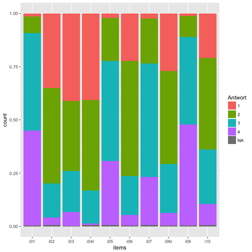
Plotting item distribution

Typical stacked bar plot

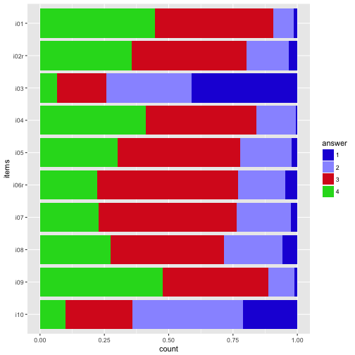
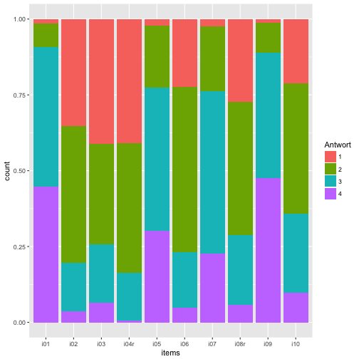
The most obvious thing is to plot the distribution of the items (here: 10) of the survey. So let’s do that with ggplot.

On the x-axis we would like to have each item (i1, i2, …), and on the y-axis the frequency of each answer, in some stapled bar fashion. That means, on the x-axis is one variable only. That’s why we need to “melt” the items to one “long” variable.

data_items %>%  
  gather(key = items, value = answer) %>% 
  mutate(answer = factor(answer)) %>% 
  ggplot(aes(x = items)) +
  geom_bar(aes(fill = answer), position = "fill") -> p1
p1

plot of chunk unnamed-chunk-10

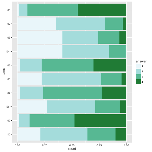
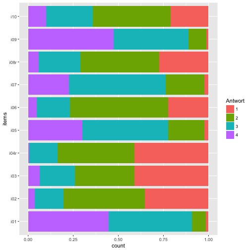
Maybe nicer to turn it 90 degrees:

p1 + coord_flip()

plot of chunk unnamed-chunk-11

And reverse the order of the items, so that i01 is at the top.

data_items %>% 
  gather(key = items, value = answer) %>% 
  mutate(answer = factor(answer),
         items = factor(items)) -> data2
  
ggplot(data2, aes(x = items)) +
  geom_bar(aes(fill = answer), position = "fill") +
  coord_flip() +
  scale_x_discrete(limits = rev(levels(data2$items))) -> p2
p2

plot of chunk unnamed-chunk-12

Colors

The beauty of the colors lie in the eye of the beholder… Let’s try a different palette.

Sequential color palettes.

p2 + scale_fill_brewer(palette = "Blues")

plot of chunk unnamed-chunk-13

p2 + scale_fill_brewer(palette = "BuGn")

plot of chunk unnamed-chunk-13

p2 + scale_fill_brewer(palette = 12)
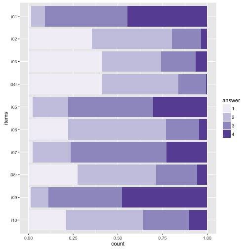
plot of chunk unnamed-chunk-13

Diverging palettes.

p2 + scale_fill_brewer(palette = "RdYlGn")

plot of chunk unnamed-chunk-14

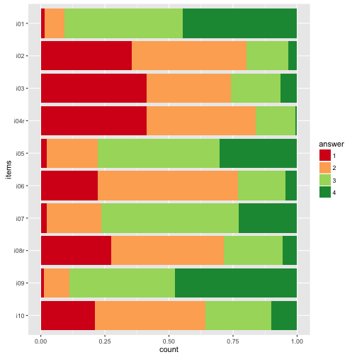
p2 + scale_fill_brewer(palette = "RdYlBu")

plot of chunk unnamed-chunk-14

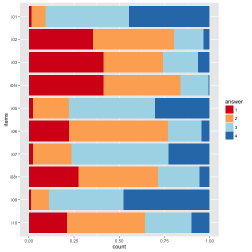
The divering palettes are useful because we have two “poles” - “do not agree” on one side, and “do agree” on the other side.

See here for an overview on Brewer palettes.

Or maybe just grey tones.

p2 + scale_fill_grey()

plot of chunk unnamed-chunk-15

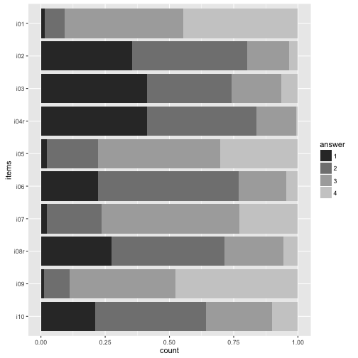
My own favorite-cherished color.

colours <- c("#2121D9", "#9999FF", "#D92121", "#21D921", "#FFFF4D", "#FF9326")
p2 + scale_fill_manual(values=colours)

plot of chunk unnamed-chunk-16

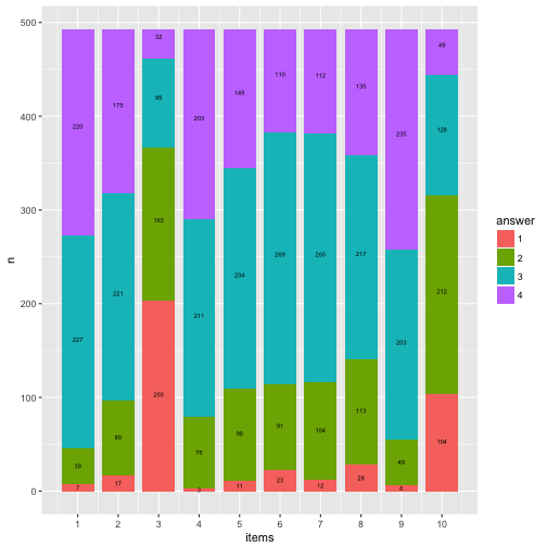
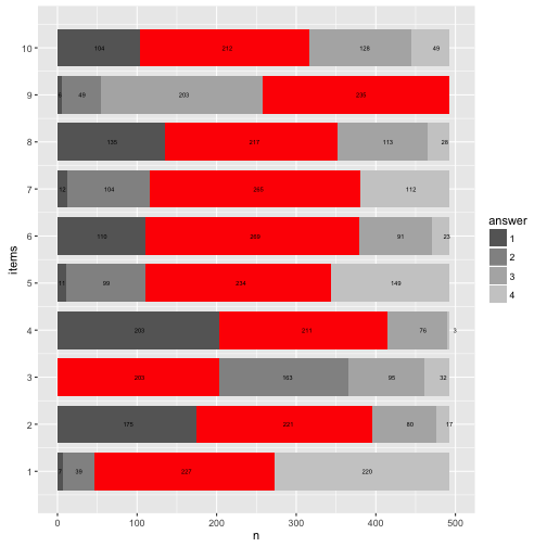
Numbers (count) on bars

It might be helpful to print the exact numbers on the bars.

data2 %>% 
  dplyr::count(items, answer) %>% 
  mutate(y_pos = cumsum(n)/nrow(data_items) - (0.5 * n/nrow(data_items)),
         y_cumsum = cumsum(n)) %>% 
  mutate(items_num = parse_number(items)) -> data3

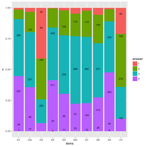
ggplot(data3, aes(x = items, y = n)) +
  geom_bar(aes(fill = answer), position = "fill", stat = "identity") +
  geom_text(aes(y = y_pos, label = n),  size = 3) -> p3

p3

plot of chunk unnamed-chunk-17

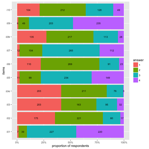
Flip coordinate system, and with “%” labels.

p3 + coord_flip() + 
  scale_y_continuous(labels = scales::percent) +
  ylab("proportion of respondents") -> p4
p4

plot of chunk unnamed-chunk-18

Highlight main category
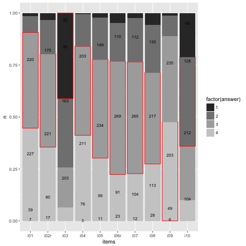
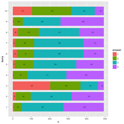
data3 %>% 
  mutate(answer = as.numeric(answer)) %>% 
  group_by(items) %>% 
  mutate(max_n = max(n)) %>% 
  mutate(max_cat = factor(which(n == max_n))) %>% 
  mutate(fit_cat = (answer == max_cat)) %>% 
  ungroup -> data4


ggplot(data4, aes(x = items, y = n)) +
  geom_bar(aes(fill = factor(answer),
               color = fit_cat), position = "fill", stat = "identity") +
  geom_text(aes(y = y_pos, label = n),  size = 3) +
  scale_color_manual(values = c("NA", "red"), guide = "none") +
  scale_fill_grey()

plot of chunk unnamed-chunk-19

To be honest, does really look nice. Let’s try something different later.

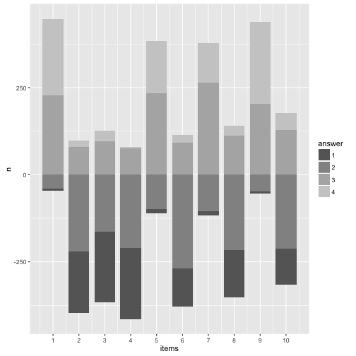
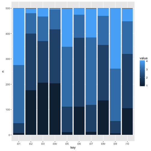
Barplot with geom_rect

This section and code is inspired by this post.

The goal is to produce a more flexible bar plot, such as a “waterfall plot”, where y= 0 is centered at the middle bar height, we need to change the geom. No more geom_bar but the more versatile geom_rect. This geom plots, surprisingly, rectangles. Hence, we need to know the start and the end value (for the y-axis, the width of the bar is just 1).

First, we need to prepare the dataset for that task.

data4 %>% 
  select(items, answer, y_cumsum) %>% 
  group_by(items) %>% 
  spread(key = answer, value = y_cumsum) %>% 
  mutate(zero = 0, end = nrow(data_items)) %>% 
  select(items, zero, `1`, `2`, `3`, `4`, end) %>% 
  ungroup %>% 
  mutate(items_num = 1:10) -> data5


data5 %>% 
  rename(start_1 = zero) %>% 
  mutate(end_1 = `1`) %>% 
  mutate(start_2 = `1`) %>% 
  mutate(end_2 = `2`) %>% 
  mutate(start_3 = `2`) %>% 
  mutate(end_3 = `3`) %>% 
  mutate(start_4 = `3`) %>% 
  mutate(end_4 = end) %>% 
  select(items_num, start_1, end_1, start_2, end_2, start_3, end_3, start_4, end_4) -> data6

head(data6) %>% kable
items_num start_1 end_1 start_2 end_2 start_3 end_3 start_4 end_4
1 0 7 7 46 46 273 273 493
2 0 175 175 396 396 476 476 493
3 0 203 203 366 366 461 461 493
4 0 203 203 414 414 490 490 493
5 0 11 11 110 110 344 344 493
6 0 110 110 379 379 470 470 493

OK, we have that, pooh, quite a mess.

So, now we need it in long form. Here come a not so elegant, but rather simple, solution for that.

data_cat1 <- select(data6, items_num, start_1, end_1) %>% setNames(c("items", "start", "end")) %>% mutate(answer = 1)
data_cat2 <- select(data6, items_num, start_2, end_2) %>% setNames(c("items","start", "end"))  %>% mutate(answer = 2)
data_cat3 <- select(data6, items_num, start_3, end_3) %>% setNames(c("items","start", "end"))  %>% mutate(answer = 3)
data_cat4 <- select(data6, items_num, start_4, end_4) %>% setNames(c("items","start", "end"))  %>% mutate(answer = 4)

   
data7 <- bind_rows(data_cat1, data_cat2, data_cat3, data_cat4) 

data7 %>% head %>% kable
items start end answer
1 0 7 1
2 0 175 1
3 0 203 1
4 0 203 1
5 0 11 1
6 0 110 1

Now let’s plot the bar graph with the rectangle plot.

data7$answer <- factor(data7$answer)

ggplot(data7) +
  aes() +
  geom_rect(aes(x = items, 
                ymin = start, 
                ymax = end, 
                xmin = items - 0.4, 
                xmax = items + 0.4,
                fill = answer)) +
  scale_x_continuous(breaks = 1:10, name = "items") +
  ylab("n") -> p5

p5 + geom_text(data = data3, aes(x = items_num, y = y_pos*nrow(data), label = n), size = 2) -> p6

p6

plot of chunk unnamed-chunk-22

Compare that to the geom_bar solution.

p3

plot of chunk unnamed-chunk-23

Basically identical (never mind the bar width).

Now flip the coordinates again (and compare to previous solution with geom_bar).

p6 + coord_flip()

plot of chunk unnamed-chunk-24

p4

plot of chunk unnamed-chunk-24

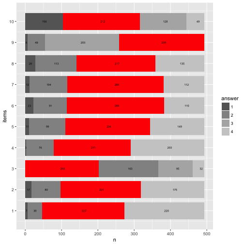
Let’s try to highlight the most frequent answer category for each item.

data7 %>% 
  mutate(n = end - start) %>% 
  group_by(items) %>% 
  mutate(max_n = max(n)) %>% 
  mutate(max_cat = factor(which(n == max_n))) %>% 
  mutate(fit_cat = (answer == max_cat)) %>% 
  ungroup -> data8

data8 %>% 
  filter(fit_cat == TRUE) -> data8a


data7 %>% 
  ggplot() +
  aes() +
  geom_rect(aes(x = items, 
                ymin = start, 
                ymax = end, 
                xmin = items - 0.4, 
                xmax = items + 0.4,
                fill = answer)) +
  scale_x_continuous(breaks = 1:10, name = "items") +
  ylab("n") + 
  scale_fill_grey(start = .4, end = .8) -> p8

    
p8 + geom_rect(data = data8a, aes(x = items, 
                ymin = start, 
                ymax = end, 
                xmin = items - 0.4, 
                xmax = items + 0.4), fill = "red")  + 
  geom_text(data = data3, aes(x = items_num, y = y_pos*nrow(data), label = n), size = 2) -> p8

p8 + coord_flip()

plot of chunk unnamed-chunk-25

Here’s a cheat sheet on colors and palettes; and here you’ll find an overview on colors (with names and hex codes).

Mrs. Brewer site is a great place to come up with your own palette and learn more about colors.
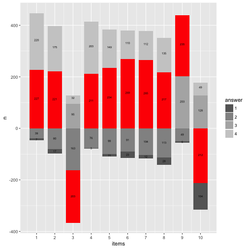
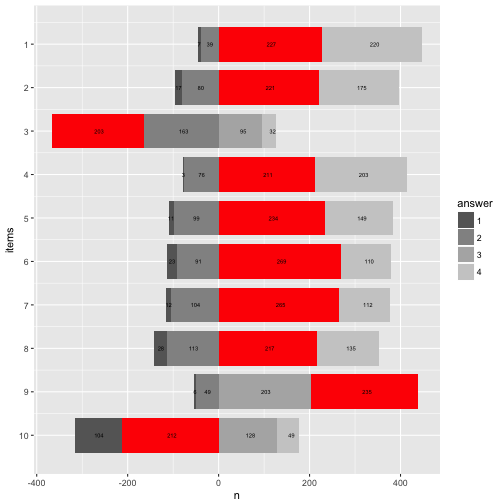
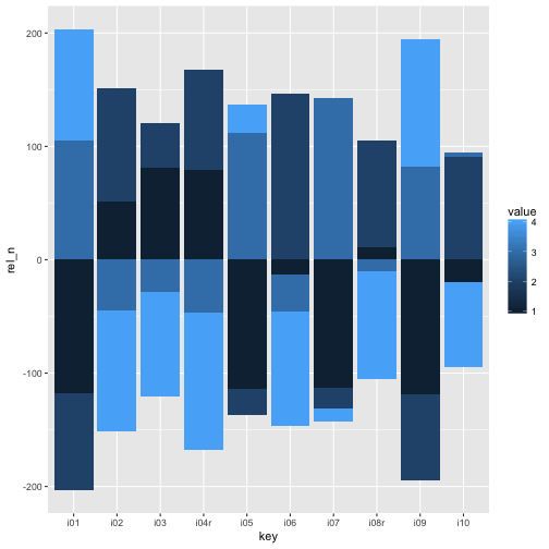
Rainbow diagram

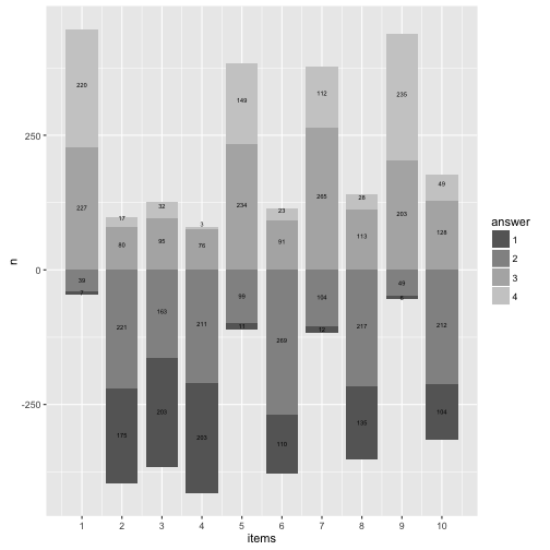
Let’s try to “move” the bars to our wishes. Precisely, it would be nice if the bars were aligned at the “Rubicon” between “do not agree” and “do agree”. Then we could see better how many persons agree and not.

More practically, if we knew that 104+212 = 316 persons basically disagree, then 316 could be our “zero line” (item 10). Repeat that for each item.

data8 %>% 
  group_by(items) %>% 
  mutate(n_disagree = sum(n[c(1,2)]),
         n_agree = sum(n[c(3,4)]),
         start_adj = start - n_disagree,
         end_adj = end - n_disagree
         ) %>% 
  ungroup -> data9


data9 %>% 
  ggplot() +
  aes() +
  geom_rect(aes(x = items, 
                ymin = start_adj, 
                ymax = end_adj, 
                xmin = items - 0.4, 
                xmax = items + 0.4,
                fill = answer)) +
  scale_x_continuous(breaks = 1:10, name = "items") +
  ylab("n") + 
  scale_fill_grey(start = .4, end = .8) -> p9

p9

plot of chunk unnamed-chunk-26

Looks quite cool.

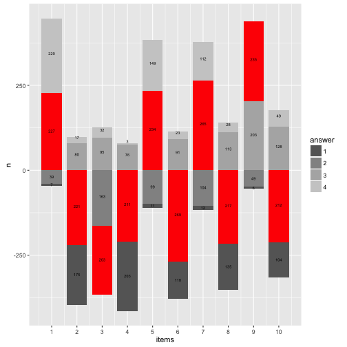
Now let’s add the numbers to that plot.

data4 %>% 
  mutate(items_num = parse_number(items)) %>% 
  dplyr::select(-items) %>% 
  rename(items = items_num) %>% 
  select(items, everything()) %>% 
  arrange(answer, items) %>% 
  ungroup -> data10


data9 %>% 
  mutate(y_pos_adj = data10$y_pos * nrow(data) - n_disagree) -> data11


p9 +  
  geom_text(data = data11, aes(x = items, y = y_pos_adj, label = n), size = 2) -> p11

p11

plot of chunk unnamed-chunk-27

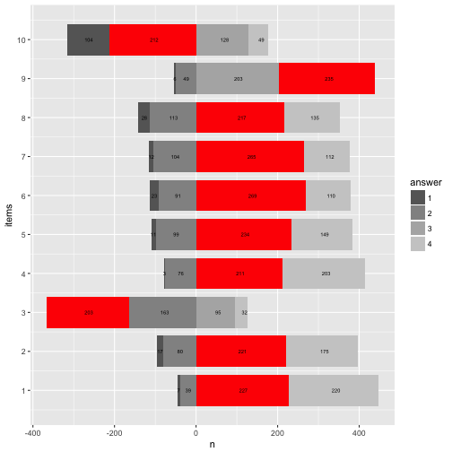
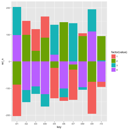
And now let’s highlight the most frequent answer category.

library(ggrepel)

data11 %>% 
  ggplot() +
  aes() +
  geom_rect(aes(x = items,
                ymin = start_adj,
                ymax = end_adj,
                xmin = items - 0.4,
                xmax = items + 0.4,
                fill = answer)) +
  scale_fill_grey(start = .4, end = .8) + 
  geom_rect(data = filter(data11, fit_cat == TRUE), 
            aes(x = items, 
                ymin = start_adj, 
                ymax = end_adj, 
                xmin = items - 0.4, 
                xmax = items + 0.4),
            fill = "red") + 
  geom_text(aes(x = items, y = y_pos_adj, label = n), size = 2) +
  scale_x_continuous(breaks = 1:10) +
  ylab("n") -> p12
p12

plot of chunk unnamed-chunk-28

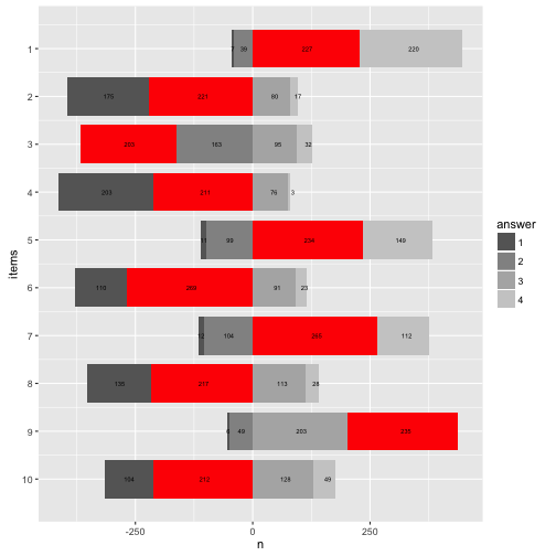
OK, that’s about it for today. May turn the waterfall by 90°.

p12 + coord_flip()

plot of chunk unnamed-chunk-29

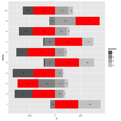
And change the direction of the now numeric items-axis.

p12 + coord_flip() + scale_x_reverse(breaks = 1:10)
## Scale for 'x' is already present. Adding another scale for 'x', which
## will replace the existing scale.

plot of chunk unnamed-chunk-30

Happy plotting!

Viele Menschen glauben an Horoskope. Doch warum? Ein Grund könnte sein, dass Horoskope einfach gut sind. Was heißt gut: Sie passen auf mich aber nicht auf andere Leute (mit anderen Strernzeichen) und sie sagen Dinge, die nützlich sind.

Ein anderer Grund könnte sein, dass sie uns schmeicheln und Gemeinplätze sind, denen jeder zustimmt: “Sie sind an sich ein Super-Typ, aber manchmal etwas ungeduldig” (oh ja, absolut, passt genau!). “Heute treffen Sie jemanden, der eine große Liebe werden könnte” (Hört sich gut an!). “Wenn Sie nicht aufpassen, könnte Ihnen heute ein Patzer unterlaufen” (Gut, dass ich gewarnt bin, ist nichts passiert heute, was beweisst, dass es richtig war, aufzupassen, Danke, Horoskop!).

Mit anderen Worten: Diese “Null-Hypothese” sagt, dass Horoskop ist so formuliert, dass man gerne zustimmt - unabhängig von den Inhalten. Die Studierenden in meinem Kurs wollten das überprüfen (das ist ein typischer Dozentensatz). Dafür haben wir uns folgende Studie überlegt: Wir legen unbedarften Versuchspersonen entweder ein echtes (vom Urheber des Horoskops als “wahr” erachtet) oder ein von uns gefälschtes Horoskop vor. Dann fragen wir, kurz gesagt: “Wie gut passt das Horoskop auf Dich?”.

Wenn das Horoskop nur Blabla ist, sollte das “Passungsgefühl” (wie gut das Horoskop auf die befragte Person passt) bei echten und gefälschten Horoskopen ungefähr gleich sein. Wenn die Horoskope die Menschen aber gut beschreiben sollten, dann sollten nur die Leute mit echten Horoskopen eine gute Passung berichten, nicht aber die Leute mit den gefälschten Horoskopen. Damit liegt die Hypothesen klar auf den Tisch – für uns, nicht für die Versuchspersonen, denen wir erstmal einen Bären aufbinden (müssen). Das nennt man dann “Coverstory” (klingt freundlicher und cooler).

In der Psychologie ist dieser Effekt als Barnumeffekt bekannt.

Schauen wir uns mal die Daten an.

Daten einlesen

Excel-Datei einlesen.

library(readxl)
data <- read_excel("~/Downloads/horo.xlsx")

Oder online die CSV-Datei einlesen.

data <- read.csv("https://sebastiansauer.github.io/data/horo.csv")

Erster Blick

library(dplyr)
glimpse(data)
## Observations: 54
## Variables: 6
## $ Sternzeichen   <fctr> Zwilling, Skorpion, Skorpion, Steinbock, Waage...
## $ Wahnehmung     <dbl> 0.00, 0.33, 0.33, 0.67, 0.67, 0.00, 0.33, 0.67,...
## $ Geschlecht     <fctr> weiblich, männlich, männlich, weiblich, männli...
## $ Alter          <int> 21, 27, 27, 26, 25, 26, 29, 26, 29, 30, 26, 33,...
## $ Gruppe         <int> 1, 1, 1, 1, 1, 1, 1, 1, 1, 1, 1, 1, 1, 1, 1, 1,...
## $ Richtig_Falsch <fctr> F, F, F, F, F, F, F, F, F, R, R, R, R, R, R, R...

NAs loswerden

data %>% 
  filter(row_number() <= 44) -> data  # ab Zeile 45 kommen nur noch Leerzeilen
# oder in der Excel-Datei die Zeilen (ab Z. 45) löschen

Check

Rechtschreibfehler bei “Wahnehmung”, das korrigieren wir.

rename(data, Wahrnehmung = Wahnehmung) -> data

Die Anzahl der “richtigen” und “falschen” Profilen sollte (etwa) gleich sein.

library(ggplot2)

data %>% 
  count(Richtig_Falsch)
## # A tibble: 2 × 2
##   Richtig_Falsch     n
##           <fctr> <int>
## 1              F    20
## 2              R    24
qplot(x = Richtig_Falsch, data = data)

plot of chunk unnamed-chunk-6 Ok, passt in etwa.

Schauen wir uns mal die Verteilung der Horoskope an.

qplot(x = Sternzeichen, data = data) + coord_flip()

plot of chunk unnamed-chunk-7

qplot(x = Sternzeichen, data = data, fill = Richtig_Falsch) + coord_flip()

plot of chunk unnamed-chunk-7

Spaßeshalber: Die Altersverteilung.

qplot(x = Geschlecht, data = data)

plot of chunk unnamed-chunk-8

summary(data$Alter)
##    Min. 1st Qu.  Median    Mean 3rd Qu.    Max.    NA's 
##   21.00   26.00   27.00   28.56   29.75   38.00      26
qplot(y = Alter, x = Geschlecht, fill = Geschlecht, geom = "boxplot", data = data, alpha = .3)
## Warning: Removed 26 rows containing non-finite values (stat_boxplot).

plot of chunk unnamed-chunk-10

“Wahrnehmung”

Ist die gefühlte Passgenauigkeit zwischen den beiden Gruppen gleich, so wie es der Barnum-Effekt vorhersagt?

Schauen wir mal…

data %>% 
  filter(!is.na(Wahrnehmung)) %>% 
  group_by(Richtig_Falsch) %>% 
  summarise(wahr_group_mean = mean(Wahrnehmung, na.rm = TRUE),
            wahr_group_md = median(Wahrnehmung, na.rm = TRUE)) -> results1

results1
## # A tibble: 2 × 3
##   Richtig_Falsch wahr_group_mean wahr_group_md
##           <fctr>           <dbl>         <dbl>
## 1              F       0.5835000         0.670
## 2              R       0.4445833         0.415

Das plotten wir mal, ist ja so was wie ein zentrales Ergebnis.

results1 %>% 
  ggplot() +
  aes(y = wahr_group_mean, 
      x = Richtig_Falsch) +
  geom_bar(stat = "identity") +
  xlab("Horoskop-Typ (Richtig vs. Falsch)") +
  ylab("Gefühlte Passung des Horoskops") 

plot of chunk unnamed-chunk-12

Eigentlich ist dieses Bild recht informationsarm. Schöner ist es (vielleicht) so:

data %>% 
  ggplot(aes(x = Richtig_Falsch, y = Wahrnehmung)) +
  geom_boxplot() +
  geom_jitter()

plot of chunk unnamed-chunk-13

Hm, sieht etwas komisch aus. Vielleicht lieber ein Histogramm:

data %>% 
  ggplot(aes(x = factor(Wahrnehmung), fill = Richtig_Falsch)) +
  geom_bar(position = "dodge")

plot of chunk unnamed-chunk-14

Das ist ganz aufschlussreich. Die Balken sind überall in etwa gleich hoch. Nur bei “Null-Passung” finden sich hauptsächlich echte Horoskope. Das spricht nicht für die Glaubhaftigkeit der Horoskope - und damit indirekt Unterstützung für den Barnum-Effekt.

Inferenzstatistik

Schauen wir mal ob sich die beiden Profilgruppen signifikant voneinander unterscheiden:

t.test(Wahrnehmung ~ Richtig_Falsch, data = data)
## 
## 	Welch Two Sample t-test
## 
## data:  Wahrnehmung by Richtig_Falsch
## t = 1.2085, df = 41.436, p-value = 0.2337
## alternative hypothesis: true difference in means is not equal to 0
## 95 percent confidence interval:
##  -0.09315257  0.37098591
## sample estimates:
## mean in group F mean in group R 
##       0.5835000       0.4445833

Der p-Wert ist größer als .05, also nicht signifikant.

Effektstärke und Konfidenzintervall

Wie groß ist die Effektstärke des Unterschieds? Wie groß ist das Konfidenzintervall der Effektstärke?

data %>% 
  count(Richtig_Falsch)
## # A tibble: 2 × 2
##   Richtig_Falsch     n
##           <fctr> <int>
## 1              F    20
## 2              R    24
library(compute.es)
tes(t = 1.21,n.1 = 20, n.2 = 24)
## Mean Differences ES: 
##  
##  d [ 95 %CI] = 0.37 [ -0.25 , 0.98 ] 
##   var(d) = 0.09 
##   p-value(d) = 0.24 
##   U3(d) = 64.29 % 
##   CLES(d) = 60.22 % 
##   Cliff's Delta = 0.2 
##  
##  g [ 95 %CI] = 0.36 [ -0.25 , 0.96 ] 
##   var(g) = 0.09 
##   p-value(g) = 0.24 
##   U3(g) = 64.05 % 
##   CLES(g) = 60.04 % 
##  
##  Correlation ES: 
##  
##  r [ 95 %CI] = 0.18 [ -0.13 , 0.46 ] 
##   var(r) = 0.02 
##   p-value(r) = 0.24 
##  
##  z [ 95 %CI] = 0.19 [ -0.13 , 0.5 ] 
##   var(z) = 0.02 
##   p-value(z) = 0.24 
##  
##  Odds Ratio ES: 
##  
##  OR [ 95 %CI] = 1.94 [ 0.64 , 5.94 ] 
##   p-value(OR) = 0.24 
##  
##  Log OR [ 95 %CI] = 0.66 [ -0.45 , 1.78 ] 
##   var(lOR) = 0.31 
##   p-value(Log OR) = 0.24 
##  
##  Other: 
##  
##  NNT = 8.53 
##  Total N = 44

Wie im Output steht: > d [ 95 %CI] = 0.37 [ -0.25 , 0.98 ]

Fazit

Die Daten sprechen nicht für die Glaubwürdigkeit der Horoskope; in beiden Gruppen (echt vs. gefakt) war die gefühlte Passung ählich. Wir fanden wenig Unterstützung für die Glaubwürdigkeit der Horoskope (bzw. dass die Leute die echten Horoskope glaubhafter einschätzten).

Der Signifikanztest war nicht signifikant; der Unterschied der Mittelwerte reichte nicht aus, um die H0 der Gleichheit zu verwerfen. Dieses Ergebnis kann auf die geringe Stichprobengröße zurückgeführt werden; andererseits kann es auch als Beleg für die Nullhypothese verstanden werden. Natürlich lassen die vorliegenden Daten keine starken Schlüsse zu; aber hey - es war eine schöne Übung :)

Die großen Effektstärkeintervalle sprechen dafür, dass der Effekt nur ungenau geschätzt wurde (aufgrund der geringen Stichprobengröße), was die Aussagekraft der Ergebnisse weiter abschwächt.

Witzigerweise war die mittlere subjektive Passung in der “gefälschten” Gruppe höher als in der “echten” Gruppe; dieser Effekt war von mittlerer Stärke (d = 0.37). Anschaulicher gesprochen: Zieht man eine Person aus jeder Gruppe, so ist die Wahrscheinlichkeit, dass die Person aus der “gefälschten” Gruppe ein größeres Passungsgefühlt hat, ca. 64% (bestenfalls).

Schluss, aus, Feierabend

Ok, für heute reichts :)