Overfitting is a common problem in data analysis. Some go as far as saying that “most of” published research is false (John Ionnadis); overfitting being one, maybe central, problem of it. In this post, we explore some aspects on the notion of overfitting.
Assume we have 10 metric variables v (personality/health/behavior/gene indicator variables), and, say, 10 variables for splitting up subgroups (aged vs. young, female vs. male, etc.), so 10 dichotomic variables. Further assume there are no association whatsoever between these variables. How likely is it we find something publishable? Apparently quite probably; but let’s give it a try.
Load some packages.
library(tidyverse)
library(corrr)
library(broom)
library(htmlTable)
Simulated dataset 10x10
Make sup some uncorrelated data, 10x10 variables each \(N \sim (0,1)\).
set.seed(123)
matrix(rnorm(100), 10, 10) -> v
Let’s visualize the correlation matrix.
v %>% correlate %>% rearrange %>% rplot(print_cor = TRUE)
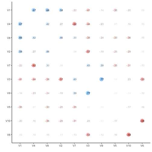
v %>% correlate -> v_corr_matrix
So, quite some music in the bar. Let’s look at the distribution of the correlation coefficients.
v_corr_matrix %>%
select(-rowname) %>%
gather %>%
filter(complete.cases(.)) -> v_long
v_long %>%
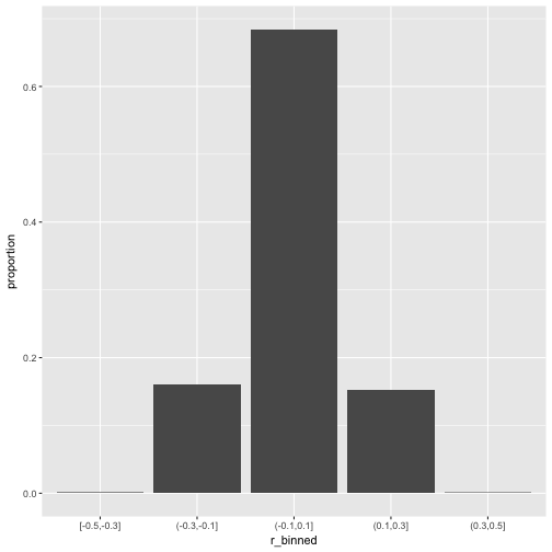
mutate(r_binned = cut_width(value, 0.2)) %>%
ggplot +
aes(x = r_binned) +
geom_bar()
What about common statistics?
library(psych)
describe(v_long$value)
##    vars  n  mean   sd median trimmed  mad   min  max range skew kurtosis
## X1    1 90 -0.03 0.36  -0.12   -0.05 0.35 -0.68 0.77  1.44 0.36    -0.68
##      se
## X1 0.04
Probably more stringent to just choose one triangle from the matrix, but I think it does not really matter for our purposes.
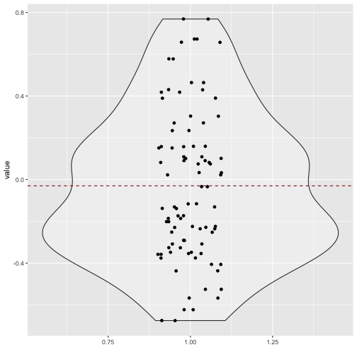
Quite a bit of substantial correlation going on. Let’s look from a different angle.
v_long %>%
  ggplot +
  aes(x = 1, y = value) +
  geom_violin(alpha = .3) +
  geom_jitter(aes(x = 1, y = value), width = .1) +
  xlab("") +
  geom_hline(yintercept = mean(v_long$value), linetype = "dashed", color = "#880011")
100x100 dataset correlation
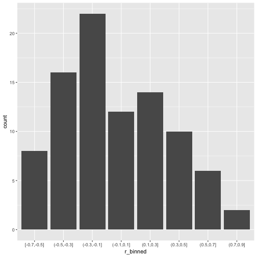
Now let’s scale up a bit and see whether the pattern stabilize.
set.seed(123)
matrix(rnorm(10^4), 100, 100) -> v2
v2 %>% correlate -> v2_corr_matrix
v2_corr_matrix %>%
  select(-rowname) %>%
  gather %>%
  filter(complete.cases(.)) -> v2_long

v2_long %>%
  mutate(r_binned = cut_width(value, 0.2)) %>%
  ggplot +
  aes(x = r_binned) +
  geom_bar(aes(y = ..count../sum(..count..))) +
  ylab("proportion")
So, how many r’s are in the (0.1,0.3) bin?
library(broom)
v2_long %>%
  mutate(r_binned = cut_width(value, 0.2)) %>%
  group_by(r_binned) %>%
  summarise(n_per_bin = n(),
            prop_per_bin = round(n()/nrow(.), 2))
## # A tibble: 5 × 3
##      r_binned n_per_bin prop_per_bin
##        <fctr>     <int>        <dbl>
## 1 [-0.5,-0.3]        10         0.00
## 2 (-0.3,-0.1]      1594         0.16
## 3  (-0.1,0.1]      6776         0.68
## 4   (0.1,0.3]      1512         0.15
## 5   (0.3,0.5]         8         0.00
That’s quite a bit; 15% correlation in the bin (.1.3). Publication ahead!
Subgroup analyses
Now, let’s look at our subgroup. For that purposes, we need actual data, not only the correlation data. Let’s come up with 1000 individuals, where he have 100 measurement (metric; N(0,1)), and 100 subgroup variables (dichotomic).
set.seed(123)
matrix(rnorm(1000*100), nrow = 1000, ncol = 100) -> v3
dim(v3)
## [1] 1000 100
matrix(sample(x = c("A", "B"), size = 1000*100, replace = TRUE), ncol = 100, nrow = 1000) -> v4
dim(v4)
## [1] 1000 100
v5 <- cbind(v3, v4)
dim(v5)
## [1] 1000 200
Now, t-test battle. For each variable, compute a t-test; for each subgroup, compute a t-test. Do the whole shabeng (100*100 tests).
But, as a first step, let’s look at the first subgroup variable only.
v3 %>%
  data.frame %>%
  map(~t.test(.x ~ v4[, 1])) %>%
  map(broom::tidy) %>%
  map("p.value") %>%
  unlist %>%
  tibble -> v3_pvalues

v3_pvalues %>%
  qplot(x = .) +
  xlab("p value") +
  geom_vline(xintercept = .05, color = "#880011", linetype = "dashed")
## Don't know how to automatically pick scale for object of type tbl_df/tbl/data.frame. Defaulting to continuous.
## `stat_bin()` using `bins = 30`. Pick better value with `binwidth`.
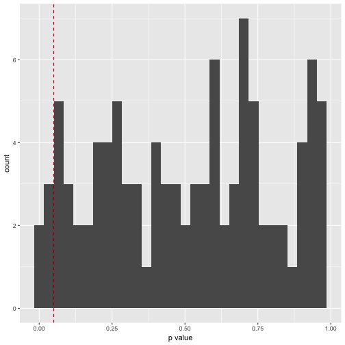
How many significant p values resulted (should be 5%, ie 5 of 100)?
v3_pvalues %>%
  filter(. < .05)
## # A tibble: 5 × 1
##            .
##        <dbl>
## 1 0.01350926
## 2 0.04115726
## 3 0.01064116
## 4 0.04251559
## 5 0.02505199
Which is exactly what we found.
p_list <- vector(length = 100, mode = "list")
i <- 1

for (i in 1:100){

  v3 %>%
    data.frame %>%
    map(~t.test(.x ~ v4[, i])) %>%
    map(broom::tidy) %>%
    map("p.value") %>%
    unlist %>%
    tibble -> p_list[[i]]

}

# str(p_list)  #tl;dr

p_df <- as.data.frame(p_list)
names(p_df) <- paste("V", formatC(1:100, width = 3, flag = "0"), sep = "")
Let’s try a giant plot with 100 small multiples.
p_df %>%
  gather %>%
  ggplot(aes(x = value)) +
  geom_histogram() +
  facet_wrap(~key, ncol = 10)
## `stat_bin()` using `bins = 30`. Pick better value with `binwidth`.
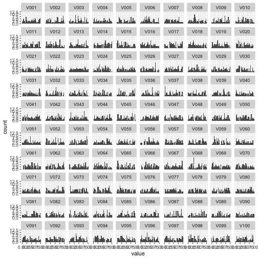
Well impressive, but that histogram matrix does not serve much. What about a correlation plot as above, only giantesque…
p_df %>% correlate %>% rplot
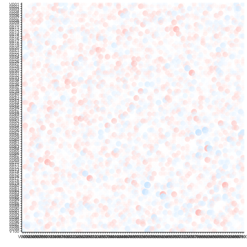
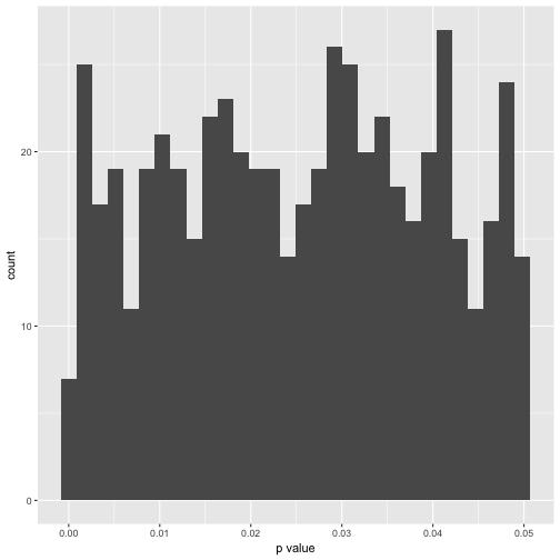
Hm, of artis values (in 10000 years). Maybe better plot a histogram of the number of signifinat p-values ( <. 05).
p_df %>%
  gather %>%
  dplyr::filter(value < .05) %>%
  qplot(x = value, data = .) +
  xlab("p value")
## `stat_bin()` using `bins = 30`. Pick better value with `binwidth`.
In exact numbers, what’s the percentage of significant p-values per variable?
p_df %>%
  gather %>%
  group_by(key) %>%
  filter(value < .05) %>%
  summarise(n = n()) -> p_significant
htmlTable(p_significant)
| key | n | |
|---|---|---|
| 1 | V001 | 5 |
| 2 | V002 | 4 |
| 3 | V003 | 8 |
| 4 | V004 | 7 |
| 5 | V005 | 4 |
| 6 | V006 | 4 |
| 7 | V007 | 4 |
| 8 | V008 | 5 |
| 9 | V009 | 3 |
| 10 | V010 | 5 |
| 11 | V011 | 6 |
| 12 | V012 | 8 |
| 13 | V013 | 7 |
| 14 | V014 | 4 |
| 15 | V015 | 13 |
| 16 | V016 | 7 |
| 17 | V017 | 8 |
| 18 | V018 | 5 |
| 19 | V019 | 7 |
| 20 | V020 | 4 |
| 21 | V021 | 10 |
| 22 | V022 | 3 |
| 23 | V023 | 5 |
| 24 | V024 | 4 |
| 25 | V025 | 7 |
| 26 | V026 | 9 |
| 27 | V027 | 4 |
| 28 | V028 | 7 |
| 29 | V029 | 5 |
| 30 | V030 | 3 |
| 31 | V031 | 4 |
| 32 | V032 | 9 |
| 33 | V033 | 8 |
| 34 | V034 | 8 |
| 35 | V035 | 4 |
| 36 | V036 | 2 |
| 37 | V037 | 11 |
| 38 | V038 | 8 |
| 39 | V039 | 2 |
| 40 | V040 | 10 |
| 41 | V041 | 6 |
| 42 | V042 | 3 |
| 43 | V043 | 5 |
| 44 | V044 | 2 |
| 45 | V045 | 8 |
| 46 | V046 | 2 |
| 47 | V047 | 8 |
| 48 | V048 | 7 |
| 49 | V049 | 2 |
| 50 | V050 | 5 |
| 51 | V051 | 4 |
| 52 | V052 | 10 |
| 53 | V053 | 5 |
| 54 | V054 | 3 |
| 55 | V055 | 3 |
| 56 | V056 | 5 |
| 57 | V057 | 3 |
| 58 | V058 | 2 |
| 59 | V059 | 1 |
| 60 | V060 | 8 |
| 61 | V062 | 6 |
| 62 | V063 | 5 |
| 63 | V064 | 3 |
| 64 | V065 | 12 |
| 65 | V066 | 4 |
| 66 | V067 | 6 |
| 67 | V068 | 2 |
| 68 | V069 | 9 |
| 69 | V070 | 6 |
| 70 | V071 | 7 |
| 71 | V072 | 8 |
| 72 | V073 | 8 |
| 73 | V074 | 8 |
| 74 | V075 | 5 |
| 75 | V076 | 4 |
| 76 | V077 | 5 |
| 77 | V078 | 4 |
| 78 | V079 | 3 |
| 79 | V080 | 4 |
| 80 | V081 | 6 |
| 81 | V082 | 9 |
| 82 | V083 | 12 |
| 83 | V084 | 5 |
| 84 | V085 | 3 |
| 85 | V086 | 6 |
| 86 | V087 | 7 |
| 87 | V088 | 4 |
| 88 | V089 | 6 |
| 89 | V090 | 6 |
| 90 | V091 | 6 |
| 91 | V092 | 7 |
| 92 | V093 | 4 |
| 93 | V094 | 5 |
| 94 | V095 | 2 |
| 95 | V096 | 10 |
| 96 | V097 | 7 |
| 97 | V098 | 6 |
| 98 | V099 | 5 |
| 99 | V100 | 2 |
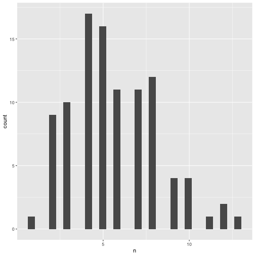
Distribution of significant p-values.
p_significant %>%
  qplot(x = n, data = .)
## `stat_bin()` using `bins = 30`. Pick better value with `binwidth`.
Summary stats of significant p-values.
p_df %>%
  gather %>%
  group_by(key) %>%
  filter(value < .05) %>%
  summarise(n_p = n(),
            mean_p = mean(value),
            median_p = median(value),
            sd_p = sd(value, na.rm = TRUE),
            IQP_p = IQR(value),
            min_p = min(value),
            max_p = max(value)) %>%
  map(mean) %>% as.data.frame -> p_summary_tab
## Warning in mean.default(.x[[i]], ...): argument is not numeric or logical:
## returning NA
Here comes the table of the mean over all 100 variables of the typical statistics.
p_summary_tab %>%
  select_if(is.numeric) %>%
  round %>%
  htmlTable
| key | n_p | mean_p | median_p | sd_p | IQP_p | min_p | max_p | |
|---|---|---|---|---|---|---|---|---|
| 1 | 6 | 0 | 0 | 0 | 0 | 0 |
In sum, overfitting - mistakenly taking noise as signal - happened often. Actually, as often as is expected by theory. But, not knowing or not minding theory, one can easily be surprised by the plethora of “interesting findings” in the data. In John Tukey’s words (more or less): “Torture the data for a long enough time and it will tell you anything”.