Bar plots, whereas not appropriate for means, are helpful for conveying impressions of frequencies, particularly relative frequencies, ie., proportions.
Intuition: Bar plots and histograms alike can be thought of as piles of Lego pieces, put onto each each other, where each Lego piece represents (is) one observation.
Presenting tables of frequencies are often not insightful to the eye. Bar plots are often much more accessible and present the story more clearly.
In R, using ggplot2, there are basically two ways of plotting bar plots (as far as I know). First, we can just take a data frame in its raw form and let ggplot2 count the rows so to compute frequencies and map that to the height of the bar. Second, we can do the computation of frequencies ourselves and just give the condensed numbers to ggplot2. Let’s look at each of the two ways in turn.
Way one: Give raw, unprocessed data to ggplot
First, let’s give the raw (unprocessed) data frame to ggplot2, and let ggplot2 compute frequencies. For example:
data(Affairs, package = "AER") # package must be installed upfron
library(ggplot2)
library(dplyr)
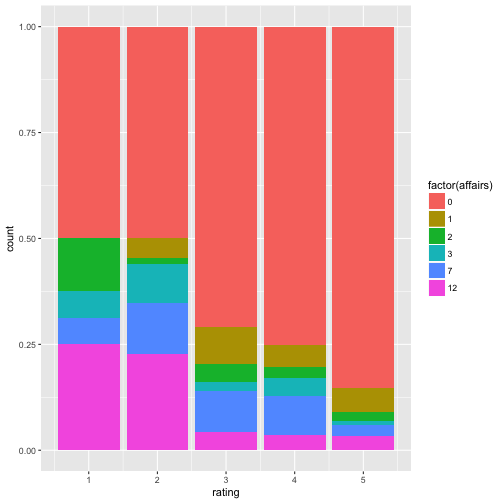
ggplot(Affairs) +
aes(x = rating, fill = factor(affairs)) +
geom_bar(position = "fill")
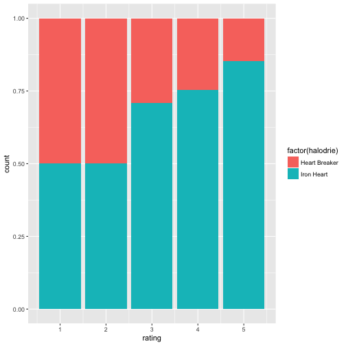
# Recode: 0 -> "Iron Heart"; else -> "Player"
Affairs$halodrie <- recode(Affairs$affairs, `0` = "Iron Heart", .default = "Heart Breaker")


ggplot(Affairs) +
  aes(x = rating, fill = factor(halodrie)) +
  geom_bar(position = "fill")
Data comes from Fair (1978): Fair, R.C. (1978). A Theory of Extramarital Affairs. Journal of Political Economy, 86, 45–61.
Some notes. We use fill = ... to say “put the number of ‘Heart Breakers’ and ‘Iron Hearts’ onto each other”. So the columns for ‘Heart breakers’ and for ‘Iron Hearts’ pile up on each other. Of importance, the position = "fill" (note the quotation marks) will make “proportion bars”, so the height of the bar goes up to 100%. This is obviously only of use if different colors indicate the relative height (frequencies) of the categories in the bar. Don’t forget to make the filling variable of type factor, otherwise the filling can go awry.
Also note that you cannot make use of qplot here, as qplot does not support the position parameter (see documentation; qplot is designed for easy, quick plotting):
qplot(data = Affairs,
      x = rating, fill = halodrie, geom = "bar", position = "fill")
## Warning: `position` is deprecated
Way two: Summarise the frequencies upfront, and give the summaries to ggplot
Way two basically consists of doing the computation of the frequencies by oneself and of then giving the frequencies per category/group for plotting. See:
A2 <- count(Affairs, rating, halodrie)
A2 <- group_by(A2, rating)
A2 <- mutate(A2, prop = n / sum(n))
Now we handover A2, the dataframe consisting of summarized data (frequencies) to qplot:
qplot(x = rating, y = prop, fill = halodrie, data = A2, geom = "col")
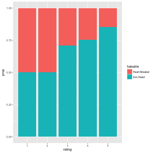
Easy, right? Note that geom col (as in column) expects single numbers; it does not count rows (as does geom_bar). In effect, geom_col(...) is geom_bar(stat = identity, ...). As our proportions sum up to 100% we do need need to care to tell about relative height plotting. Works out automatically.
To the contrary, geom_bar won’t work:
qplot(x = rating, fill = halodrie, data = A2, geom = "bar")
Translating qplot to ggplot is easy enough:
ggplot(A2) +
  aes(x = rating, y = prop, fill = halodrie) +
  geom_col()

Some polishment:
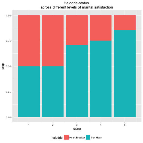
qplot(x = rating, y = prop, fill = halodrie, geom = "col", data = A2) + theme(legend.position = "bottom") + labs(title = "Halodrie-status \nacross different levels of marital satisfaction") +
  theme(plot.title = element_text(hjust = 0.5))
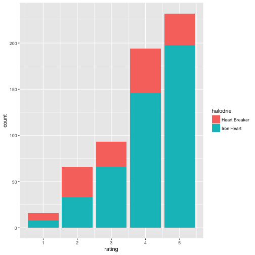
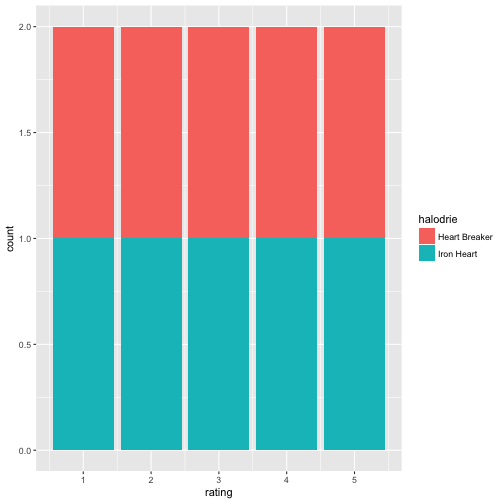
Now suppose, we want not showing the proportions, ie., the bars should not have height 100%, but the real count-height. position = "stack" will accomplish that.
ggplot(A2) +
  geom_col(aes(x = rating, y = n, fill = halodrie), position = "stack")

Note that this view makes it more difficult to tell in which column the proportion of “Heart Players” is high(er).
In qplot:
qplot(data = A2,
      x = rating,
      y = n,
      fill = halodrie,
      geom = "col")

Happy plotting!