Pearson’s correlation is a well-known and widely used instrument to gauge the degree of linear association of two variables (see this post for an intuition on correlation).
There a many formulas for correlation, but a short and easy one is this one:
.
In words, can be seen as the average product of z-scores.
In “raw values”, r is given by
.
Here, refers to the difference of a value to its mean.
At times it is helpful to write r so that the similarity to the covariance gets clear:
OK. But why is it, that r cannot be larger than 1 (and not smaller than -1)?
That is, why does the following inequality hold: ?
This is the question we are addressing in this post. I haven’t found much on that on the net, so that’s why I sum up some thoughts in this post.
Cauchy-Schwarz Inequality
One explanation, quite straight forward, is based on the Cauchy-Schwarz Inequality. This inequality can be stated as follows:
,
where denotes the dot product of a vector, eg. x.
This formula can be rewritten as
But this formula looks very similar to the correlation, if we first take the square root of both sides:
and then cancel out the (1/n) part from the raw values equation of r above:
.
Now rewrite r in this way:
.
The raw formula of r matches now the Cauchy-Schwarz inequality! Thus, the nominator of r raw formula can never be greater than the denominator. In other words, the whole ratio can never exceed an absolute value of 1.
Looking at the regression line
A second line of reasoning why r cannot the greater than 1 (less than -1) is the following.
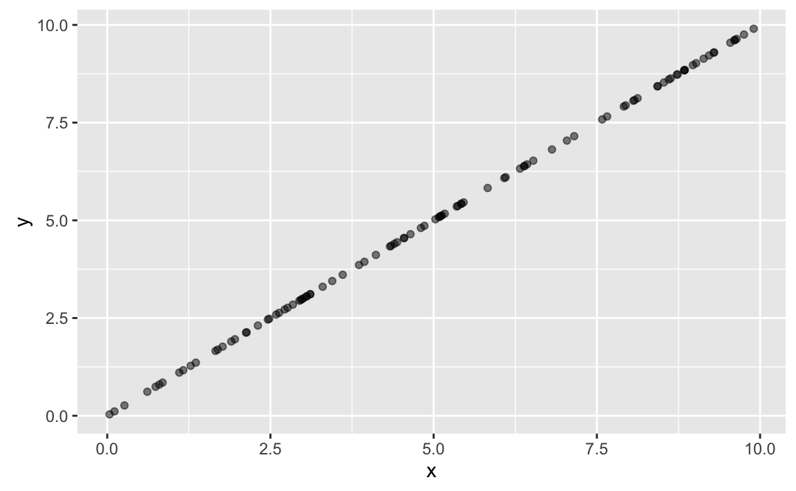
Suppose X and Y are perfectly correlated, for example like this:
x <- runif(n = 100, min = 0, max = 10)
res <- rnorm(n = 100)
y <- x
library(ggplot2)
library(tibble)
ggplot(tibble(x, y), aes(x = x, y = y)) + geom_point(alpha = .5)
Now, what happens if we z-scale X and Y? Not much:
z_x <- as.numeric(scale(x))
z_y <- as.numeric(scale(y))

df1 <- tibble(z_x, z_y)
ggplot(df1, aes(x = z_x, y = z_y)) + geom_point(alpha = .5)
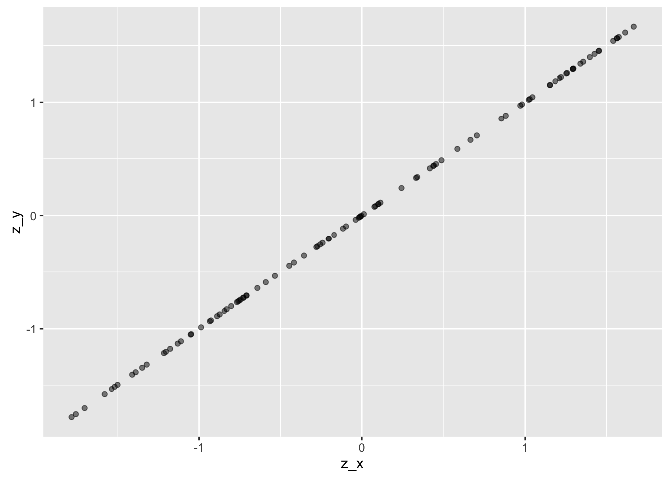
The difference is that mean X and meany Y is both zero, and SD for both X and Y is 1, so the scaling has changed (the line has a gradient of 1 now).
Note that perfect correlation of z-scaled variables means that for each there is an of same value.
For example:
library(magrittr)
z_x <- x %>%  scale %>% as.numeric %>% sort
z_y <- y %>%  scale %>% as.numeric %>% sort
df2 <- tibble(z_x, z_y)
head(df2)
## # A tibble: 6 x 2
##         z_x       z_y
##       <dbl>     <dbl>
## 1 -1.688960 -1.688960
## 2 -1.688875 -1.688875
## 3 -1.685675 -1.685675
## 4 -1.621873 -1.621873
## 5 -1.554167 -1.554167
## 6 -1.532031 -1.532031
But if for all X and Y it means that the means and variances of X and Y are the same, too. It actually means that X equals Y.
If we look at the formula of the correlation for perfectly correlated z-scaled variables X and Y we find:
In words, when two variables are perfectly correlated (ie., their graph is a line), then r=1.