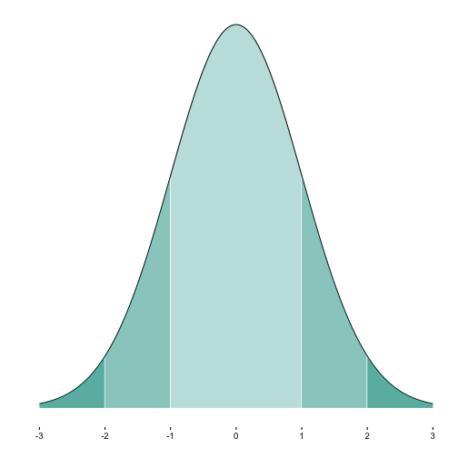
When plotting a normal curve, it is often helpful to color (or shade) some segments. For example, often we might want to indicate whether an absolute value is greater than 2.
How can we achieve this with ggplot2? Here is one way.
First, load packages and define some constants. Specifically, we define mean, sd, and start/end (z-) value of the area we want to shade. And your favorite color is defined.
library(ggplot2)
library(dplyr)
##
## Attaching package: 'dplyr'
## The following objects are masked from 'package:stats':
##
##     filter, lag
## The following objects are masked from 'package:base':
##
##     intersect, setdiff, setequal, union
mean.1 <-0
sd.1 <- 1
zstart <- 2
zend <- 3
zcritical <- 1.65

my_col <- "#00998a"
Next, we build a sequence from 3sd left to 3sd right to the mean. Along this sequence (for each value) we will compute the density of the normal curve. The data will be used for plotting the curve and the shaded area(s).
x <- seq(from = mean.1 - 3*sd.1, to = mean.1 + 3*sd.1, by = .01)


MyDF <- data.frame(x = x, y = dnorm(x, mean = mean.1, sd = sd.1))
Then, we define a “shading” function which does the shading job.
shade_curve <- function(MyDF, zstart, zend, fill = "red", alpha = .5){
  geom_area(data = subset(MyDF, x >= mean.1 + zstart*sd.1
                          & x < mean.1 + zend*sd.1),
            aes(y=y), fill = fill, color = NA, alpha = alpha)
}
Now we plot it:
p1a <- ggplot(MyDF, aes(x = x, y = y)) + geom_line() +
  shade_curve(MyDF = MyDF, zstart = -1, zend = 1, fill = my_col, alpha = .3) +
  shade_curve(MyDF = MyDF, zstart = 1, zend = 2, fill = my_col, alpha = .5) +
  shade_curve(MyDF = MyDF, zstart = -2, zend = -1, fill = my_col, alpha = .5) +
  shade_curve(MyDF = MyDF, zstart = 2, zend = 6, fill = my_col, alpha = .7) +
  shade_curve(MyDF = MyDF, zstart = -3, zend = -2, fill = my_col, alpha = .7) +
  scale_x_continuous(breaks = -3:3) +
  scale_y_continuous(breaks = NULL) +
  theme_classic() +
  ylab("") + xlab("")

p1a
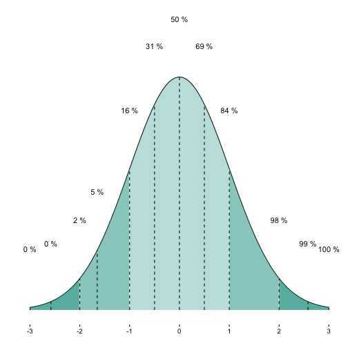
OK. Another nice feature would be have printed the cumulative percentages for each shaded segment.
For that purpose, let’s add a variable with the cumulative density.
MyDF %>%
  mutate(y_cdf = cumsum(y)) -> MyDF
But we are only interested in some quantiles. So let’s filter these and kick out the rest.
MyDF %>%
  filter(x %in% c(-3, -2.58, -2, -1.65, -1, -.5, 0, .5, 1, 1.65, 2, 2.58, 3)) -> MyDF_filtered
Now, let’s add the cumulative percentages for some quantiles of interest.
p1a + geom_text(data = MyDF_filtered,
                aes(x = x, y = y + .1, label = paste(round(y_cdf, 0),"%")),
                check_overlap = TRUE) +
  geom_segment(data = MyDF_filtered,
               aes(x = x, xend = x, y = 0, yend = y), linetype = "dashed")