reading time: 10 min.
Pearson’s correlation (short: correlation) is one of statistics’ all time classics. With an age of about a century, it is some kind of grand dad of analytic tools – but an oldie who is still very busy!
Formula, interpretation and application of correlation is well known.
In some non-technical lay terms, correlation captures the (linear) degree of co-variation of two linear variables. For example: if tall people have large feet (and small people small feet), on average, we say that height and foot size are correlated.
But what is maybe less well known is some intuitive understanding of correlation. That’s the plan of this post.
Roughly, correlation can be seen as the average deviation rectangle:
library(ggplot2)
data(tips, package = "reshape2")

(ggplot(tips) +
 geom_hline(yintercept = mean(tips$tip), linetype = "dashed") +
 geom_vline(xintercept = mean(tips$total_bill), linetype = "dashed") +
 annotate("rect",xmin = mean(tips$total_bill), ymin = mean(tips$tip),
 xmax = tips$total_bill[24], ymax = tips$tip[24], alpha = .1,
 color = "red", fill = "red") +
 annotate("text", x = 30, y = 8,
 label = "X[i] - bar(X)", parse = T, colour = "Red") +
 annotate("text", x = 42, y = 5.5,
 label = "Y[i] - bar(Y)", parse = T, colour = "Red") +
 geom_point(aes(x = total_bill, y = tip)) +
 geom_point(x = tips$total_bill[24], y = tips$tip[24], color = "red",
 alpha = .1, size = 4) +
 theme(axis.title=element_text(size=28),
 plot.title = element_text(size = rel(4))))
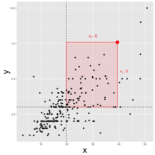
“Deviation” means here distance from the mean. For example, if my height is 1.95 meters, and the mean height is 1.80 meters my “deviation” or “delta” would be 0.15 meters.
A bit more formally, this mean average deviation is ) , where means “mean of X” or “average X”.
This measure of “joint deviation” or let’s say coordinated deviation is called covariance as it measures the degree to which large deltas in X go together with large deltas in Y.
Looking at a more official formula we find:
.
Now, let’s do the same calculation not with the normal, raw data (such as my height of 1.95 meters) but use z-standardized values instead.
Computing the “average deviation rectangle” with z-values (instead of raw values) yields the correlation or Person’s correlation coefficient:
.
In words, the correlation (Cor) of X and Y is the mean z deviation rectangle.
Wait a minute! Does that mean that if correlation is zero, than the mean deviation rectangle equals zero? Yes, thats true! How can that be? Let’s visualize:
library(TeachingDemos)
library('MASS')
##
## Attaching package: 'MASS'
## The following object is masked from 'package:dplyr':
##
##     select
samples = 200

data_1 = mvrnorm(n=samples, mu=c(0, 0), Sigma=matrix(c(1, 0, 0, 1), nrow=2), empirical=TRUE)

data_df_1 <- data.frame(data_1)

cor.rect.plot(y = data_df_1$X1, x = data_df_1$X2)
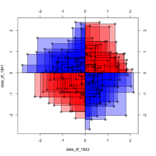
We see that the average red rectangle appears roughly the average blue rectangle. Now, the red rectangle have a positive sign (+), whereas the blue ones have a negative sign.
This is because in the upper right corner, both X and Y delta is positive (my height and my foot size is above average), yielding a positive product value (eg., +10 * +3 = +30). Similarly, in the lower left (red) corner, both deltas are negative (values below average), yielding a positive product (eg., -10 * -3 = -30).
In the “blue corners” (upper left, lower right), one delta has a negative sign and one delta has a positive sign, yielding a negative sign for their product (e.g, -10 * + 3 = -30).
Hence, some rectangles have a positive value, some a negative. In sum, the average rectangle is zero. Zero mean rectangle means zero correlation.
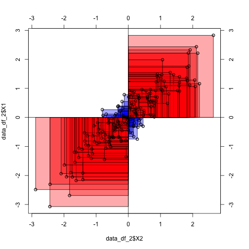
To the contrary, in the following diagram we see that the average rectangle is positive and quite large (as their are only few blue ones):
library(TeachingDemos)
library('MASS')


data_2 = mvrnorm(n=samples, mu=c(0, 0), Sigma=matrix(c(1, .9, .9, 1), nrow=2), empirical=TRUE)

data_df_2 <- data.frame(data_2)


cor.rect.plot(y = data_df_2$X1, x = data_df_2$X2)
The “averaging rectangles process” can be visualized like this:
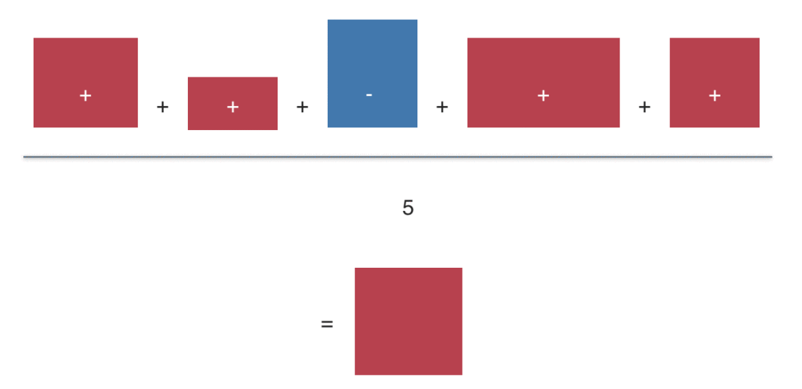
Sum up the value (area) of the deviation rectangles. Then divide by the number of rectangles to get the average rectangle (or average value). This value is the covariance (if you started with raw values). Or the correlation, if you started with z-values.
For more in depth voyage, have a look at the paper where 13 ways to look at the correlation coefficient are discussed.