In data analysis, we often ask “Do these two groups differ in the outcome variable”? Asking this question, a tacit assumption may be that the grouping variable is the cause of the difference in the outcome variable. For example, assume the two groups are “treatment group” and “control group”, and the outcome variable is “pain reduction”.
A typical approach would be to report the strenght of the difference by help of Cohen’s d. Even better (probably, but this atttitude is not undebated) is to report confidence intervals for d.
Although this approach is widely used, I think it is not ideal. One reason is that we (may) have tacitly changed our hypothesis. We are not asking anymore “Do individuals between the two groups differ?” but we ask now “Do the mean values differ?”, which is different. Although we are used to this approach, there are problems: Often, our theories do not state that e.g., some pill will change the mean of a group. Rather, the theory will (quite rightly, in principle) suggest that some chemical compound in an organism will change some molecules, thereby some cell metabolism products, and finally bringing about some biological and/or psychological change (to the better). This is complete different a theory. And the last theory makes sense (potentially) from a biological and logical perspective. The former does not make any sense. How can some chemical affect some group averages, some “average organism” which does not exist in reality? If we agre with that notion we would be forced, I believe, not to compare means.
But what can we do instead? In fact, some new methods have been proposed; for example James Grice developed what he has dubbed Observation Oriented Moeling. But maybe an easy, first step alternative could be using the “common language effect size” (CLES). CLES simply states “given the observed effect, how likely is it that if we draw two individuals, one from each of the two groups, that the individual from the experimental group will have a higher value in the variable of interest?” (see here).
The value of CLEs is observational, not a hypothetical parameter. It is quite straight-forward man-on-the-street logic. For example: “Draw 100 pairs from the two groups; in 83 cases the experimental group person will a higher value”. That makes sense from an observation or individual organism point of view.
Practically, there are R packages out there which help us computing CLES (or at least one package). The details of the computation are beyond the scope of this article; see here for mathematical details.
Rather, we will build a nice plot for displaying a number of CLES differences between two groups.
First, let’s get some data, and load the needed packages.
library(tidyverse)
# library(readr)
extra_file <- "https://raw.github.com/sebastiansauer/Daten_Unterricht/master/extra.csv"

extra_df <- read_csv(extra_file)
This dataset extra comprises answers to a survey tapping into extraversion as a psychometric variable plus some related behavior (e.g., binge drinking). The real-word details are not so much of interest here.
So, let’s pick all numeric variables plus one grouping variable (say, sex):
# library(dplyr)
extra_df %>%
  na.omit() %>%
  select_if(is.numeric) %>%
  names -> extra_num_vars
First, we compute a t-test for each numeric variable (using our grouping variable “sex”):
# library(purrr)
extra_df %>%
  dplyr::select(one_of(extra_num_vars)) %>%
  # na.omit() %>%
  map(~t.test(. ~ extra_df$Geschlecht)) %>%
  map(~compute.es::tes(.$statistic,
                       n.1 = nrow(dplyr::filter(extra_df, Geschlecht == "Frau")),
                       n.2 = nrow(dplyr::filter(extra_df, Geschlecht == "Mann")))) %>%
  map(~do.call(rbind, .)) %>%
  as.data.frame %>%
  t %>%
  data.frame %>%
  rownames_to_column %>%
  rename(outcomes = rowname) ->
  extra_effsize
Note: output hidden, tl;dr.
Puh, that’s a bit confusing. So, what did we do?
- We selected the numeric variables of the data frame; here
one_ofcomes handy. This function gets the column names of a data frame as input, and allows to select all of them in theselectfunction. - We mapped a t-test to each of those columns, where
extra_df$Geschlechtwas the grouping variable. Note that the dot.is used as a shortcut for the lefthand side of the equation, ie., whatever is handed over by the pipe ` %>% ` in the previous line/step. - Next, we computed the effect size using
tesfrom packagecompute.es. - For each variable submitted to a t-test, bind the results rowwise. Each t-test gives back a list of results. We want to bind those results in a list. As we have several list elements (for each t-test), we can use
do.callto bind that all together in one go. - Convert to data frame.
- Better turn matrix by 90° using
t. - As
tgives back a matrix, we need to convert to data frame again. - Rownames should be their own column with an appropriate name (
outcomes). - Save that in an own data frame.
And compute the differences in CLES, and plot it:
# library(ggplot2)
extra_effsize %>%
  dplyr::select(outcomes, cl.d) %>%
  mutate(sign = ifelse(cl.d > 50, "+", "-")) %>%
  ggplot(aes(x = reorder(outcomes, cl.d), y = cl.d, color = sign)) +
  geom_hline(yintercept = 50, alpha = .4) +
  geom_point(aes(shape = sign)) +
  coord_flip() +
  ylab("effect size (Common Language Effect Size)") +
  xlab("outcome variables") +
  ggtitle("CLES plot") -> CLES_plot


CLES_plot
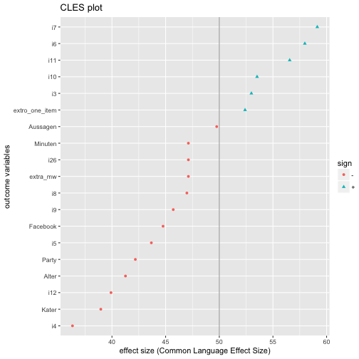
The code above in more detail:
- select columns
outcomesandcl.d; note thatcl.dstands for CLES (here: Common Language Cohen’s d, as CLES is derived from Cohen’s d). - Compute variable to tell in which direction the difference points, ie., whether it is greater or smaller than 50%, where 50% refers to ignorance towards the direction of difference.
- Well, now plot, but sort the outcomes by their CLES value; for the purpose of sorting we use
reorder. - Flip the axes because it is more beautiful here.