Plotting a normal distribution is something needed in a variety of situation: Explaining to students (or professors) the basic of statistics; convincing your clients that a t-Test is (not) the right approach to the problem, or pondering on the vicissitudes of life…
If you like ggplot2, you may have wondered what the easiest way is to plot a normal curve with ggplot2?
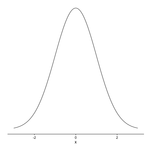
Here is one:
library(cowplot)
## Loading required package: ggplot2
##
## Attaching package: 'cowplot'
## The following object is masked from 'package:ggplot2':
##
##     ggsave
p1 <- ggplot(data = data.frame(x = c(-3, 3)), aes(x)) +
  stat_function(fun = dnorm, n = 101, args = list(mean = 0, sd = 1)) + ylab("") +
  scale_y_continuous(breaks = NULL)
p1
Note that cowplot here is optional, and gives a more “clean” appearance to the plot. Without cowplot, ie., the standard theme of ggplot2, you will get (better restart your R session before running the next code):
library(ggplot2)


p1 <- ggplot(data = data.frame(x = c(-3, 3)), aes(x)) +
  stat_function(fun = dnorm, n = 101, args = list(mean = 0, sd = 1)) + ylab("") +
  scale_y_continuous(breaks = NULL)
p1
