A well-known property of regression models is that they capture the unique contribution of a predictor. By “unique” we mean the effect of the predictor (on the criterion) if the other predictor(s) is/are held constant. A typical classroom example goes along the following lines.
All about storks
-
There’s a correlation between babies and storks. Counties with lots of storks enjoy large number of babies and v.v.
-
However, I have children, I know the storks are not overly involved in that business, so says the teacher (polite laughters in the audience).
-
Once we consider a third variable, call it nature-level, we see that the correlation between storks and babies vanishes.
-
Assume that nature-level and storks are correlated - in nature-rich areas there are a lot of storks. Assume further that nature-level and the amount of babies are correlated - in nature-rich areas people have relatively many babies.
-
That’s why we find a correlation between babies and storks (“spurious” it is called), which is (fully) attributable to the nature-level.
This is all well-known but it helps to see it in real data. That’s the objective of this post.
Tip, sex, and total_bill - two simple bivariate analyses
Let’s have a look at the tips dataset.
data(tips, package = "reshape2")
And load some datajudo packages.
library(tidyverse)
First, simple bivariate assocations for sex-tip and total_bill-tip.
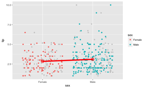
Is there an assocation between sex and tip?
ggplot(tips) +
  ggplot2::aes(x = sex, y = tip) +
  geom_jitter(color = "grey80") +
  geom_jitter(data = tips, aes(color = sex)) +
  stat_summary(fun.y = mean, color = "red", geom = "line", size = 2, group = 1) +
  stat_summary(fun.y = mean, color = "red", geom = "point", size = 5, group = 1, alpha = .5)
tips2 <- select(tips, -sex)

tips %>%
  ggplot() +
  aes(x = total_bill, y = tip) +
  geom_point(data = tips2, color = "grey80") +
  geom_point(aes(color = sex)) +
  facet_wrap(~sex)
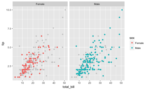
It appears that men do tip slightly more than women do.
tips %>%
  group_by(sex) %>%
  summarise(tip_sex_mean = mean(tip),
            tip_sex_md = median(tip))
## # A tibble: 2 x 3
##      sex tip_sex_mean tip_sex_md
##   <fctr>        <dbl>      <dbl>
## 1 Female     2.833448       2.75
## 2   Male     3.089618       3.00
Ok, some 25 Cent difference, in favor of men. Some association is present in the data.
Let’s run a regression on that, just to double-check.
lm(tip ~ sex,
   data = tips)
##
## Call:
## lm(formula = tip ~ sex, data = tips)
##
## Coefficients:
## (Intercept)      sexMale
##      2.8334       0.2562
Ok, confirmed.
Now, what about the association of total_bill and tip?
tips %>%
  ggplot +
  aes(x = total_bill, y = tip) +
  geom_point()
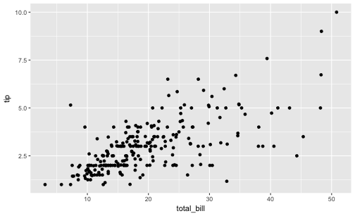
Oh, clearly, some correlation is present between total_bill and tip.
tips %>%
  summarise(cor_tip_bill = cor(tip, total_bill))
##   cor_tip_bill
## 1    0.6757341
And let’s have a look at the slope of the regression.
lm(tip ~ total_bill, data = tips)
##
## Call:
## lm(formula = tip ~ total_bill, data = tips)
##
## Coefficients:
## (Intercept)   total_bill
##      0.9203       0.1050
Multivariate analysis
Now let’s do that in one run:
lm(tip ~ total_bill + sex,
   data = tips)
##
## Call:
## lm(formula = tip ~ total_bill + sex, data = tips)
##
## Coefficients:
## (Intercept)   total_bill      sexMale
##     0.93328      0.10523     -0.02661
Notice that the slope of the predictor total_bill has not changed much. But sex did!
So, the unique contribution of sex is very small, about 2 Cent, and in favor of women when considered in junction with total_bill!
Let’s visualize the multivariate appraoch
First, for easier visualization, let’s bin total_bill in say, 5, bins.
tips$bill_bins <- cut_interval(tips$total_bill, n = 5)
Now let’s plot all three variables in one go.
tips %>%
  ggplot +
  aes(x = bill_bins,
      y = tip,
      fill = sex) +
  geom_boxplot() +
  geom_point(alpha = .5)
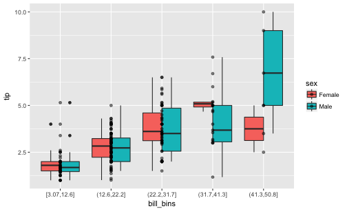
We see that females do tip more than men when the 5 bins of total_bill are considered each in isolation. For 4 of the 5 bins we find that the median of the women is higher than that of the men. Only in the 5th, ie., highest bin, we found that men tip higher. However, this bin is slightly populated, so we may negligate it. In sum, looking at each bin of total_bill - women tip more than men do!
Depicted differently:
tips %>%
  ggplot() +
  aes(x = total_bill, y = tip) +
  geom_point(data = tips2, color = "grey80") +
  geom_point(aes(color = sex)) +
  facet_wrap(~sex)

Dichotomize total_bill
Maybe even more vivid is we we do not bin total_bill in 5 bins, but just in two.
tips$bill_bins <- cut_interval(tips$total_bill, n = 2)
Again, let’s plot the three variables.
tips %>%
  ggplot +
  aes(x = bill_bins,
      y = tip,
      fill = sex) +
  geom_boxplot() +
  geom_point(alpha = .5)
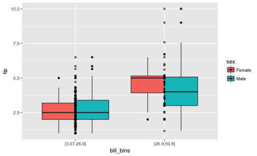
We find that women seem to tip slightly more than men do; at least not less.
A Simpson case
What happens can be considered a Simpson’s paradox, based on the fact that men spend more than women do (higher total_bill). Even though they tip less or equally to women it appears they tip “in sum” (not considering total_bill) more simply because total_bill and tip are related.
Let’s dichotomize total_bill and see which sex group (females or males) occur more frequently.
tips %>%
  mutate(bill_di = ntile(total_bill, n = 2),
         bill_di_f = if_else(bill_di == 1, "low", "hi")) %>%
  count(sex, bill_di_f) %>%
 # gather(bill_group, n, -n) %>%
  ggplot() +
  aes(x = sex, fill = bill_di_f, y = n) +
  geom_col(position = "fill")
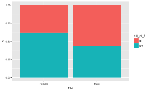
We see that the in the male group, high values occurr more frequently.
Path model
sex_male has a positive effect on total_bill; and total_bill in turn on tip.
But sex_male does not exert much of an influence on tip anymore, after controling for total_bill (in fact, the positive effect turned to a weak negative impact).
library(DiagrammeR)
mermaid("
graph LR
  total_bill-->tip
  sex_male-->total_bill
  sex_male---tip
 ")

Conclusion
That kind of “swapping” of the regression coefficient is a frequent observation in (multiple) regression. We may conclude that the multivariate analyses with 3 variables is more adequate than the bivariate analyses with one predictor only.
However, a caveat is that we can never be sure that this swapping process is now complete. Maybe we are missing out some more variable that will again make the coefficients swap. Alas, this we cannot know in observational reseach. That’s why observational data should not be overinterpreted.
Of course, even if commonly speak of “effects” this language should never be taken as indicative of causal effects. Causal effects is nothing that can firmly be established by statistics. Causality claims rest of more logical and substantive argument.