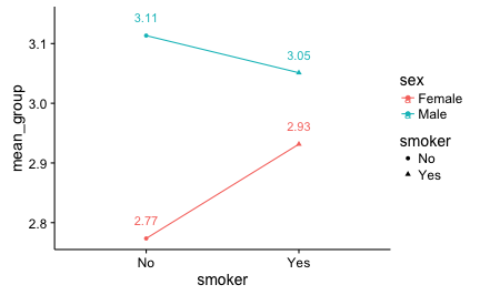
Often, both in academic research and more business-driven data analysis, we want to compare some (two in many cases) means. We will not discuss here that friends should not let friends plot barplots. Following the advise of Cleveland’s seminal book we will plot the means using dots, not bars.
However, at times we do not simply want the diagram, but we (or someone) is interested in the bare, plain, naked, exact numbers too. So we would like to put the numbers right into the diagram. One way to achieve this is the following:
First, let’s load some data and some packages (in R):
data(tips, package = "reshape2")  # load some data

library(dplyr)
library(tidyr)
library(ggplot2)
Then, summarize the variables (ie., compute means per group). Note that for ggplot (and many other graphing systems) it is necessary that the the variable depicted at (say) the X-axis conforms to one column in the data set. Thus, we often have to change the structure of the data set (but here not…).
tips %>%
  group_by(sex, smoker) %>%
  summarise(mean_group = mean(tip)) -> tips2
OK; now let’s plot it with ggplot2:
tips2 %>%
    ggplot(aes(x = smoker, y = mean_group,
             color = sex, shape = smoker,
             group = sex,
             label = round(mean_group, 2))) +
  geom_point() +
  geom_line() +
  geom_text(aes(x = smoker, y = mean_group + 0.03))

The whole syntax can be accessed at Github.