Moderator effects (ie., interaction or synergy effects) are a topic of frequent interest in many sciences braches. A lot ink has been spilled over this topic (so did I, eg., here).
However, in that post I did now show how to visualize error in case of nominal (categorical) independent variable, and categorical moderator.
Luckily, visualization of this case is quite straight forward with ggplot2.
First, some data and packages to be loaded:
library(tidyverse)
data(tips, package = "reshape2")
Then, we summarise the data:
tips %>%
  group_by(sex, smoker) %>%
  summarise(tip_groups = mean(tip),
            tip_sem = (sd(tip)/sqrt(length(tip)))) -> tips2
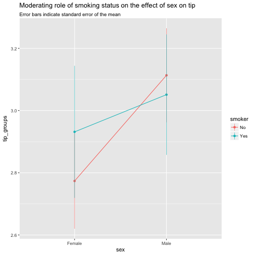
tips2
## Source: local data frame [4 x 4]
## Groups: sex [?]
##
##      sex smoker tip_groups tip_sem
##   <fctr> <fctr>      <dbl>   <dbl>
## 1 Female     No       2.77   0.154
## 2 Female    Yes       2.93   0.212
## 3   Male     No       3.11   0.151
## 4   Male    Yes       3.05   0.194
Remember that the standard error of the mean is computed as
\(sem = \frac{sd(x)}{\sqrt{n}}\) Now we take this summarised data and plot it:
tips2 %>%
  ggplot() +
  aes(x = sex, y = tip_groups, color = smoker) +
  geom_line(aes(group = smoker)) +
  geom_point() +
  geom_linerange(aes(x = sex, ymin = tip_groups - tip_sem, ymax = tip_groups + tip_sem), size = .3) +
  labs(title = "Moderating role of smoking status on the effect of sex on tip",
       subtitle = "Error bars indicate standard error of the mean")

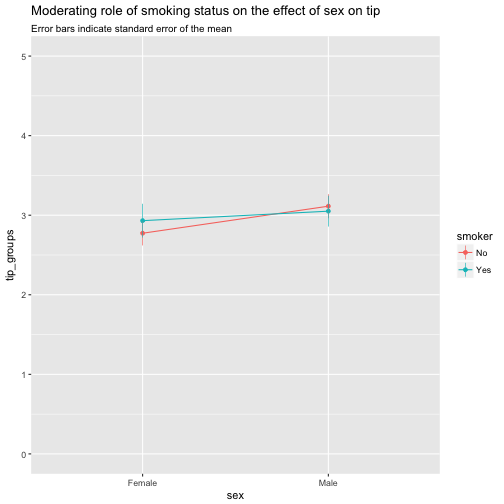
Maybe better changing the domain of the y-axis to put the effects in a (different) perspective:
tips2 %>%
  ggplot() +
  aes(x = sex, y = tip_groups, color = smoker) +
  geom_line(aes(group = smoker)) +
  geom_point() +
  geom_linerange(aes(x = sex, ymin = tip_groups - tip_sem, ymax = tip_groups + tip_sem), size = .3) +
  labs(title = "Moderating role of smoking status on the effect of sex on tip",
       subtitle = "Error bars indicate standard error of the mean") +
  scale_y_continuous(limits = c(0,5))
